New House Numbers
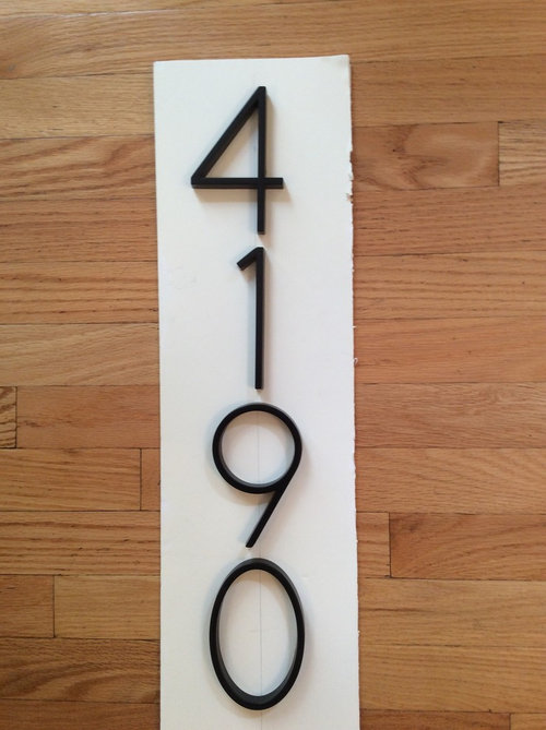
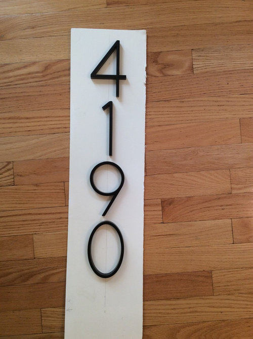
If they are centered, the 4 and 1 look odd.
コメント (37)

Najeebah
6年前try for horizontally. if not, I find the first better looking but the second much more readable
They look rather thin, how big are they? be careful of shadows obscuring the numbers, and ensure they're easily visible from the street
hamfast
質問の投稿者6年前Thank you for replying. The numbers are going on a column about the size pictured. They stand a little away from the surface so they will probably look a little than this.Najeebah
6年前all right, do look at them from the street. at a distance, a 1 can look like a 7, a 9-0 like an 8 and so on PRO
PRONew England Design & Construction
6年前They may be more legible with slightly more space between them, but the first one is better. The second makes me feel a little OCD.
hamfast
質問の投稿者6年前Yes they need more space between them. I agree the first looks better. I guess I want to know if there is rule to follow when placing the numbers vertically.
CLC
6年前最終更新:6年前I am the odd one out because I like the second layout. I think it looks better if each number is centered on the plate. The first layout has the 4 leaning left. Try both layouts again with the numbers spaced further apart
Najeebah
6年前clc, you're not the odd one lol, I prefer the second too :)
hamfast, ah ok. I don't think they'd look considerably thicker, but it may work nevertheless. how far is it approximately from the column to the street?
acm
6年前More spacing may make #2 look more reasonable.
(Yes, of course the 4 is out of alignment in #1, but it's vertical bar aligns with the bar of the 1, which makes it feel right to many.)
acm
6年前Hah, just to irritate a different subset of designers (and give you another option), here's the arrangement that's right-aligned instead of centered. it keeps the 4 and 1 aligned, but of course now it's the 1 that's out of line, so to speak...


Porter Edun
6年前We have vertical 3D numbers similar in style yet in a silver tone and a tiny bit thicker on a square column. I think they just need to be a pinch further apart as in the very first post.
hamfast
質問の投稿者6年前Acm--I may like that arrangement best. I really think the 4 and 1 need to be lined up.
Thank you to everybody. I will keep playing around with all of the suggestions. PRO
PROOlthof Homes
6年前The first option works the best. Is it possible to put some more space vertically between the numbers?
hamfast
質問の投稿者6年前The numbers will be on the column left of the front door. The door is centered between the left and right columns. Solid staining of our cedar house is almost complete.
The numbers will not be easily visible horizontally on the siding.
.
Najeebah
6年前if it must be so (4 on one column, not one on each of the four) it could do, but there should be a better way. 4 vertically is visible but possibly not the easiest to notice or read from the street. is there nowhere near the street you could put it? a decorative post in the ground, postbox, fence, or something similar?
sharayak
6年前Most definitely option 2. But the space created by the form of the four makes a larger gap visually between the 4 and the 1. So you will need to space the 1,0 and 9 slightly more than the 4 and 1. I'm a graphic designer. :)sharayak
6年前I asked my husband (he's a architectural technologist) and he's said "how is this a question, there is so much tension in the first one it stresses me". Ha PRO
PROJohn McLean, Architect
6年前If you place the numbers on a post, will they be visible there at night? Is a light shining on them? Might you have a light fixture under the roof on the porch that could cast some light on numbers placed to the right of the door? The would likely be a better location in my view (it's a common place to look for house numbers by emergency crews). If you don't think they will be sufficiently visible from the street, can you exchange this size of numbers for a larger size?
If you are set on applying them to a post, I'd suggest using the second arrangements and shifting the "1" slightly more to the left and increasing the vertical spacing a tad as others have suggested. There is no right or wrong way to do this, but whatever looks right to the design eye doing it. If your design eye is good, the positioning will be just fine.
hamfast
質問の投稿者6年前Thank you again everybody! I know it is a silly dilemma--I was not expecting to be so uncertain about such a minor thing. I had no trouble picking out paint or making other decisions!Najeebah
6年前Not silly, we enjoy the dilemmas, so thanks for posting. Have you gotten closer to a decision?

katinparadise
6年前I know it's late but I'll weigh in anyway. I prefer either #2 or acm's suggestion of a right side alignment. Maybe these images will help.


 They all have the 1 lined up in the center. I agree they should be spaced just a bit more apart.

wacokid
6年前Have you purchased the #'s? They come with paper alignment stencil showing alignment and where to drill holes for the screws.hamfast
質問の投稿者6年前Kateinparadise
Those images help a lot! That is the first vertical I have seen with a 4 and 1 together.hamfast
質問の投稿者6年前Wacokid-The numbers did come with templates but no instructions for vertical placement, only horizontal.katinparadise
6年前Glad it helped. I was surprised to find something with almost the exact same numbers. Good luck with your decision!


Mark Bischak, Architect