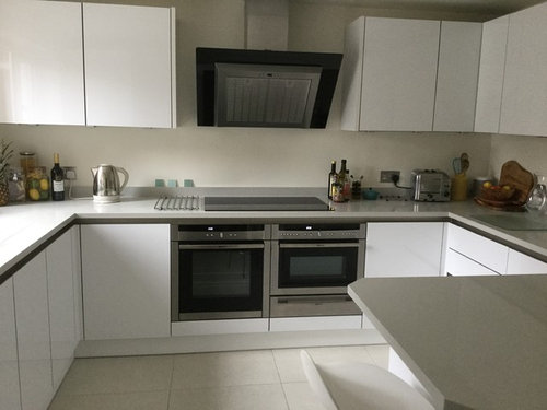
New Kitchen!
コメント (34)

juliaosborne49
質問の投稿者8年前Hi Colourhappy! Thank you for the comment - I agree that needs some colour. Possibly green or teal tiles then. Haven't thought about laying them that way in your photo looks effective plus I really like the teal tiles on your page. Were they expensive & where were they from? I always thought our floor is too light so may get that redone in either mid grey or wood sometime in the future! PRO
PROAmber Jeavons Ltd
8年前最終更新:8年前Hello Julia,
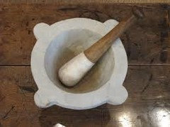
I think if you were to add a clear tile... like the subway in my image.. for me it's far more tasteful.... Then you are free to focus on beautiful accessories.. Like the pasta pot tap! : ) ) but also... think of warm textures... a stack of chopping boards close to oven/hob, lovely marble pestle and mortar.. and the toaster! Situate these where they are needed.. Dualit is a beautiful piece of kitchen equipment and demands to be seen! Possibly put away the jars and bottles in favour of cleaner lines..
A large wooden bowl of fruit would be nice near that seating area... but if colour is a must, then I do like certain elements of colourhappy's first image, namely the wood and green tile works well with the wolf oven.. it's a different look and quite different from yours.... so with yours I would focus on the sleekness of it and the subtle scheme you can create from the additional pieces... Marble, woods and so forth, smaller accessories.. and a clear subway tile would be my style choice.... : ))


Juliet Docherty
8年前Hi Julia, my tiles were Marlborough. I think they were from the 'Seasons' range. They are slightly irregular and the glaze picks this up with lovely darks and lights. Can't remember the price, around 90p each perhaps. I do think a wood floor would look great at some point, budget allowing (as always). Good luck.
Jonathan
8年前I would get an upstanding in the same material as the work top. Then add colour with accessories or with paint
Ash McGregor
8年前I'd go for clear glass. Don't think you necessarily need more colour and the current colour of the walls looks good with the floorjuliaosborne49
質問の投稿者8年前Hi! Thanks for comments! Will defo change the floor for wood sometime later but in the meantime think I need to add some bright accessories and a bright Roman Blind :>) I love red accessories so may go for bright pics and vases plus some wood and plants to add texture! Still in two minds whether glass will be good or brick type tilesgls5
8年前Hi Julie, we are currently putting in a new kitchen and went thru the same dilemma. In the end we went for a metallic silver glass splashback yet to be installed. My view is the glass gives you clean lines and is easy to clean. You can also add a splash of colour by using coloured appliances such as toaster or vases - we have gone for red appliances to brighten the metallic silver. The problem with tiles is the grout gets dirty after awhile. Save yourself the headache and go for glass. Geoff
Sarah Hales
8年前We have a very similar coloured kitchen and opted to add drama with a deep red, sparkly (sounds a bit blingy but it's a subtle hint of a sparkle) glass splash back, just behind the hob. It looks great in the evening when the lights on the cooker hood are on. Everyone comments on it and because the rest of our kitchen and dining area are so neutral, it's exactly what it needs.Jacky Potts
8年前I have a similar colour kitchen and have put a black glass splash back in and have then incorporated colour in accessories, which are currently lime green and pink. I am now getting a little bored of that and am looking to change to red. That is the beauty of keeping it neutral, you can afford to change your mind as the mood takes you.juliaosborne49
質問の投稿者8年前Hey All! Thank you for your comments! Think will go for glass - just need to think on whether we go for silver, black, grey or pale green! Sooo many colours! Will add a bright blind too for effect with a Venetian blind behind it. :-)juliaosborne49
質問の投稿者8年前Hi Lou! Worktop a pale grey sparkle Quartz! Have thought about a grey splashback but would it be too neutral as the kitchen is all pale colours? :) PRO
PROAkiva Projects Ltd
8年前Hello Julia,
Both would look nice, however I think in your case I would rather go for metro tiles to add some depth to your space. Glass sheet could be the other option. I definitely think you need to add some colour, so whatever option you go for add some colours. You could consider warm colours, red, yellow, orange, purple. Even green or blue..
Otherwise very nice kitchen, well done!
StJames Design Interiors

Aleksandra Arhipova
8年前Amazing kitchen! Please don't put any bright colours, it will instantly look cheap and outdated. I love the tiles in the first comment - like metro, but more of a checked-pattern layout. Metro as such is coming out now, it's been around for way too long and will not be for much longer. Where is the kitchen from if you don't mind me asking?juliaosborne49
質問の投稿者8年前Hi St James Design! Thank you for your comment. You think that the tiles will add some interest that would be lacking from the flat glass then! That's a thought.... The only thing with too strong a colour is that may get bored of it but then again tiles are pretty inexpensive on the whole to change. What about teal colour or would that be too cold? Or a darker grey than worktop
Aid in a herringbone effect may add interest?juliaosborne49
質問の投稿者8年前Hi Aleksandra! So good to see your comment - really mean that :) kitchen is from Magnet. Maybe tiles will add interest & texture as the kitchen is flat salad effect and no handles so that's a thought; although I love the sleek lines of some of the pale green glass examples on Houzz. I think that a colourful window blind in a modern print will also add & few flowers/plants.Juliet Docherty
8年前Hi Julia, in terms of colours, there are numerous colours that aren't so easily identifiable (think F&B colour charts). I would avoid a bright colour as I think it would look harsh next to the white units. Soft olives, subdued turquoises or even an edgy mustard colour could work. Good luck.
alyper
8年前A bold colour splashback behind the cooker (we got a smoked glass in teale) and paint the walls in a lighter shade and accessories with colour highlights. Makes it easy to change as the mood takes you as time goes by. Cannot see how colour can cheapen a design!
minnie101
8年前Hi Julia. I think the wood floor will be great and add warmth and texture. I would go for a mid grey glass splash. Add the colour in accessories. I think a grass green would look fantastic against the grey. Maybe look for some green earthenware bottles or glass for the oils. Add a plant and a herb and maybe a couple more green accessories with maybe something in charcoal. Unless you can afford real flowers each week add a vase of good quality faux flowers on the breakfast bar, I like oka direct.
eehchristie
8年前If you choose a tile, my advice would be to think of this when choosing the size...... the smaller the tile, the more grout you will see. Grout is truly impossible to keep clean on a splashback. Oil and grout just stick together and look dirty. Good luck with your choices. All clean and shiny and new. Lovely.
 PRO
PRONicholas Engert
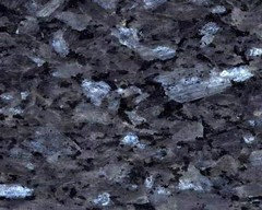
8年前I would consider back coated glass which comes in many colours. It is easy to keep clean and the joints can be aligned with the fitted cupboards.
Glazed tiles will result in too many grout lines which will get dirty. (Why are grout lines so wide these days? In Edwardian times they were virtually non existent!)
The other option is granite. This will be costly but the effect of the worktop lights on the granite might be worth it.
Great kitchen - I hope you find the right solutions
 PRO
PROcreativeorg
8年前I would go with a solid glass splashback behind the hob and then leave the rest with just an upstand. It looks cleaner and more contemporary and is easier to keep clean in the long run. It looks fab!!
juliaosborne49
質問の投稿者8年前All! Thank you for all the comments - really busy fitting everything in at the mo so may be a little while before we get around to finishing. Still haven't hung the door & that's more of a priority for me tbh. Good to have all your imply though :) PRO
PRODIY Splashbacks
8年前Beautifully designed kitchen. Particularly that worktop!
The design is so simplistic, it would be a shame to visually clutter it with too many grout lines. If you opt for tiles, consider something slightly larger than the usual metro tile and don't be afraid to opt for a matt finish. Matt tile and glass can create a very luxurious look, and a good contrast to the gloss units. This kitchen is kind of like yours if you invert the colours, and you can see how the clean lines of the glass don't detract from the sleek units.

juliaosborne49
質問の投稿者8年前Thank you - still to decide on colour but tend to think glass will be easier to clean & sleeker look. Probably go for pale or Torquay green glass along back wall but I think templating is gonna be tricky!- PRO
DIY Splashbacks
8年前Hi Julia, It's not as difficult as you might think!
Most of the time all you'll need are measurements to create a simple sketch or diagram. We, and other splashback companies make that relatively simple. When you're at that stage, take a look at our tutorials... even a DIY novice can do it. http://glasssplashbacks.com/inspiration/index.php/how-to-guides/
 PRO
PROMeghana Badiani
8年前Hi
I recently painted the area between cupboards and worktop in a colour that was in some art work that was hung in the kitchen and sourced a 'cost effective' clear splash back to fit on top. Budget was tight so this worked well.
Also just my opinion, the seamless splash back looks quite effective in a contemporary white kitchen rather than tiles. It continues the clean lines and modern look.
If you're not keen on bright colours, a marble wallpaper with the clear splash back would also look luxurious and different.
Add some lighting under the cupboards to highlight the splash back and accent the room with dark wood whether that's the floor or small items like chopping board or utensil holder.


Juliet Docherty