need help choosing cabinet paint color
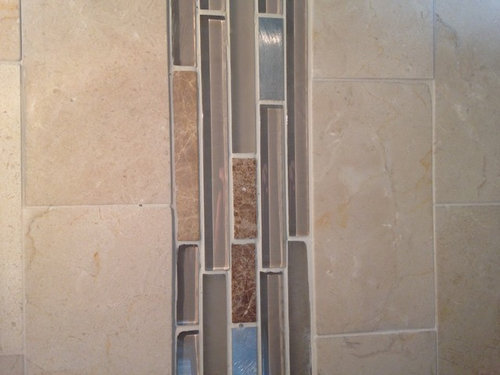
so i'm jumping on the painted kitchen cabinet trend. i just bought a house with awful distressed cream cabinets and i want to paint them a bluish grey. however, the granite and backsplash (which aren't my taste but i don't have $ to change) are mostly beige with some silvery accents. so i'm struggling with whether to go with a warm bluish grey or a cool bluish grey color. any favorite paint colors that you think would work with these elements??

コメント (13)
 PRO
PROSimpleDecoratingTips.com
9年前I actually think that the granite is super neutral, with both warm and cool tones in it. Whichever way you go with your cabinet color, it will pull that tone out of your granite. (I'd choose a cooler tone...)
Liz www.HometoCottage.com
Linda Bethea
質問の投稿者9年前thanks! any recommendations for specific paint colors. i'm looking for something not too light and not too dark (yes, i know i sound like goldilocks!)
 PRO
PROAccess Home Staging
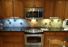
9年前When choosing your paint colour be sure to keep in mind the amount and quality of natural light as it will dramatically change how the colour looks in your home.

acm
9年前I'd go with a warmer tone, just so you don't make your backsplash look pink by contrast. It looks like that accent tile will put you in good position for a range of greys and bluish greys -- no concrete suggestions here, since I don't keep a color deck handy. :)
Whatever you choose, get a sample of that and a couple of related colors and paint them on cardboard to lean around your kitchen -- a couple different walls, a couple different times of day -- to be sure you have it right before you do the deed. Good luck! PRO
PROMarteen Moore Interior Planning
9年前You have a few quite a few choices. It would be nice to see what the surrounding areas look like, to make sure they all flow together. The range of color you have to choose from is a deep Espresso, to a warm deep Gray, a lighter Gray, or even a clean neutal beige. What ever you choose, don't egnore your surroundings... Feel free to contactact me. You can find my information on my Houzz professional page. Good luck.
- PRO
SimpleDecoratingTips.com
9年前Actually, I really recommend that you get several paint chips from where you're going to get your paint and bring them home. Tape them to your cabinets to see how they look in your room with your lighting. Remember that paint color will change according to what is reflecting on it, so remove anything that will not be staying, (or cover it up with white paper). But to suggest a color on the internet is really a bad idea... What your stone is in real life compared to what I'm seeing on my screen could be quite different.
Yes, I know that some folks on Houzz do make paint color suggestions, but I will not... I have too much experience selecting paint for clients and am amazed how one color will look a certain shade in one house, but look like a completely different color in a different house. It's not a responsible practice to attempt. Painting is hard work, and to wind up with the wrong color after all that work is frustrating! It's worth your while to get paint chips, lots of them, and go from there.
I hope that helps! Liz www.HometoCottage.com  PRO
PROCabinets 4U, Inc.
9年前Keep in mind how dramatically your lighting will affect how these colors "read".
Linda Bethea
質問の投稿者9年前not yet - going to take advice and paint some swatches to put next to cabinets and observe in various lights. off to paint store this afternoon!
 PRO
PROWashington Marble Works
9年前You might consider doing different colors on the top and bottom ones intentionally...if not for the same reason listed above. I love the look of a darker color on the bottom and lighter on the top, it really helps bring light into the space and create the illusion of a larger room.


leelee