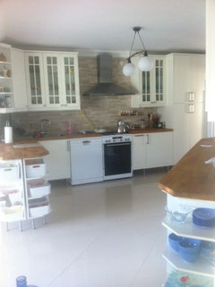
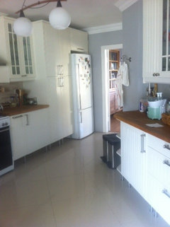
what color would you use for the kitchen wall?
ASN ASN
11年前
I first tried green but didn't like it, do you think beige and brown tones , or gray colors would be fine?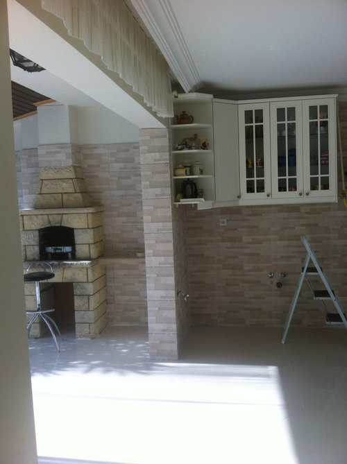


注目アンサー
並び替え:古い順
コメント (40)

inkwitch
11年前I agree. A more "taupe-y" color may go better with the cabinets which look more creamy than white. Definitely not green.ASN ASNさんはinkwitchさんにお礼を言いました
houssaon
11年前最終更新:11年前At first I thought grey, beige, but you really need to color compliment the existing beiges and yelllow tone of the stone. Pluse you have a lot of white in the floor and the cabinetry.
How about blue? Look at Boca Raton Blue 711 by Benjamin Moore · 詳細or
 Stratton Blue HC-142 by Benjamin Moore · 詳細
 Buckland Blue HC-151 by Benjamin Moore · 詳細
 PRO
PROThe JLW Company
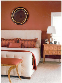
11年前warm red or red-orange would be beautiful with all the neutrals and set a beautiful tone in a kitchen. PRO
PRORana/Art Palette
11年前You should see the general tone of your kitchen cabinets, counter and backs splash before you decide on the wall color. Any color depending on the shade you are using may look too pink, blue or other hue. Since Cabinets, counter and back splash are more of a permanent feature of your kitchen, the wall color choice depends on them. Now once you have selected the color you are going to go with, you want to select the shade whether dark or light of that color depending on the amount of lighting you have in your kitchen/ room. Kitchen will only benefit from lighter shade since more light is going to bounce off to your beautiful counter, back splash and cabinets. Hope this helps!
victorianbungalowranch
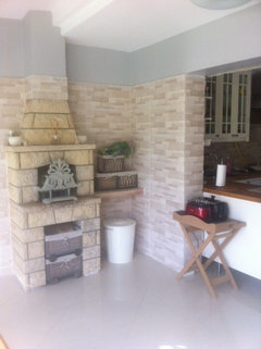
11年前That looks like an outdoor fireplace or something. Never seen anything like that in a kitchen. Where do you live?
The green is rather bright and would have maybe been better in a more sagey color. The bright turquoise wall outside makes me think that something in that color family but more muted might work, perhaps something like duck egg green--sort of a green-blue grayish tone.
The stone in the fireplace is a lot more yellow than the stone on the wall so that makes it tough to get just the right color. The taupe type floor and the extreme difference in light levels don't help.
I would consider doing a completely different color in the kitchen area than the sunroom area, because the same color will look like two colors anyway, and possibly not matching colors. Perhaps just painting the sunroom portion a neutral, maybe the color of your cabinets, or a lighter version of the floor, would be enough.ASN ASNさんはvictorianbungalowranchさんにお礼を言いました PRO
PROcasa art studio
11年前We have used a colour in our home called Latte by Sherwin Williams (#6108) and it is really nice with stone and wood. One shade lighter is called Nomadic Desert and that could look nice also. Good luck!ASN ASNさんはcasa art studioさんにお礼を言いました PRO
PROMerri Interiors, Inc.
11年前As a professional, I offer a color consultation at a fair charge for 2 hrs of time. It may be worth the investment to be sure of the right color especially since its a space open to other rooms. Look for someone in you area & be confident in your color choice.berekann
11年前I used tumbled stone by Kelly Moore - a nice greige. Greys and bones are trending now, browns and tans are fading. . . so, it will be easier to decorate around those colors. Otherwise, i like the blue choices above.ASN ASNさんはberekannさんにお礼を言いましたyytcm
11年前I think the absolutely first thing you need to do is find a color consultant who really understands the undertones of color and how to work with them, because I think your biggest issue in the combo of rooms is that you have a "yellow" stone fireplace (magnificent though it be) and "pink" tile behind it and "pink" floors (all of which are permanent fixtures in the rooms); and yellow and pink undertones don't mix. Until you find a way to deal with that issue (very hopefully without tearing anything out and redoing it), no matter what wall color you choose, you'll never be completely happy with the rooms. I would look for a color consultant who definitely has training in working with undertones. Maria Killam (MariaKillam.com) has an intense training program dealing with this issue. She's out of Vancouver but she does online consults and she's trained a lot of people, some of whom may be in your area. Any money spent on a knowledgeable color consultant would be well spent. Good luck!!! PRO
PROTammy Kretz, Ethan Allen, McCandless, PA
11年前I would chose two colors, grays and beige tones. I would use the warmer of the two on the ceilin-the lighter one would blend seamlessly with the wall tile. This also creates a softer blend with the tile and the warmer tone on the ceiling would accentuate the beauty of the fireplace- one of your focal points in the kitchen. This combination would also draw your eye to the outside patio area. Hope this helps.
ASN ASN
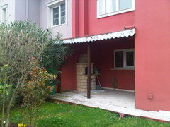
質問の投稿者11年前thank you all,was really useful,I'l show the finished picture in 10 days' time ( will probably use a warm grey/greige color like B.Moore Northern Cliffs 1536, see sample picture with natural stone/grey wall). Many of you advised me blue and azure, that's beautiful, but I used blue so much, see my living room-simply blue, it is adjaceent to the kitchen. The fireplace used to be an exterior one, I just did some remodelling and enlarged the kitchen, see my kitchen porch-before-after pics, so wish everybody a nice week, further comments are always welcome :)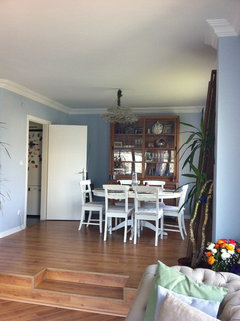

- PRO
Tammy Kretz, Ethan Allen, McCandless, PA
11年前I would use the lighter shade on the wall and the warmer beige tone on the ceiling. there is a lot going on in the kitchen so i would keep all the walls the same color. Let the fireplace and the cabintery stand out and be interesting to look at. I would also add some interesting artwork to the wall to the left of the fireplace, closest to the outside patio. You just don"t want to focus on the wall color, but instead have the wall color act as a back drop to the more interesting elements in the space. - PRO
Tammy Kretz, Ethan Allen, McCandless, PA
11年前Without seeing the stone in person and just using my judgement of what i am seeing on the website. I would use SW 6072versatile gray on the walls and somethingk like sw 6107 Normadic desert on the ceiling if those colors are some of the tones in the wall tile and complement the fireplace. If the color for the ceiling feels to dark for you then back it down one shade or so. - PRO
Tammy Kretz, Ethan Allen, McCandless, PA
11年前ASN ASN Just another thought. I looked at the photos that you like from the Houzz idea book. what i am trying to convey is very much like your second [picture that is the stone fireplace by J. Grant Desgin. It is exactly what i am thinking would work for you. Different room because that looks like an outdoor space, but same idea. Hope this helps.ASN ASNさんはTammy Kretz, Ethan Allen, McCandless, PAさんにお礼を言いました - PRO
The JLW Company
11年前Just want to make one last pitch...Hope you at least give some consideration to a warm tone like reds or red/oranges and look at them in space. As beautiful as the "neutrals" are....you have very little wall space. Think of the color like matting on a piece of art, it should showcase the room elements. The key is to avoid a red or red/orange with a blue undertone. Be sure to use a warmer saturation, that was the problem with the original green you selected, the saturation and undertone were too cool. ASN ASN
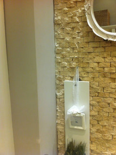
質問の投稿者11年前Dear Ethan Allen, SW versatile gray 6072 seems very similar to the gray tone that I have on my mind now, this gray goes well with natural stones and oak wood (furniture which I plan to place), here are some further pictures of the room, the stone files on the wall have the SW 6107 desert color tone by the way:) But I prefer to keep the whole ceiling pure white , finally I'll have cream kitchen cabinets, beige granite tiles on the floor, warm grayish walls and some wooden table/chairs, thank you again..


ASN ASN
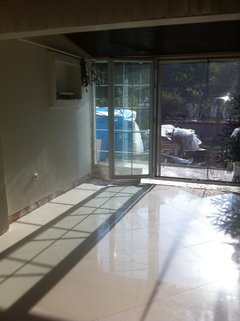
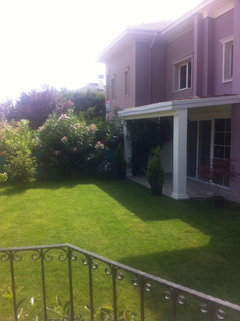
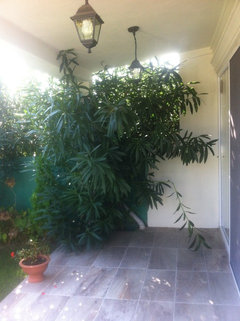
質問の投稿者11年前Dear jlenartweary, actually I have a big wall opposite to the fireplace, see the pic with the ugly bright green wall&cream cabinet, see also a former pic of the same wall from inside and outside, personally I also like red as a complementary color, wanted to use warm red wine/coral red transparent big curtains for the big windows (this part is almost like a half-winter garten), red colored texture for the curtain, tablecloth might help in making it all more interesting ? ( will put an oak wooden round table and chairs ), many thanks:)


- PRO
Tammy Kretz, Ethan Allen, McCandless, PA
11年前It's Tammy with Ethan Allen. I think it's worth a try. What do you think about the painting the ceiling?ASN ASNさんはTammy Kretz, Ethan Allen, McCandless, PAさんにお礼を言いました 
Natalie
11年前Hi---still like this color for your room... There's something about your space that needs a warm color. If you opt for gray, then make certain it is a warm hue such as in the second pic---Rockport Gray by Ben Moore. Hope this is helpful. Good Luck!
[houzz=][houzz=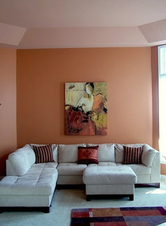 coral living room · 詳細]
 Living Room · 詳細ASN ASNさんはNatalieさんにお礼を言いました
ASN ASN
質問の投稿者11年前Hi Tammy,I 'll keep the ceiling pure white for a while ( just recently changed the old worn out dark oil painted low quality wooden ceiling with higher levelled-drywalls) and wait for the first results with warm light gray walls and look at its harmony with the beige granite floor tiles, creamy kitchen cabinets, light greige stone wall tiles...will upload the finished kitchen picture ( guess in 10 days), then I might think of adding some color to the ceiling maybe?After all, the most challenging item in the whole kitchen is the old fireplace, maybe I should get it painted but I do not know whether that type of material can be painted , plan to hang red translucent curtains (like that from desperate housewives Gabi Solis' kitchen)...red curtains might make it all more interesting ..you can also see the very former version of the wall opposite to the fireplace with the dark low ceilling.. .that wall will become gray-greige with red curtains in the corner, .many thanks

- PRO
The JLW Company
11年前Be careful with the red sheers as they don't have the depth of texture to balance all of your stone/brick. It is so difficult when decorating a space as people fall in love with elements...the key is to always big picture it. I always tell my students, look right, left, above and below and how will your decision impact all of that.
By the way, I love Tammy's idea of doing something interesting on the ceiling with a bit of color. I understand your fear of darkness from your prior experience but perhaps just consider changing the value on the ceiling so you bump it up a bit. Aren't you glad you asked all of us decorating addicts our opinions? :)ASN ASNさんはThe JLW Companyさんにお礼を言いました ASN ASN
質問の投稿者11年前Hi Natalie, I liked the second gray-greige color ( prefer mute colors since I've many details in the kitchen, the kitchen has a almost triangular base, has 2 sections and some unwished corners,walls I cannot change ), you may see other pics..made the ceiling higher, changed the floor tiles to one type (formerly had two sections in the kittchen)...it was just tiring...my remodelling has not totally finished yet, many thanks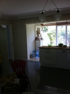


ASN ASN
質問の投稿者11年前Hi jlenartweary, www.houzz.com is really great, I'm so happy to get so many valuable tips from professionals like you, many thanks again, wish you all a nice stay, bye:)- PROASN ASNさんはTammy Kretz, Ethan Allen, McCandless, PAさんにお礼を言いました
 PRO
PRORayco Painting
11年前Here are a few great colors to start with:
Kelly Moore - Wise Owl
Kelly Moore - Snip of Tannin
Use a low sheen finish like Satin or Eggshell to keep the focus on your cabinets.ASN ASNさんはRayco Paintingさんにお礼を言いました
Connie
11年前coral.... as per natalie. I have constant coral in my open concept kitchen/ family room, with neutral cabinets and floor, ( but with Jurassic Green granite counters) and the coral is perfect with warm neutrals.
Jayme H.
11年前I think the grey or beige would be the way to go. Always compare samples to their surroundings before deciding. That has never done me wrong. Lighting in stores is never the same as at home.ASN ASNさんはJayme H.さんにお礼を言いました ASN ASNさんはDeborah Rodvikさんにお礼を言いました
ASN ASN
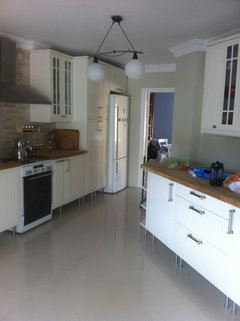
質問の投稿者10年前Here is the result, chose warm gray color ( sorry I didn't upload the photos earlier..) and thank you all again ...
inkwitch
10年前Stunning results! Congratulations on getting it finished without going nuts! Love what you did with the front porch. That stone flows nicely with the rest of the room. See, you're better than you thought. Lovely.


houssaon