White trim...peachy cabinets...panic attack..help :(
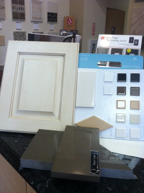
So I splurged quite a bit on this Shiloh Inset Cabinet. They are eggshell with subtle cafe brushed on highlight which looked great in the showroom. In my house it has a peachy pinky understones. I picked Dogwood Blossom PPG paint for trim, Whiskers for the wall color.
Reclaimed barnwood on floor and beams. I really like rustic/industrial look with clean modern look. I think my cabinets are just not the right.
What can I do to make the Cabs not look so peachy or rather what can I do in this space so that these colors don't clash too much.
I do want classic subway tile as backsplash. Iam think 4x12 with oyster gray grout. My counter is Lagos blue quartz composite.
I feel like after splurging and having design consulation, how did I miss out on this big detail of trims and cabs looking so off :(
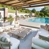
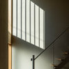
thanks...attached pictures are there to give you some feel of the space.


注目アンサー
並び替え:古い順
コメント (88)
lessismoore
11年前I'm a "graphic" designer, I used to work in newspaper production - everything is fast there! But it sure helps that you provided specific product links! Here is the palette with the concerto gray and yes, I think it is too gray too. I really liked the expensive one (of course) the Ceasar stone, which was somewhere right in between brown and gray.. LOL
erika672
11年前(Don't know if someone has already suggested this) Change you lightbulbs to daylight or brightwhite. Soft white gives off a yellow glow that may change the color of your cabinets. I changed the lights in my kitchen and my cabinets went from orange to natural looking oak. Hope that helps.C Thoman
11年前I love the restoration hardware trolley pendants that you chose! I personally think they would be beautiful and interesting in your space! My only concern with them, and the reason I didn't use them in a space in my home that I was considering them for is that they only take 25 watt bulbs so they don't give much light... and the edison bulbs are pricey for a much used space. I too think your kitchen will be beautiful and your cabinets will take on a completely different look once your warm floors, beams, and counters are installed.Business_Name_Placeholder
11年前I really think the floor as it is now and all the full lighting with no color or furnishings around it yet is what is giving your eye the peach color right now, though I see more yellow on my screen than peach. I do think as it comes together with whatever you choose it will start to take on the 'way it looked in the showroom' look that you are after.sagefam5
11年前I didn't read all the comments, so someone else might have said this, but looking at the paint swatches on the wall, I'd go with the one that is least "greenish." With green and red being complimentary colors, if you choose a greenish grey, it will make the cabinets look more pinkish (that peachy color you're wishing was more neutral). The cabinets are beautiful! I hope you find the perfect color and lighting combo that makes you love them too!margot1024
11年前Wait until all the paint etc is done, it's amazing how color and light play off each other resulting in unlikely color combinations that are gorgeous!Christine Austin Design
11年前I agree with sagefam5. Gray-green will bring out the pinker tones in the cabinets. Colour online is different for everyone often not even close in real life. If your colour consultant had your samples when she picked the wall colour, it should look great. But here is a design trick if you are in doubt. Take a sheet of paper and cut a one inch or smaller square in the centre of it. place a paint chip up against the material you are working with (in this case the cabinets) and make sure they both show in the window you've made and preferably in the same proportion. The white eliminates competing colour from your field of view and shows very clearly how the colours will affect each other. This trick also works with just the colour itself to see how it should appear once it is is on all the walls. Make sure you do this during the day and at night since colours appear completely different depending on how the room is lit. Remember you are ignoring the white paper and just looking at the colours in the one inch square windoe. Don't start second guessing all your decisions (although it sounds like you would be happier with the mason jar pendants ct design studio suggested) I would also go with a creamier tone on the subway since if it appears too gray, it could bring out the pinkier tones as sagefam5 shared. The great thing about paint is that it is the easiest finish to change.Laurie Mischel
11年前Wow Wow! I love the details in your kitchen/house. The cabs are completely awesome and I am envious. The whole look is gorgeous. So many good comments above and I love the tip we all picked up from Christine Austin design. You can be sure I will use that one often. I like the caged industrial lights best that CT Design studio offered up. My first reaction to the RH light you chose was, eek. I just don't like the feel of it with everything else. It looks old and ornate. Everything else is great, great, great. I admit that the cabs being a different shade from the trim would really scare me too but all those designers above make it sound like it will be fine. I loved the person's analogy of being in the bank and noticing all the details that didn't seem like they went together but as a whole it all looked good. Have fun. Can we all come see it when it's done? :)Sharon McLeod
11年前I'd like to throw a suggestion for counter tops out there... Cambria colour Braemer ( http://www.cambriausa.com/PageFiles/14564/large_swatch_0380.jpg). It's beautiful in person!!Sharon McLeod
11年前^ Exactly. I think it would be stunning!
Braemar has several colours that would really pop in that colour palette.sharleeg
11年前consider a classic Subway shape tile in Calacatta Oriental , which has white, creama dn gray tones to pull it all together and i agree... let hubby make a choice somewhere else like i did :)) Those mason jars are just wonderful!Radhika Raghuraman
質問の投稿者11年前Sharon. That does look beautiful. I was hoping for a non busy quartz surface and hence picked lagos azul but after seeing what lessismore's palette Iam loving it. I think it might be too late for the change as I placed the order on Friday. I can go to the showroom in Monday and see if they have Cambria.
Lessismore the more biscuit tile, is tht a particular manufacture that carries it?Radhika Raghuraman
質問の投稿者11年前Ok I looked more photos online with the cambria stone...I think it will pull all the colors well, just feel it might be a bit too busy. I guess the trick is to find the right backsplash that pulls it all together.Sharon McLeod
11年前The backsplash would definitely have to be simple. But there is lovely movement in the stone, and it really is beautiful. Be sure to let me know if you go that way, I'd love to see pics of the final kitchen!guycaron
11年前If i may make a comment.
What's with the transom over the door, then up to the upper glass doors, then down to the next cabinets, then up to the hood, then back down to the next cabinet, then up.
In my opinion, there are too many horizontal lines on that wall.
Do you also need to have so many posts?
Justmy opinion, don't want to be rude...guycaron
11年前If i may make a comment.
What's with the transom over the door, then up to the upper glass doors, then down to the next cabinets, then up to the hood, then back down to the next cabinet, then up.
In my opinion, there are too many horizontal lines on that wall.
Do you also need to have so many posts?
Justmy opinion, don't want to be rude...Radhika Raghuraman
質問の投稿者11年前Guycaron. You are not being rude. I am responding back to the wonderful folks who have been kind enough to give their 2cents. I feel that's the least I can do :) I am also using my phone to comment so it doesn't let me go back and forth..hence too many posts from my side. Feel free to ignore this thread :)feeny
11年前最終更新:11年前Radhika, I don't think guycaron meant your comments in this thread when he said "posts". I think he meant the actual physical posts in your third photo. He's wondering if they are all necessary for structural support.lessismoore
11年前Hi Radhika - I just tuned the colors on the white w/gray grout - just to see how it would be with a biscuity tone with a brown grout. I think finding a glossy subway tile in a similar color should be easy? Like possibly "ice cube" from Daltile ...
http://products.daltile.com/series.cfm?series=162&item=2416&log=2 -Radhika Raghuraman
質問の投稿者11年前Feeny and guycaron...you are right. Will stick to the main topic which is making the cabs blend in with the rest :)Nielson Finish Carpentry
11年前You might want to rethink your countertop choice if you have time. That color will really exargerate your cabinet colors.Sharon McLeod
11年前If the company hasn't templated yet, it's not too late to change the colour. If they've templated, it is quite possibly too late, but call them FIRST THING tomorrow morning and if they haven't started cutting, you should be good to change it up.Amy Sumner
11年前lessismoore, how gracious you are! You have kindly taken time to help a stranger with concrete, helpful advice. This thread is what Houzz is all about, in it's best form.lessismoore
11年前sumnerstuff - What a lovely thing to say! I enjoy doing a bit of photoshop when I have time and if the situation can benefit (and/or has a photo I can work with). This is a fun place to "hang out" - The people posting design dilemmas are brave, and no matter how conflicted the opinions might be, 99% of the posts have something positive to say. I've learned a lot in the short time I've been visiting :-)Madeline
11年前I can't add a thing. But this makes great reading and I do hope I'm "getting it" all subliminally -- all of the worthy advice, product ideas. Houzz is a great place to spend Sunday afternoon. Take care, madelineelbit
11年前Color theory would dictate that you should warm up the wall color---that will cool off the warm tones in the cabinets you dislike. Pick a shade closely aligned with the cabinet color and go a tad warmer. Color is always about what it is seen adjacent to it. The other option is to use warm lighting. That might synchronize everything.Crossroads Design
11年前Why on earth are the cabinets installed before your walls are painted? Maybe once the walls are painted it will take on a new look for you.feeny
11年前最終更新:11年前Many people choose to paint the walls last, partly to choose a color that works with the kitchen's colors once they can see everything installed. This is what we did, taking a color for the walls out of the shades of veining in our soapstone counters after they were oiled. That's not something we could have seen or planned ahead of time. So there may be many different reasons for painting the walls last. But I agree that the visual effect of the cabinet color will change once the walls are finished.nevadan
11年前Blue countertops will make the cabinets look peachier. Peach colored granite will do the opposite. Actually peach is the nicest color for a kitchen, so don't worry about it. If you want to you can change the appearance of the cabinets with bluer lighting and with window treatments that filter the light differently.Radhika Raghuraman
質問の投稿者11年前I didn't know if i should start a new discussion or add to this, but I wanted to share photos of the kitchen with the paint and counter top. Deciding a backsplash has been pretty tiresome. Like I had mentioned above, the brushing highlight makes the cabs a bit creamier but the overall look of the house is more neutral gray. Your thoughts on the various backsplash options are highly appreciated. The first one is a vein cut limestone slab ...one in the middle is also limestone but a bit darker. 3rd one is a mosaic..not a big fan of it but it pulls the colors beautifully. The stark white of the pantry door against the cabs still bothers me. Any suggestions? If I paint the pantry door and the trim around it to match the cabs, would it look ok.


Flawless Interior Design
11年前the 4 x 12 tile, its too large for the space, what kind of lighting do you have? Do the cabinets have the peach paint or you just think they look that way? Have you thought of a stainless back splash? the tiles you are showing match too much, its almost predictable.Flawless Interior Design
11年前And the walls are normally done after the cabinets are installed, because the installation is labor intensive, therefore, the walls would get scratched or damaged.Radhika Raghuraman
質問の投稿者11年前haven't bought the lights yet but thinking of putting 2 of Sonneman Tribecca on the island and Torpedo wall sconce from Restoration hardware on the sink. attached are the images. The tiles do come in different sizes... http://www.tileshop.com/shop/index.aspx?q=tile&restrictBy=producttype(text)=Tile,material(text)=Limestone. I could easily go with 4x8 staggered. I just bought bunch of these to see how it looks against the cabs.

Natalie
11年前Hi---Beautiful cabs! I think a blend would look very nice and help "pull" the different undertones. Wall color needs to be darker 2-3 shades deeper than the cabs. Pics for inspiration. Check SW 7039 Virtual Taupe and SW 7032 Warm Stone for wall color. Good Luck!
[houzz=][houzz= W10 Grey Smoke Quartzstone Brick Glass Mosaic · 詳細]
 W11 Grey Smoke Quartzstone Modular Glass Mosaic · 詳細
Monique Jacqueline Design
11年前I like Natalie's tile accents. I think you need to contrast to the cabinets. When you try to match you accentuate the cabinet undertones and in your case, this is not what you want to do. You want to eliminate the peach undertones.
Cheers!
m.Radhika Raghuraman
質問の投稿者11年前thank you all for the suggestions. What do you guys think of the darker limestone slab? The reason i chose that tile is that the same tile but a bigger field size will be going on the fireplace which is quite open to the kitchen. I was afraid the mosaic would look too busy as the the tile will be going all the way up. The ones above are quite nice. Thanks Natalie. The walls have already been painted. It PPG paint's whiskers.Monique Jacqueline Design
11年前I like the limestone, but I think that it too close to matching your cabinets. That is why I suggested that you contrast to the cabinets. In person, are you getting any peach undertones or have those diminished now that you have added additional elements to the space? If there isn't any peach undertones being brought forward, then I think that the limestone is beautiful! Hard to tell from the photos sometimes!
Cheers!
m.Radhika Raghuraman
質問の投稿者11年前Monique...actually it doesn't look peachy now that the paint and counter top is up. It is def creamy...esp right next to the pantry door. I think that is my biggest issue. I am trying too hard to blend the pantry door's white to the cabs and the backsplash. I do want neutral clean lines and I would like to bring in colors like orange/red through furnitures and accessories. I am thinking old furnitures..worn out paint. There are 2 versions of the same limestone...i was thinking of the darker one in fireplace and lighter ones that has delicate orangish brown veins as backsplash. Perhaps my pendant lights could be blown colored glass like the one Niche Modern pendants make. On a personal note..i want to thank you for your input from day 1. This has been an exhausting process :)Natalie
11年前最終更新:11年前Just wanted to add, I do not think your cabinets look peach at all. They are cream with a yellow undertone. If anything, they look yellow, not peach. The wall color in the photo of the lights you recently posted is a shade darker than those I suggested. I think deeper walls would look stunning. I love your lights by the way. Excellent choices... CheerS!Monique Jacqueline Design
11年前Hello!
I am so glad that you are no longer seeing the peach undertones! I remember our first postings and the fear that you had! Everyone sees color differently and it is amazing what we see along the way, but once all the elements start coming together it most ALWAYS works out. The hard part is having the patience to the end. Anyways, I prefer the lighter limestone detail from the photos that you previously provided above!
YOUR welcome, I love seeing and knowing that I have some how helped along the way! The process can sometimes be grueling but with encouragement and advise along the way, it always turns out great!
Excited to see your finished project!
Cheers!
m.Radhika Raghuraman
質問の投稿者11年前Natalie..the tribecca loft is beautiful. Absolutely my kind of place. Infact I have some similar furniture pieces from india. Thanks for sharing. It sort of too late to change wall color. any changes from now on would have to be done after we close on the house. But i will def try a darker shade once I settle in.
Monique. I was thinking perhaps changing the pantry to door to an old rustic door with chippy paint if it continues to bother me. These are easy fixes...changing the tile or cabinets are going to be hard. I am sort of leaning twds the lighter tile as well, although the dark ones blends with the counters better. Thank you all for the input. I have 2 days to decide on the tile :) Happy new year to you all.jacksonbeth
10年前There are a lot of options here! I would suggest looking at some kitchen photos online - one of the best sites to look at is http://carolinaheartwoodcabinetry.com/our-products/raleigh/ they design cabinets and kitchens, so these pics will let you see how others did their kitchens!! :) Great for ideas.User
10年前Congratulations on using your imagination with the metalwork and industrial look. All the best with your creativity in the future.iamcaroline
8年前Hey there! I am (two years later) where you are when you were first starting out but I haven't chosen a white yet for my shiloh cabinets. I current have china white on my kitchen cabs and think it looks way too creamy. I always wanted more of a white white kitchen, but the polar seems super creamy and the arctic scares me. Any advice? I also have the lagos counters, white subway tile. Going for Farmhouse industrial...


User