Does this entryway look complete?
Hi. I have been toying with my entryway set up and I now think I have it 'complete.'
I know things always change, but does this look like it's done or does it need something more or less? I still want to get a bench seat and rug for underneath, but I would like to get someone else's opinion. Excuse the lighting. Would love suggestions.


I know things always change, but does this look like it's done or does it need something more or less? I still want to get a bench seat and rug for underneath, but I would like to get someone else's opinion. Excuse the lighting. Would love suggestions.
注目アンサー
並び替え:古い順
コメント (32)

Charis Elizabeth
質問の投稿者9年前Oh and lighting isn't an option atm. I would love to include a lamp, but no nearby power point :(
decoenthusiaste
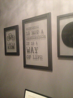
9年前最終更新:9年前5-5-75 = art centers 5' above the floor when alone, bottoms 5" above the furniture when hanging with it, width no more than 75% of the furniture's width when they hang with it. You could use some color and texture or pattern too. How about some seating there? I'd advise you to get two more matching pix to hang in a grouping of 4 above the console - two over two with a frame's width between them. Layering textures is key to opulance · 詳細
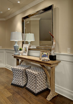 Entry · 詳細
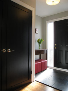 Front Entry with Black Doors · 詳細
 Bayshore Condo Design · 詳細
Chem K
9年前Optimise your existing lighting with a mirror that not only serves function but helps reflect light in this space. I would centre it above the console table and flank both art on either side.
Add a plant or orchid instead of the little succulent. Kimani Antique Silver Mirror · 詳細
 Double Phal Orchid with Vase Arrangement · 詳細
 PRO
PROHalasz Designs
9年前最終更新:9年前I love what you're currently working with, my suggestion would be to group the art work and add a pop of colourful fresh blooms.
Charis Elizabeth
質問の投稿者9年前Thanks heaps!!!!!!!!! Like seriously... I was working with existing hooks. And I'm definitely looking for colour I just hadn't found anything around that 'fitted' it's a slow process. PRO
PROMirens Inc
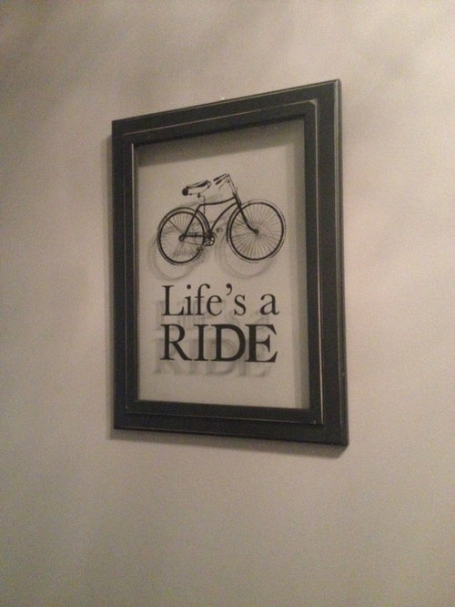
9年前If you only have these two wall arts, you can try hanging them one above another right along the centerline if the table. This arrangement will draw more vertical attention and make the vignette look more minimalist and modern.Charis Elizabeth
質問の投稿者9年前Mirens what about hanging that existing artwork that's on the table up in that space? Or should I source something else.
msliu7911
9年前As others have mentioned, I think a 3rd piece of art or wall decor could really help complete the look. I would do a mirrored piece in the center that is bigger than the smaller pieces (24x36 or if it's round at least 35" diameter). Then place the smaller pieces centered and spaced about 12" from the middle piece on both sides.Charis Elizabeth
質問の投稿者9年前Okay well I followed some suggestions, but I couldn't find the seats today. I will keep on the hunt. A little better?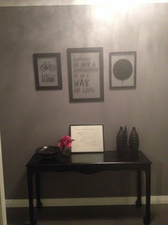

flannel flower
9年前I would use a higher table given it's an entry, just feels like you would walk in and there's a table around your knees. Then larger or extra art or a mirror. Maybe some metallics (gold or bronze) to add some colour e.g. In lamp, mirror frame or some other accessory.Charis Elizabeth
質問の投稿者9年前Flannel did you see my recent post? I did originally spray the e tower gold but my husband hated it. He's like that looks s hit. I can't win sometimes.
Vega Maguire
9年前i would of had more eyecatching pictures on the wall with prehaps a burst of hot pink or yellow- PRO
Mirens Inc
9年前Cc, if you like the vertical arrangement, you can certainly place the artwork on the table in the middle, between the other two! moodlelu
9年前I like the thought of larger art or mirror centered above the table. Flowers could add the pop of color, but so could swapping out the vases for something with more, lighter color. In the photo they blend in so well with the table they seem to add more darkness to what you say is an already poorly lit area. Also possible might be a small runner to lighten the surface of the table, this would help make the objects on top "pop" so to speak.leelee
9年前You need some color to add interest. Take another look at the pics you posted. Everything is monotone.Charis Elizabeth
質問の投稿者9年前Thanks for the comments guys. I did if you have a look a few comments up I actually purchased a few small things I could find in my small town (err 1 target only) I found a matching frame and flowers and I'm a little happier. I have added a lot of colour in the house in other rooms but the entryway and main living area has me petrified. I don't know which direction to turn as I haven't purchased our main couch yet. Slow and steady. Appreciate the comments!


decoenthusiaste
9年前最終更新:9年前Your art still needs to be lowered and balanced. The two side pieces should be lower in relation to the larger piece, and the entire group should come down so they and the table make a visual unit.msliu7911
9年前Agree with above comment. The pictures are still too high in general. Two options: A- If you're going to still have the white photo on the table leaned up against the wall, then you only need to pull down the outside 2 photos (have their tops line up about 1/3 of the way down from the top frame of the big pic) .... B- If you're not keeping that white leaning photo, then you need to pull down the larger picture and the pictures on the side.Charis Elizabeth
質問の投稿者9年前Right well here's an update. Still haven't found ottomans or rug, but I'm happier with this than before. One shopping trip at a time.

sarainitaly
9年前It looks a lot better - I would just try to find one taller object, that can *connect* the table to the wall art. Look at the entry table pics here: http://www.pinterest.com/sarainitaly/organize-and-shelves/ They all have lamps or statues, or vases that link the two areas. Personally, I love mirrors over the tables. Perhaps look for a taller lamp, since you mentioned the area being darkish.sarainitaly
9年前"One shopping trip at a time." - look around your house. I steal from rooms in my house, all the time. PRO
PROFurnished Up Fine Furniture and Home Decor
9年前The seating suggestion from decoenthusiaste sounds spot on and I'm biased towards having a mirror there instead (more functional too.) PRO
PROSoCal Contractor
9年前I would add a large mirror in the center and two pieces of art to feel the wall. The table could also use some color and more accessories.Charis Elizabeth
質問の投稿者9年前So I've included a progress photo. Still haven't found appropriate mirror, but it's coming along. I debate between two vases I already have. I haven't purchased much part from the globe.

 PRO
PROHavven
9年前Hi, Love the wall colour!
Not sure if anyone has suggested this but I think a big cane basket or two hamper style baskets will fill in the space nicely underneath the console.
One more thing, add a few sprigs or tall twigs into those vases it will add a touch of nature it's needing. PRO
PROKaleidoscope Color Consulting
9年前CC - add color...unless you purposely are going for monochromatic...don't be afraid to go large with wall decor and accessories, yet be cautious to not go heavy & bulky considering the sleek style of the console.
I like your latest 2 illustrations above the best because of the addition of the color tone and interest of the textured silver vases. Also, it is okay to layer the wall decor and console accessories (as in.decoenthusiaste posting)
Wishing you a brightly colored day,
Marychristina405
9年前Second the comments on adding a mirror -- and note that you are looking for the right one. I sympathize with that as I've been looking over a year for the right full-length mirror for a bathroom. Meanwhile, to add height, you could put the leaning print on an easel. It's a pet peeve of mine that leaning art just looks like someone was too uncommitted or energetic or ran out of picture hooks. An easel would look deliberate.
The intense pink flowers complement the wall color (at least as far as one can count on a computer image to show colors) beautifully. The scale of the globe seems too small for the space.Charis Elizabeth
質問の投稿者9年前I think I might switch the tall flowers over to the left and see if that makes a difference. Globe may not look so tiny. The globe one size bigger was $150 dollars more than the smaller and I debated it. I still wanted the space to be user friendly. I.e enough room to dump things as you walk in the door.
It's a slow slow process. Also you won't be able to see to the left, I painted our entry door black instead of the white. Looks brilliant, but it took nearly three weekends.
Thanks for the input.. I can't wait to find the perfect mirror... It's out there... Somewhere...Charis Elizabeth
質問の投稿者9年前Also those flowers to the right took a month to stumble across. Right shade etc. every time I went to find something it wasn't even close.- PRO
Kaleidoscope Color Consulting
9年前People think Interior Design is a fun easy job...now you get a taste of it. Even though we have the training and experience, it is definitely WORK and the thought process is the same that you are going through. Good Luck!


moogers