


最近のアクティビティ
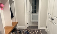
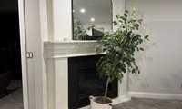

Are you only asking about a different color or making changes (then consider decreasing the size of the firebox and adding a filler panel).
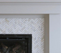
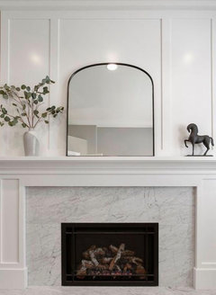
Whether painting or doing more, suggest waiting until your new furniture and accessories are added. If changing the flooring, it will have a big influence as well.

I like the hexagon mosaic tile on the FP. I'd either paint it the same color as the walls (in a different sheen - as suggested by Lyn) OR I'd wait to decide what to do with the FP until after you've selected your new furniture.
I do like the idea of adding moulding to the over mantel area - I also like the idea of using a nice piece of art over the mantel vs. a mirror.

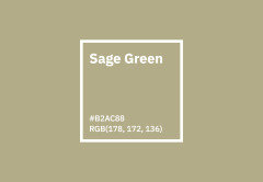
I would use a sage green in the whole room including the fireplace.
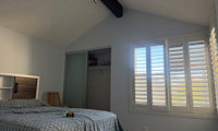
We have skylights in 3 different rooms (bedroom, kitchen and dining room/never had leakage in 16 years).
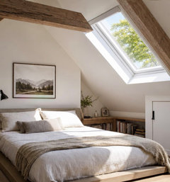
Our bedroom’s large skylight is directly over our bed..and I love to hear the rain’s patter and see the stars. Maybe choose based on how much light you want and taping out both options on the ceiling should help. For the size of the room, I’d opt for one.
Also to @Celery, i said clearly in the post the room does have windows.
Q I definitely like two better than just the one. And I think I prefer the two spaced further apart.
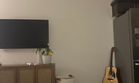
Maybe step back and consider the entire wall, as balance is key and suggest removing the little items.
You mentioned you didn’t want a fake plant, is a real one ok (?) and place by the window/ensure it has height. Chair moved to the right and pull out a bit to create a better connection + art and move guitar to other side. Add a few heavier pieces on the console that connect with each other.
With a few adjustments, the space will feel warmer and more inviting.
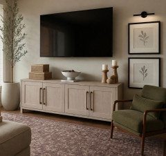

Two ways I'd go here:
Option 1 - a symmetrical pair, one print either side of the TV. Clean and calm, works if you're happy centring the screen on the wall. Match the two prints in size and hang them level with each other.
Option 2 - a vertical stack of two prints in that empty space to the right of the TV. I think this is the stronger look for your wall, since the TV already sits off to one side. The stack adds height to balance the long horizontal screen, and fills the open area without crowding the corner. Keep the two frames close together (a few inches apart) so they read as one unit.
Either way, given your warm wood, rattan and greige palette, I'd keep the art minimalist - muted Japandi landscapes or soft abstract shapes in natural oak or slim black frames.
I run a minimalist wall-art shop (Inprint Designs) and wrote a guide showing both these layouts with exact sizes and spacing - hope it helps!
Considering the whole wall:
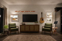
AI used identical chairs and lamps on both sides, but they wouldn't have to be, and variation would actually be more interesting. (This also assumes you are a versatile musician and have a bassoon lying around. Doesn't everyone??)
If you can’t adjust, think about removing and sealing up the door vs buying a compact car. We’ve owed three homes and never had access into the house from the garage. In no time you‘ll just take in stride…but it comes down to your priorities.

Sorry, I purposefully wasn't specific on which part of the stair does not meet code, as there is only a picture and no dimensions. But, per general U.S. code (where these sections are not ones that are altered locally):
- for this existing straight stair run into the garage door, there does not have to be a landing as long as you have a "landing" area inside the door;
- if the stairs would be turned perpendicular to the door, then obviously you need a landing outside the door to turn, but the dimension of around 36" wide would look to stick out further than the existing steps;
- the risers have to meet 7 3/4" maximum (including measured from top of door threshold) and treads 10" minimum;
- differences between risers can be no more than 3/8";
- if the stair is 30" or higher, then you cannot have fully open risers;
- the primary door has to swing in if there is no outside landing (adding a storm door may swing over steps);
- 4 risers require a graspable handrail;
- if the stair is 30" or higher, guardrails are required to be 36" high and meet object pass-through limitations, if guardrails double as a handrail then must also meet handrail spec.
.
For the door fire rating that was mentioned, the door does not have to be listed and labeled as a fire rated door, but if it has a window then that window must be rated (existing prehung metal door is fine, window is not). This would be the only code section that historically was amended, but is usually not anymore this millenium.
The attic stair kicks in code sections because it is next to a window, so the glass would need to be tempered and depending on how high the window is to grade outside it may need a guardrail in front of it.
This information is kinda down in the weeds, and assuming your recent purchase had an escrow inspection, this is not typical information an inspector would know. And most people would not care a great deal about this garage stair, I just mentioned code because the width and guardrails could be something where young kids and elder folks may have some trouble navigating. And bringing storage to the attic next to the window could be a dangerous situation.
I really appreciate this information! I will take measurements of the steps and post them as soon as I am back over at the house.
The previous owners had two cars that they had parked in the garage when we did the walkthrough …in hindsight I realize one of the cars was a very small sports car. The other was a vintage Toyota jeep. I just missed the issue because everything seemed spacious at the time with their two cars.
I’d get some Kraft paper and cut to size. Tape the two pieces in the different locations and also test height and proximity preferences. Also consider where they will best be appreciated.
On that wall facing the stairs 6097 and maybe paint that stair wall a color from the art .
You have a lot of wall space for artwork. Those 2 pics are just a start. Determine where you will place additional artwork and this might help with your current decision.
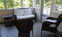
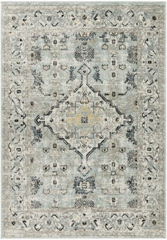
So it doesn’t feel as squeezed in, suggest moving love seat over and place table/plant (or lamp) in the corner. Suggest adding a new rug horizontally, which will make the area feel larger and using green would be a lovely choice. Rug style below would work with the one in the dining area. Play around with the chairs‘ locations.
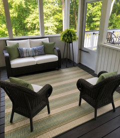
That looks great, thank you!
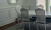
If…table could be turned, a sideboard would be useful, create interest and ground the room.
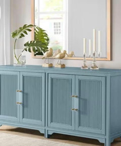
On opposite wall, you could tape out large art sizes (horizontally) and see what you prefer. Suggest not cluttering up the walls, as less will be more.

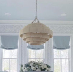
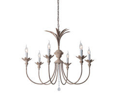
Nothing next to the windows, but suggest adding roman blinds. If open to replacing the fan, a chandelier will have a huge impact.
I'd actually use the long wall for a set of three framed artworks rather than one oversized piece. Three 60 × 90 cm (24 × 36 in) pieces, evenly spaced, would create a strong focal point while still feeling balanced with the length of the wall.
I'd keep the artwork cohesive rather than identical - similar tones or a related series would work beautifully. For the frames, I'd go with slim white or off-white to keep things light and cohesive with your white cabinetry, trim and mirror, letting the art itself carry the room.
I wouldn't add anything beside the mirror. There's already plenty of architectural detail there, so giving it some breathing room will keep the dining area elegant rather than busy.
A lovely color for a bedroom but I use bedding to start color scheme for bedrooms and for sure with a guest room. Sorry not many reviews on paint colors usually but if you like it and it works with the bedding do it and stop analyzing . And if you want real help we would need to see the space and the bedding.
I don’t think someone’s experience will help, as there are too many factors to consider. The articles below may help (2nd has a visualizer), but your best bet is to get a test pot. If you already have bedding, art, accessories and furniture, consider getting a quart to get a feel of the outcome. If you’d like recommendations to complement what you have, provide some pictures.
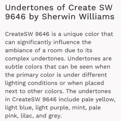
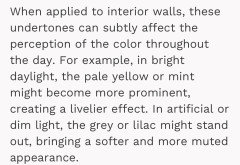
https://decorcreek.com/create-sw-9646-paint-color-by-sherwin-williams

With 12' ceilings, I wouldn’t eliminate the pendant entirely. Even with a smaller island, that much vertical space can make the kitchen feel a little unfinished without something bringing the ceiling and island together.
Rather than several pendants, I’d consider one light, sculptural linear fixture. It would give you the cleaner updated look you’re after without overwhelming the small island.
I recently explored 8 different designer pendant approaches and how dramatically they can change a room without changing the rest of the design. You might find some useful inspiration here:
I think a kitchen’s style, layout/size and of course personal preference are all factors. Your kitchen feels cavernous and pendants could break that up a bit; perhaps even extend beyond the island.
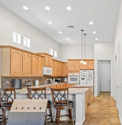
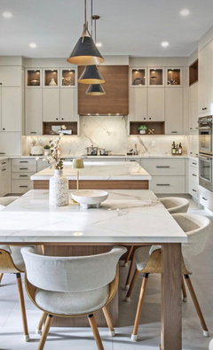
If not a fan, instead consider pendants over the peninsula which could break up the expanse.
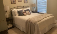
Three feet would allow for a narrow bench and a mirror above could also be handy.
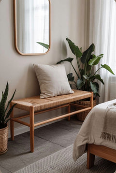
NOthing needed other than maybe some art it is a small space do not make it smaller even the chair just magnifies the small space .
Not every wall has to have stuff on it.
If you actually had more guests staying over, then I would suggest something like a flat/thin wall mounted Samsung Frame TV, as some people like to watch a bit of TV before going to sleep.
I’d wait until the vanity is installed and major items are complete. Then test different hardware to get a sense of what suits vanity and room, keeping in mind functionality and proportions as well.

P.S. Yes, wall mounted faucet may look more modern. I can look into that. I was planning to do an LED "touch" mirror above vanity.
Floating vanities are not only for modern bathrooms. I've seen quite a few that look nice in transitional bathrooms. It really depends on the details of the vanity - if it's one that isn't very long = a lot of space between bottom of vanity and floor + has glossy white or walnut slab doors = a definite modern look.
I also have a floating vanity in a bathroom - it is also supported by recessed boards as Beverly did in her bathroom. My vanity isn't very far off the floor - I debated whether to add some nice looking support legs that could be seen along the front (I still sometime think that I should add them - however, there isn't a lot of space - and I doubt anyone would notice except for me!)
A floating vanity does make the room look wider - seeing more of the floor tile gives the illusion of more space.
I also have under cabinet lighting - they are on motion detectors = they come on at night in order to eliminate the need to to flip on lights when using the bathroom in the middle of the night. It's a nice feature that was pretty inexpensive.
I think you may have changed the finished height to 36" - I wouldn't do shorter than that.
Also, you don't have to lose the top drawer. A u-shaped cut out will help for the pipes + you can do a thicker mitered counter to help house the sink (plus, have a bit of frame between the countertop and the top drawer if more space is needed).
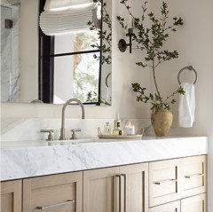
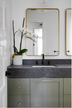
The drawer fronts can be built to be taller than the sides of the drawers = they hide the frame that provides the extra space in order to have a useable drawer.
I have never used F&B, but over the years I have settled on the sheens I like: for the walls, a washable matte; for the trim, satin, and for the ceiling flat.
If you go onto the F&B website there is a lot of helpful information regarding wall/trim/ceiling decisions for different rooms.
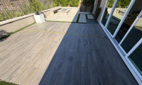
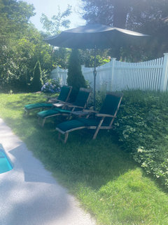
For modern I would use HDPE to keep looking new. I adore teak and it is what I chose over twenty years ago. I sourced it from a legal company but now know better. That being said I love my outdoor teak pieces that stay out all year in a New England coastal environment. Other than cleaning off leaves, pollen and bird droppings I have done zero maintenance in decades so they are now naturally grey not the modern golden that your inspiration shows. For my situation, I love a Natucket old feel aesthetic, they have been an ideal choice but not for a modern look. Now for cushions my green sunbrella captain lounge chair cushions are still pristine after 22 years uncovered from April until October ( unlike the teak we bring these in for winter)
This is 20 year old aged teak it greyed within the first year and than maintained this tone for decades.
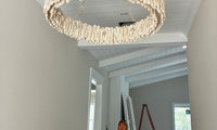
If you don’t like, you never will and if possible, return (or sell), but don’t paint as it’s not only the finish that isn’t great. Have you selected the furniture and accessories and if so, can you advise, so as to receive more helpful suggestions - the big picture is key.
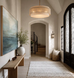
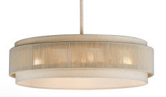
I think your instinct is right — I wouldn’t paint it. The color is part of the problem, but the scale and visual weight bother me more. In this space I’d go for something lighter and more sculptural rather than another large, heavy chandelier.
I recently compared 8 unusual moon-inspired lights, including pendant options and some much more minimal designs. It might give you a few ideas if you decide to replace this one rather than try to make it work:
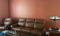
Of the two, a soft sage would be my choice and vibrancy can be added with a rug, art and cushions.



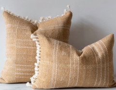
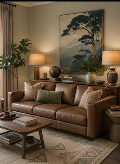
Blue?
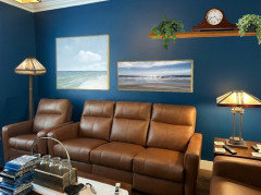
I also aligned the chair on the left with the sofa, so they read as one divided-seat unit. For me, that looks more intentional than the slight angle does.

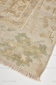
etsy rug
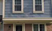
Maybe these will help if you want blue
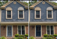

I like the first blue Maureen used. It matches your siding beautifully
In terms of color schemes a bright yellow would be eye catching here! https://www.buildersservicecompany.com/how-to-coordinate-exterior-house-colors
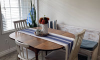
I‘d test the art’s feasibility for a few days. You could use Command strips in case it’s not feasible and not leave a mark.
Thank you, but am not looking for furniture at this moment.

I didn't find them, I put your picture into Chap GPT and that's what it came up with. I just uploaded a picture of your print into Chat GPT and asked it to make two coordinating prints for it. That's what it came up with. You could do the same thing and then separate out each one and have it printed at Walgreens or Walmart or Staples to match your other print.
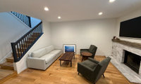
Given the size of the space, suggest a large rug in blue/grey/cream and consider how you want room to feel style wise. Suggest adding a console to ground the wall/give more weight. This is just to give you an overall concept.
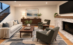
Style wise you mentioned modern sophisticated that could work with rustic. Maybe something like this?
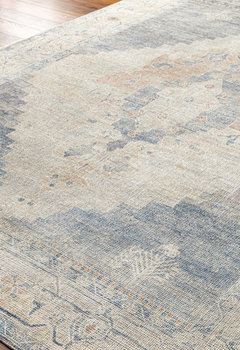
https://beckiowensliving.com/products/luca-i-rug?variant=50046457250096
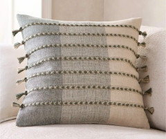
Your art alone will be too small on such a large wall; maybe consider using in a different location.
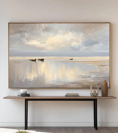
Love these - thanks!
A rugs like these combines both blue and taupe.
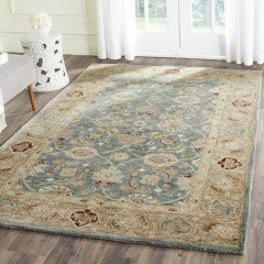
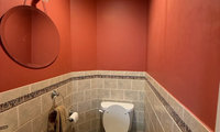
You had mentioned you wanted a decadent room, but I’m not seeing that.
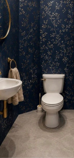
Think about the big picture and be sure the walls and flooring work together.
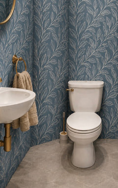
^^^^ I had the same thought as Maureen above - when I suggested the color I did in my first comment, it was due to pulling up BM Wenge -
Screenshot from a TikTok:

However, apparently when it dries, it turns much more brown - especially in rooms without any natural light.
Here is another wall painted with BM Wenge - it has violet/purple undertones.
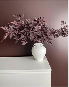
I thought it had more of a red undertone vs. purple/violet - which is why I thought about BM Nicholson. Sorry.
It appears to look like just a dark brown in powder rooms without natural light. It doesn't look "decadent" to me - especially with the tiles that you're considering for the lower portion of the walls.
If you decide to use wallpaper or a stencil on the walls, make sure that you coordinate your floor tile.
If you decide that you really do want a "decadent" powder room, I would reconsider the options that you've shown.

if it were me I’d remove the tile walls, for me it emphasizes the unusual shape of the room - I’d do wallpaper in a heart beat but if that’s not an option i’d be tempted by a light silvery sage green
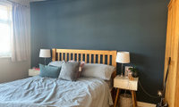
Maybe make a few changes and live with for a bit. No matter what you decide to do, light layered bedding is a great way to draw the eye and off set dark walls, especially in a small room. Do you need drapes? Consider larger lamps and a mirror for light reflection. If you decide to paint, suggest including the radiator or it will stick out.
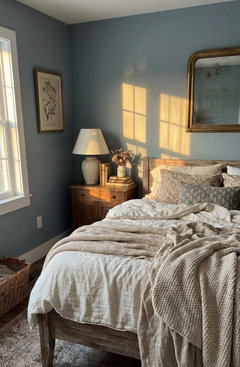
I agree with getting blinds that block the lights and shadows, (like the total blackness type of blind or shade), and leaving the draperies open at all times.
I think a bamboo or wood blind that is lined would add some pretty texture and bring the color of your headboard and other furniture over to the window wall. Then longer curtains as suggested but keeping them open in the winter. Emily's rendition is lovely and works well with your new wall color.
Suggest going onto ChatGBT and provide details. After seeing the first version, ask for changes until you get close /meets your needs. This was a first attempt, based on the info you provided.
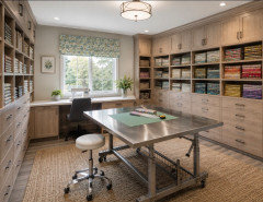
ChatGBT is not a designer all it does is hunt down your decription on the web it just it faster ,and often screws up measurements too. I think you know exactly what you want so do it. BTW I would not do a stainless topped table since scissors will scratch the heck out of it in no time . I actually like a butcher block table for a sewing table . I also like large tables for both laying out patterns and working . As for the ability to raised and lower that will need someone who can make that happen. Check out scissor tables or Uline makes an electric one
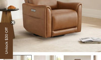
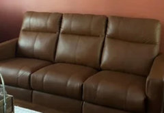
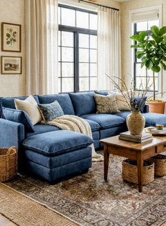
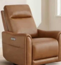
The info and pictures help. Given your coastal pictures, consider blue and it’s a lovely choice with caramel. The furniture feels squeezed in, can you edit pieces? Whatever you do, suggest a rug to help ground things.
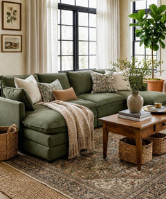
I removed the couch pic/comments in my posting, as the room is a lot smaller then I imagined. Can’t see two couches working and suggest editing the opposite wall. I used ChatGPT to show you how green will feel.
The extension is nicer visually as it fills that wall. You’ll lose a seat though if someone doesn’t want to lounge. Maybe an ottoman instead?
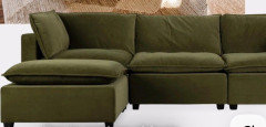
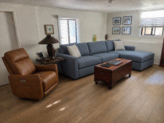
I’d go with a muted blue or blue-grey fabric. It would complement the warmth of the caramel leather beautifully without competing with it, and it would also work really well with the white walls and the blue tones you already have in the room. I’d choose a textured woven fabric rather than another leather so the two pieces feel collected rather than matched.
Maybe a blue like this?
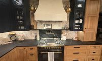
Changing small items like handles and lighting won’t make a difference overall. Don’t be disappointed that your level of enthusiasm isn’t expressed by some of your friends. Tastes are so different and also your expectations for their enthusiasm may be too high. It has a lot going on (stain, dark blue, black, ivory, different counters), so that might affect their responses, as it feels chopped up
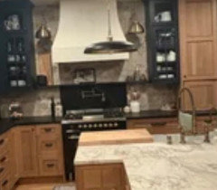
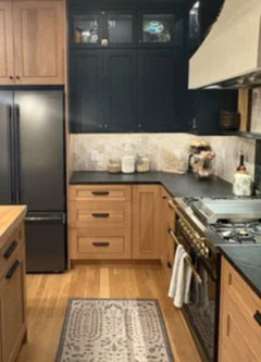
If interested (and possible), suggest stripping the navy and stain to match the rest. Even add wood trim on the hood to help tie in a bit better. I’d replace the island pendant and hardware to the same brass finish as the faucet. The art of mixing well is created with cohesiveness.
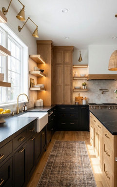
This looks like a very well functioning kitchen with top end choices. So brava for that! For me, though, it's the black cabinets that break up the visual flow of the uppers. There are big blocks of finish contrasts going on in a kitchen with no window: black cabinets; wood cabinets; massive cream range hood, i.e. three visual fields in a small amount of space. All the same, leave it. You like it.
Two possible tweaks if you must:
Counter stools matching wood instead of black stools as below. And clear glass pendants.
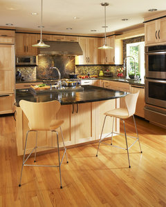
That said, you're done. Enjoy your new kitchen.

Spectacular!
If you paint it two different colors, the space will feel smaller/broken up. Suggest choosing a neutral color and create a visual separation with two rugs and accessorize the entrance to feel more like a foyer.
If interested, I’d remove all the smaller accessories, as larger items will ground/define each space better.
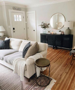
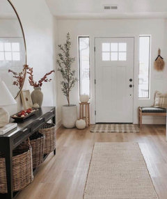

I would colour block the wall leaving a border of the wall colour. No I would not do a line up the wall as your image shows. Here is how it should be done.
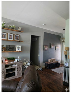
IMO a foyer is the introduction to your home so should be in the style of the home so wahy not actually paint that whole wall the color to make it part of the home
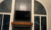
If you skipped adding stone, would your budget then allow for the windows to be replaced (which would be my priority) as that wall is really busy and I’d also remove the peaked section…less is more. Maybe look at inspiration pictures to identify what you like/suits your furniture/decor’s style. It’s hard to recommend without knowning, but hope this helps.
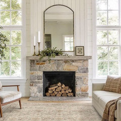

Would suggest you replace the windows if your budget allows. Would also suggest you remove the paneling if possible and replace with new gypsum board. If your budget doesn't allow for that will suggest that you paint the paneling the same color as the adjacent walls to make it stick out less.
Too many shapes in one place. Right now you’ve got rectangles, triangles, semi circles and squares- a lot for the eye to take in. Painting out the paneling will make for a less busy look.
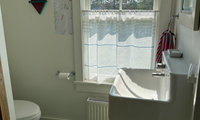
They are so similar so I think the outcome will have the same effect.
Have you considered going a bit darker/more vibrant for more impact and a window film could be really cute.

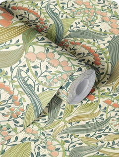
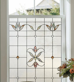
I like both papers, but, think they may be too cutesy for a powder room.
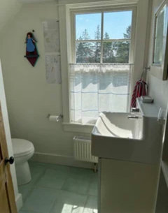
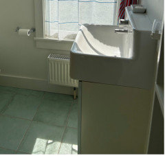
I notice there are a few tones of green in the bathroom. Find a paper to include them>
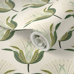

Aren't you in Maine? I'm somewhat of a traditionalist and I wouldn't use a tropical or color-saturated paper just because a powder room allows you to be bold. It's a Maine powder room.
I like the idea of a colored background rather than a cream background, like the blue-gray paper Emily posted. I like how the creamy white flowers pick up the color of the vanity and window trim while the background matches the floor tile. I wouldn't use that particular paper however.

From ChatGPT
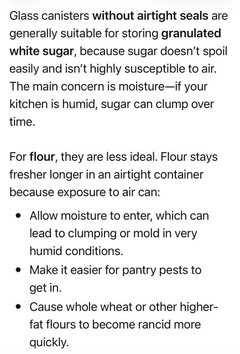
Where do you live? Region/climate will make all the differance in this decision. Would I use them in Florida-no. Here in the northern midwest yes.
Im in the northeast ( NY) so i get all 4 seasons- but we have central air in our home, , so it is temperature controlled
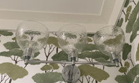

The essential design feature on the light fixture is that the glass ball/glove has a glass neck which is not typical. This one from Lucia Living doesn't come in chrome or in a 3 light.
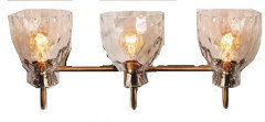
Here's a list of almost all the Brand Name 3/Vanity Lights on the market on one site.
https://wilsonlighting.com/bathroom-fixtures/three-lights/chrome/clear-textured
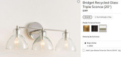
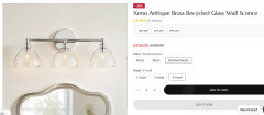
Is it presently in the powder room or is that the picture from Marketplace? If in PR, suggest flipping so lights face down (won’t accumulate as much dust either).
The chances of finding the exact fixture might be difficult and be paying full price.
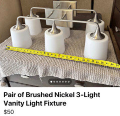
Maybe search on Marketplace for a set that might even suit better, are proportionate to mirror(s), and complement the faucets and hardware. If patient, you’ll eventually find (and may even suit better).
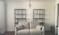
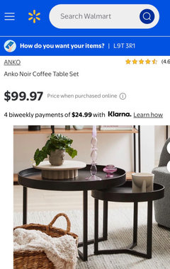
Just use art and cushions to break up the love seat/wall and by placing the seating against the wall, you may have room for small nesting tables.
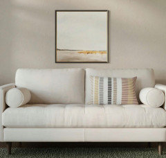
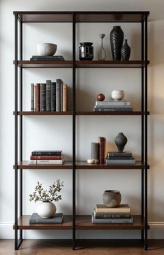
Placing the shelving on each side of the love seat will create a well balanced focal wall that also grounds the room.

Who knows if the tenant will even have books? They may appreciate more floor space instead.
I would be more worried about nightstands and end tables than book storage. Something like this gives a table surface for a lamp and a place to set your phone but also lets you store books and whatever else you need in the drawers below. They're only 17" across.
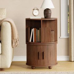
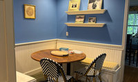
It’s important to consider the big picture, so you end up with a cohesive, inviting space. Hope these ideas help.
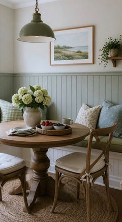
1. The two small pictures are lost on the wall…try hanging them vertically between the cabinets, or add open shelves (stained the same as table) and intermix with cups etc.
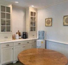
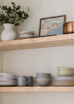
2. On the now blank wall, suggest a grouping.
3. Seating area: I’d remove the floating shelves in a heartbeat for a lot of reasons. Looks like the flooring is green(?), so I’d paint the bead board and/or the bench green. The wood trim will be uncomfortable when people lean back…so suggest adding large cushions and change the fabric on the seat pad to suit. A hanging lamp will add a lot of ambiance and you’ll need compact chairs, given the small space and the water cooler’s location.
This is the exterior of my home. It’s a Cape with a few additions.
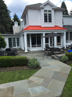
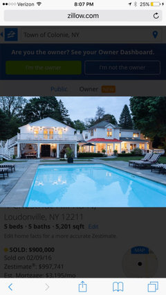
Gorgeous home!
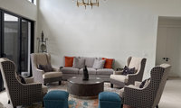
Are you open to using your art elsewhere? Because of its size and having to fill up the wall, it feels heavy and busy. Sometimes less is more.
What about larger/lighter art and then use as your jumping off point when choosing the couch (proportions will be important) and with the rug and ottoman decisions. Hope this helps give you a sense of the feel.
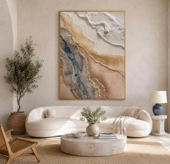
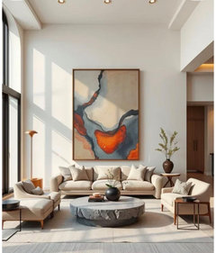
Pictures can be deceiving as to space, but is there room to turn the whole living room layout 90 degrees (rug included)?
Is the bar floor sunken (step-down)? Looks like a 1980's Toll Brothers plan. We saw a few with that layout when looking at houses in southwest FL, but they were original and needed lots of remodeling!
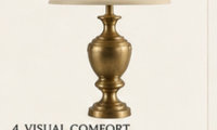
Height + width/finish/shade’s shape are all important.
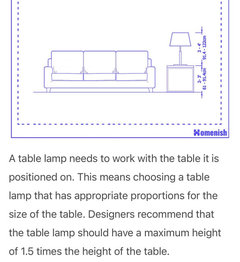
I think your lovely room feels both traditional and contemporary and suggest a lamp that will add to its feel. (I‘m not a fan of the shade in your example.) I find testing a lamp in the room really helps and return if not great.
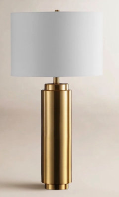
Like a few have suggested, select chunkier lamps. That will help even out the thin legs of the end tables. If the picture in the center can be reframed I’d go with a thinner frame there, since the other painting has a thick frame as well. Together they seem heavy and a thinner frame in the center would help balance them out.
I like your choice of chandelier. That would look nice in your room. I added a blue throw to pull some of the blue to the sofa.
You have a beautiful space, which I hope you enjoy!
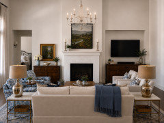
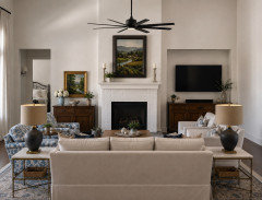
The all brass lamp that you posted seems a bit heavy and stodgy. Would suggest selecting a lamp that is not all brass but perhaps a combination of brass and ceramic.
Until floor plans are provided, potential and suitable suggestions are more or less just ideas. There may be other needs to consider and once these have been defined, suggest getting quotes. It’s really the best way to decide, both financially and practically. She should also weigh the unheaval and inconvenience, as these are more than cosmetic.
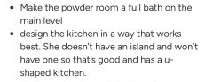
Have you discussed maintenance (inside and out), repairs, and emergencies. Our house was built in the 70’s (we’re in our 70’s) and we needed a new furnace in December (no heat for 2 days), flooding in our basement due to recent extreme rainfall, and fence damaged in very high winds. Only mentioning, as before time/money is invested and her only being 65, I’d suggest waiting to make the long-term house decisions. A friend of mind in her 60’s bought a condo. The building is within walking distance to everything, has an indoor pool, a social room where people meet for wine and cheese, fitness classes, etc. She was living in a large home on her own and says it was the best decision.

I started a thread in another forum about living options. Join the conversation.
https://www.houzz.com/discussions/6584459/senior-living-options#n=14
Yes to what Jan and Arcy said. I'm in my 50s, DH in his 60s and we've already had this conversation. When we start to get to the point that keeping up with the house and property is becoming too much, we will seriously consider one of the senior living places. An extended family member just moved into two years ago, and I gotta say I'm kinda envious of how NICE the place is, I wish my own home had thoughtful features like that (extra wide halls, zero steps not even to enter, no cumbersome interior doors, etc). She's in a place where she can pay for a different "package" if she needs a higher level of care, which is huge because she won't have to move as her abilities decline and need for care increases; you can take it all the way to the end of life there. Yes it costs a heck of a lot more but how great you wouldn't have to move at that stage of things. Dining hall a short walk away, all sorts of activies, a bus that takes you shopping or to appointments (with a reservation), no property maintenance. She even has a cleaning person that comes in weekly included.
The drawback? The sheer cost of it. My hope is that by the time DH and I need to seriously consider this type of thing prices will come down (or at least not have increased substantially), they seem to be building more and more of these places in the area.
ETA: All that to say, is the $$$ your mom is going to spend on renovations wise at this point? Would that money be better spent on minor cosmetic things to make her enjoy it while she's there, but the big money saved/invested for future need for a move to a senior living place?

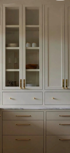
Given the location of this area, unless using as an appliance or coffee station, will you really need functionally?
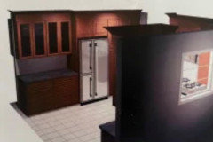
We designed our last kitchen‘s area similar to below...glass cabinets on each side, closed in the middle with drawers. It was ideal for our needs.
To help you visualize, here are dark cabinets. There are lots of combinations and maybe consider before you make a final decision.
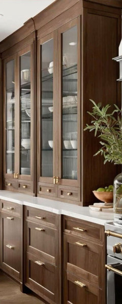
A cupboard would be on both sides.
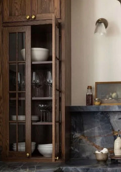
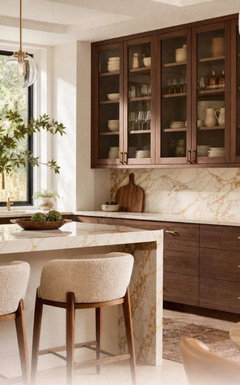
'Form follows function.' I love my glass front cabinet doors because they break up the many solid cabinets, but they are also right over the DW so it's easy to load them up with pretty dishes in an orderly fashion--it functions well. Consider carefully how you will use this cabinet.
Thank you everybody. I posted the floor plan father up in the comments and I was planning on putting my everyday dishes and glasses in the 36” wall cabinet above the dishwasher since it’s in close proximity to the dishwasher as well as the kitchen table. These potentially glass-front cabinets next to the refrigerator would be used for lesser used items since the cabinets are farther away from the prep/cook/clean-up areas. I still haven’t decided which direction I want to go with the doors for the cabinets in question. One potential hang-up is that it will be 2 separate cabinets instead of one big cabinet open across the inside.
What I had in mind..hope this helps.
And this if they fit
Good luck🙂
Thank you so much for your help!