
DIY Projects
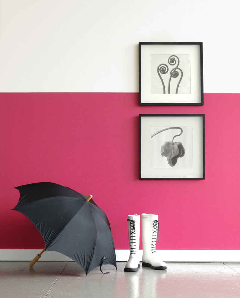
Love bright and bold hues, but worried that putting a vibrant color across all four walls, from floor to ceiling might be too much? Try taking the intense shade just halfway up the wall! Pair it with a gentle neutral up top – think white or light grey – to soften the saturation like we did here with PETAL .04 and BISQUE .01. Learn how to MAKE THIS: Halfway Hue Wall here: http://www.colorhousepaint.com/blog/make-this-halfway-hue-wall/
Design by Vicki Simon Interior Design
赤に近い効果のある、彩度の高いピンクショッキングピンクやローズピンク、フューシャピンクのような鮮やかなピンクは、彩度が高いため赤がもつ強いイメージに近づき、色としての強さが前面に出てきます。合わせる色は、モノトーンがおすすめ。明快な印象の組...