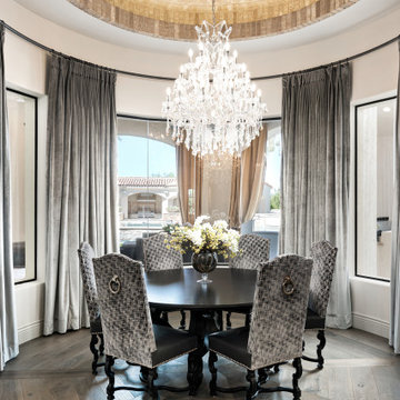
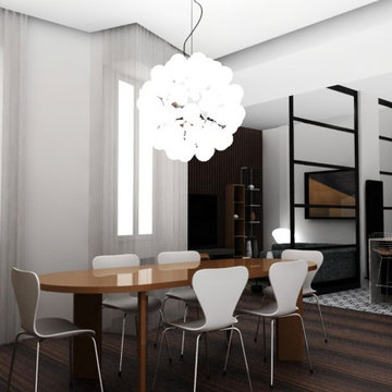
ミッドセンチュリースタイルのダイニング (折り上げ天井、クロスの天井) の写真
絞り込み:
資材コスト
並び替え:今日の人気順
写真 1〜20 枚目(全 69 枚)
1/4
Download our free ebook, Creating the Ideal Kitchen. DOWNLOAD NOW
As with most projects, it all started with the kitchen layout. The home owners came to us wanting to upgrade their kitchen and overall aesthetic in their suburban home, with a combination of fresh paint, updated finishes, and improved flow for more ease when doing everyday activities.
A monochromatic, earth-toned palette left the kitchen feeling uninspired. It lacked the brightness they wanted from their space. An eat-in table underutilized the available square footage. The butler’s pantry was out of the way and hard to access, and the dining room felt detached from the kitchen.
Lead Designer, Stephanie Cole, saw an improved layout for the spaces that were no longer working for this family. By eliminating an existing wall between the kitchen and dining room, and relocating the bar area to the dining room, we opened up the kitchen, providing all the space we needed to create a dreamy and functional layout. A new perimeter configuration promoted circulation while also making space for a large and functional island loaded with seating – a must for any family. Because an island that isn’t big enough for everyone (and a few more) is a recipe for disaster. The light white cabinetry is fresh and contrasts with the deeper tones in the wood flooring, creating a modern aesthetic that is elevated, yet approachable for everyday living.
With better flow as the overarching goal, we made some structural changes too. To remove a bottleneck in the entryway, we angled one of the dining room walls to create more natural separation between rooms and facilitate ease of movement throughout the large space.
At The Kitchen Studio, we believe a well-designed kitchen uses every square inch to the fullest. By starting from scratch, it was possible to rethink the entire kitchen layout and design the space according to how it is used, because the kitchen shouldn’t make it harder to feed the family. A new location for the existing range, flanked by a new column refrigerator and freezer on each side, worked to anchor the space. The very large and very spacious island (a dream island if we do say so ourselves) now houses the primary sink and provides ample space for food prep and family gathering.
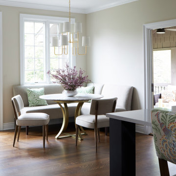
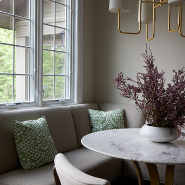
The new kitchen table and coordinating banquette seating provide a cozy nook for quick breakfasts before school or work, and evening homework sessions. Elegant gold details catch the natural light, elevating the aesthetic.
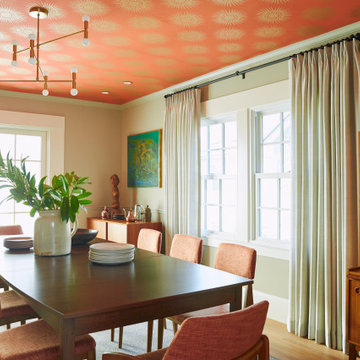
The dining room was transformed into one of this client’s favorite spaces and we couldn’t agree more. We saw an opportunity to give the dining room a more distinguished identity by closing off the entrance from the foyer. The relocated wet bar enhances the sophisticated vibe of this gathering space, complete with beautiful antique mirror tiles and open shelving encased by moody built-in cabinets.
Updated furnishings add warmth. A rich walnut table is paired with custom chairs in a muted coral fabric. The large, transitional chandelier grounds the room, pairing beautifully with the gold finishes prevalent in the faucet and cabinet hardware. Linen-inspired wallpaper and cream-toned window treatments add to the glamorous feel of this entertainment space.
There is no way around it. The laundry room was cramped. The large washer and dryer blocked access to the sink and left little room for the space to serve its other essential function – as a mudroom. Because we reworked the kitchen layout to create more space overall, we could rethink the mudroom too – an essential for any busy family. The first step was moving the washer and dryer to an existing area on the second floor, where most of the family’s laundry lives (no one wants to carry laundry up and down the stairs if they don’t have to anyway). This is a more functional solution and opened up the space for all the mudroom necessities – including the existing kitchen refrigerator, loads of built-in cubbies, and a bench.
It’s hard to not fall in love with every detail of a new space, especially when it serves your day-to-day life. But that doesn’t mean the clients didn’t have their favorite features they use on the daily. This remodel was focused largely on function with a new kitchen layout. And it’s the functional features that have the biggest impact. The large island provides much needed workspace in the kitchen and is a spot where everyone gathers together – it grounds the space and the family. And the custom counter stools are the icing on the cake. The nearby mudroom has everything their previous space was lacking – ample storage, space for everyone’s essentials, and the beloved cement floor tiles that are both durable and artistic.

We made an awkward open space into a functional and sophisticated haven, uniquely blending mid-century charm with the essence of California living. Designed to harmoniously accommodate both playfulness and refined living, our client's vision was to create an inviting living space, a stylish dining area, and a fun-filled kid's play zone all within one cohesive layout.
ヒューストンにある高級な中くらいなミッドセンチュリースタイルのおしゃれなダイニングキッチン (濃色無垢フローリング、両方向型暖炉、クロスの天井) の写真
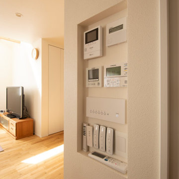
スイッチやエアコン、エコキュート、24時間換気設備、インターホンをひとまとめに集約しました。
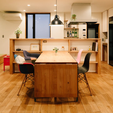
他の地域にあるミッドセンチュリースタイルのおしゃれなLDK (白い壁、無垢フローリング、クロスの天井、壁紙) の写真
他の地域にあるミッドセンチュリースタイルのおしゃれなLDK (白い壁、無垢フローリング、クロスの天井、壁紙) の写真
Like what you see? Call us today for your home renovation consultation! (909) 605-8800. We hope you are as excited to see this reveal as we all were. What an amazing transformation! This beautiful Claremont, CA home built in 1955 got a wonderful Mid-Century Modern update to the kitchen. The fireplace adjacent to the kitchen was the inspiration for this space. Pure white brick matched with a natural “Dune” stained maple mantle. Opposite the fireplace is a display will donned with matching maple shadowbox shelving. The pure white cabinets are topped with a Cabrini Grey quartz from Arizona Tile, mimicking a combination of concrete and limestone, with a square edge profile. To accent both the countertop and the cabinets we went with brushed gold and bronze fixtures. A Kohler “White Haven” apron front sink is finished with a Delta “Trinsic” faucet in champagne bronze, with matching push button garbage disposal, soap dispenser and aerator. One of the largest changes to the space was the relocating of the plumbing fixtures, and appliances. Giving the stove its own wall, a 30” KitchenAid unit with a stainless steel hood, backed with a stunning mid-century modern rhomboid patterned mosaic backsplash going up to the ceiling. The fridge stayed in the same location, but with all new cabinetry, including an over-sized 24” deep cabinet above it, and a KitchenAid microwave drawer built into the bottom cabinets. Another drastic change was the raising of the ceiling, pulling the height up from 8 foot to 9 foot, accented with crown moldings to match the cabinetry. Next to the kitchen we included a built in accent desk, a built in nook for seating with custom leather created by a local upholsterer, and a built in hutch. Adding another window brought in even more light to a bright and now cheerful space. Rather than replace the flooring, a simple refinish of the wood planks was all the space needed blending the style of the kitchen into the look and feel of the rest of the home.
Project Description:
// Type: Kitchen Remodel
// Location: Claremont, CA
// Style: Mid-Century Modern
// Year Completed: 2019
// Designer: Jay Adams
// Project Features: Relocation of the appliances and plumbing, Backsplash behind stove and refrigerator walls, in a rhomboid mosaic pattern, Microwave drawer built into the lower cabinets. And a raised ceiling opening up the space.
//View more projects here http://www.yourclassickitchens.com/
//Video Production By Classic Kitchens etc. and Twila Knight Photo
Download our free ebook, Creating the Ideal Kitchen. DOWNLOAD NOW
As with most projects, it all started with the kitchen layout. The home owners came to us wanting to upgrade their kitchen and overall aesthetic in their suburban home, with a combination of fresh paint, updated finishes, and improved flow for more ease when doing everyday activities.
A monochromatic, earth-toned palette left the kitchen feeling uninspired. It lacked the brightness they wanted from their space. An eat-in table underutilized the available square footage. The butler’s pantry was out of the way and hard to access, and the dining room felt detached from the kitchen.
Lead Designer, Stephanie Cole, saw an improved layout for the spaces that were no longer working for this family. By eliminating an existing wall between the kitchen and dining room, and relocating the bar area to the dining room, we opened up the kitchen, providing all the space we needed to create a dreamy and functional layout. A new perimeter configuration promoted circulation while also making space for a large and functional island loaded with seating – a must for any family. Because an island that isn’t big enough for everyone (and a few more) is a recipe for disaster. The light white cabinetry is fresh and contrasts with the deeper tones in the wood flooring, creating a modern aesthetic that is elevated, yet approachable for everyday living.
With better flow as the overarching goal, we made some structural changes too. To remove a bottleneck in the entryway, we angled one of the dining room walls to create more natural separation between rooms and facilitate ease of movement throughout the large space.
At The Kitchen Studio, we believe a well-designed kitchen uses every square inch to the fullest. By starting from scratch, it was possible to rethink the entire kitchen layout and design the space according to how it is used, because the kitchen shouldn’t make it harder to feed the family. A new location for the existing range, flanked by a new column refrigerator and freezer on each side, worked to anchor the space. The very large and very spacious island (a dream island if we do say so ourselves) now houses the primary sink and provides ample space for food prep and family gathering.
The new kitchen table and coordinating banquette seating provide a cozy nook for quick breakfasts before school or work, and evening homework sessions. Elegant gold details catch the natural light, elevating the aesthetic.
The dining room was transformed into one of this client’s favorite spaces and we couldn’t agree more. We saw an opportunity to give the dining room a more distinguished identity by closing off the entrance from the foyer. The relocated wet bar enhances the sophisticated vibe of this gathering space, complete with beautiful antique mirror tiles and open shelving encased by moody built-in cabinets.
Updated furnishings add warmth. A rich walnut table is paired with custom chairs in a muted coral fabric. The large, transitional chandelier grounds the room, pairing beautifully with the gold finishes prevalent in the faucet and cabinet hardware. Linen-inspired wallpaper and cream-toned window treatments add to the glamorous feel of this entertainment space.
There is no way around it. The laundry room was cramped. The large washer and dryer blocked access to the sink and left little room for the space to serve its other essential function – as a mudroom. Because we reworked the kitchen layout to create more space overall, we could rethink the mudroom too – an essential for any busy family. The first step was moving the washer and dryer to an existing area on the second floor, where most of the family’s laundry lives (no one wants to carry laundry up and down the stairs if they don’t have to anyway). This is a more functional solution and opened up the space for all the mudroom necessities – including the existing kitchen refrigerator, loads of built-in cubbies, and a bench.
It’s hard to not fall in love with every detail of a new space, especially when it serves your day-to-day life. But that doesn’t mean the clients didn’t have their favorite features they use on the daily. This remodel was focused largely on function with a new kitchen layout. And it’s the functional features that have the biggest impact. The large island provides much needed workspace in the kitchen and is a spot where everyone gathers together – it grounds the space and the family. And the custom counter stools are the icing on the cake. The nearby mudroom has everything their previous space was lacking – ample storage, space for everyone’s essentials, and the beloved cement floor tiles that are both durable and artistic.
パリにあるお手頃価格の小さなミッドセンチュリースタイルのおしゃれなダイニング (ベージュの壁、淡色無垢フローリング、暖炉なし、折り上げ天井、羽目板の壁) の写真
Our eclectic modern home remodel project turned a closed-off home filled with heavy wood details into a contemporary haven for hosting with creative design choices, making the space feel up to date and ready to host lively gatherings.
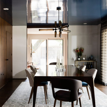
The dining room and bar portion of the home is incredibly stunning and make for great entertaining. The crown molding detail on the ceiling and the beautiful light fixture above the dining room table elevates this space. The walnut flooring mirrors the molding above, an excellent design choice for this space!
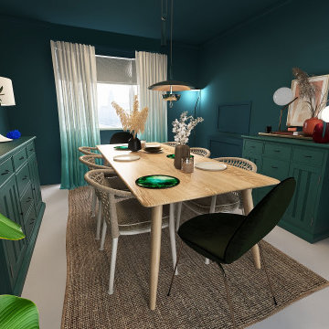
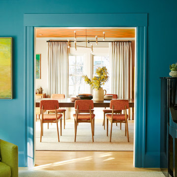
Colour and connection are the two elements that unify the interior of this Glasgow home. Prior to the renovation, these rooms were separate, so we chose a colour continuum that would draw the eye through the now seamless spaces.
.
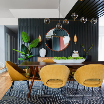
We worked off of a cool turquoise colour palette to brighten up the living area, while we shrouded the dining room in a moody deep jewel. The cool leafy palette extends to the couch’s upholstery and to the monochrome credenza in the dining room. To make the blue-green scheme really pop, we selected warm-toned red accent lamps, dried pampas grass, and muted pink artwork.
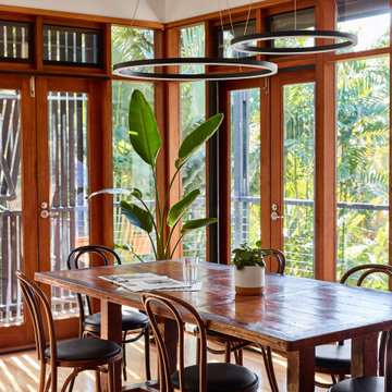
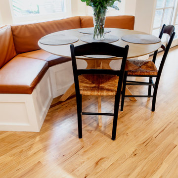
Breakfast nook and dining area featuring a stunning curved brick ceiling, custom windows, and wood floor.
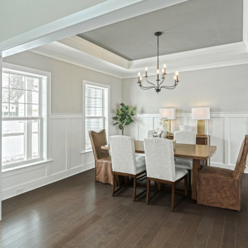
フェニックスにあるラグジュアリーな巨大なミッドセンチュリースタイルのおしゃれなダイニング (朝食スペース、白い壁、無垢フローリング、茶色い床、折り上げ天井、パネル壁) の写真
フェニックスにあるラグジュアリーな巨大なミッドセンチュリースタイルのおしゃれなダイニング (朝食スペース、白い壁、無垢フローリング、茶色い床、折り上げ天井、パネル壁) の写真
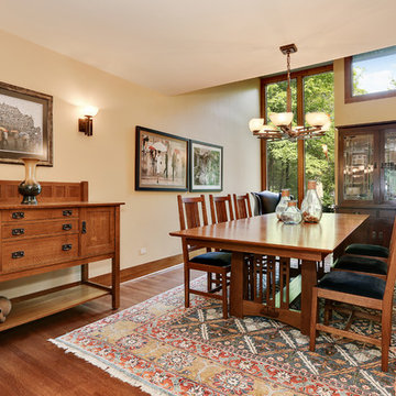
The homeowner had previously updated their mid-century home to match their Prairie-style preferences - completing the Kitchen, Living and DIning Rooms. This project included a complete redesign of the Bedroom wing, including Master Bedroom Suite, guest Bedrooms, and 3 Baths; as well as the Office/Den and Dining Room, all to meld the mid-century exterior with expansive windows and a new Prairie-influenced interior. Large windows (existing and new to match ) let in ample daylight and views to their expansive gardens.
Photography by homeowner.

Потолок на кухне-столовой двухуровневый, с гипсовым карнизом по периметру. Потолочная люстра в стиле арнуво испания. На стенах бумажные обои с растительным рисунком.
ミッドセンチュリースタイルのダイニング (折り上げ天井、クロスの天井) の写真
1