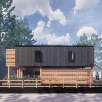
小さな家の外観 (緑化屋根、混合材サイディング) の写真
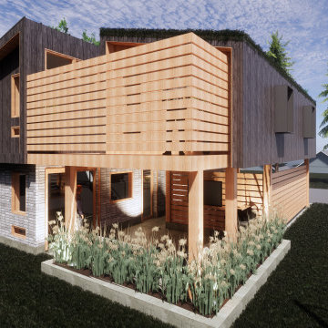
Carriage house, laneway house, in-law suite, investment property, seasonal rental, long-term rental.
バンクーバーにある小さなトランジショナルスタイルのおしゃれな家の外観 (混合材サイディング、緑化屋根) の写真
バンクーバーにある小さなトランジショナルスタイルのおしゃれな家の外観 (混合材サイディング、緑化屋根) の写真
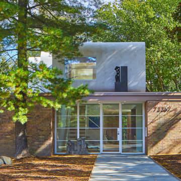
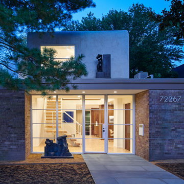
Designed in 1970 for an art collector, the existing referenced 70’s architectural principles. With its cadence of ‘70’s brick masses punctuated by a garage and a 4-foot-deep entrance recess. This recess, however, didn’t convey to the interior, which was occupied by disjointed service spaces. To solve, service spaces are moved and reorganized in open void in the garage. (See plan) This also organized the home: Service & utility on the left, reception central, and communal living spaces on the right.
To maintain clarity of the simple one-story 70’s composition, the second story add is recessive. A flex-studio/extra bedroom and office are designed ensuite creating a slender form and orienting them front to back and setting it back allows the add recede. Curves create a definite departure from the 70s home and by detailing it to "hover like a thought" above the first-floor roof and mentally removable sympathetic add.Existing unrelenting interior walls and a windowless entry, although ideal for fine art was unconducive for the young family of three. Added glass at the front recess welcomes light view and the removal of interior walls not only liberate rooms to communicate with each other but also reinform the cleared central entry space as a hub.
Even though the renovation reinforms its relationship with art, the joy and appreciation of art was not dismissed. A metal sculpture lost in the corner of the south side yard bumps the sculpture at the front entrance to the kitchen terrace over an added pedestal. (See plans) Since the roof couldn’t be railed without compromising the one-story '70s composition, the sculpture garden remains physically inaccessible however mirrors flanking the chimney allow the sculptures to be appreciated in three dimensions. The mirrors also afford privacy from the adjacent Tudor's large master bedroom addition 16-feet away.
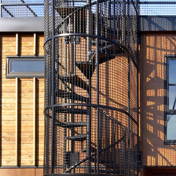
Spiral stair to putting green on the roof. Photography by Ben Benschneider.
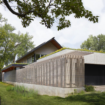
シアトルにあるラグジュアリーな小さなインダストリアルスタイルのおしゃれな家の外観 (混合材サイディング、緑化屋根) の写真
シアトルにあるラグジュアリーな小さなインダストリアルスタイルのおしゃれな家の外観 (混合材サイディング、緑化屋根) の写真
The homeowners sought to create a modest, modern, lakeside cottage, nestled into a narrow lot in Tonka Bay. The site inspired a modified shotgun-style floor plan, with rooms laid out in succession from front to back. Simple and authentic materials provide a soft and inviting palette for this modern home. Wood finishes in both warm and soft grey tones complement a combination of clean white walls, blue glass tiles, steel frames, and concrete surfaces. Sustainable strategies were incorporated to provide healthy living and a net-positive-energy-use home. Onsite geothermal, solar panels, battery storage, insulation systems, and triple-pane windows combine to provide independence from frequent power outages and supply excess power to the electrical grid.
Photos by Corey Gaffer
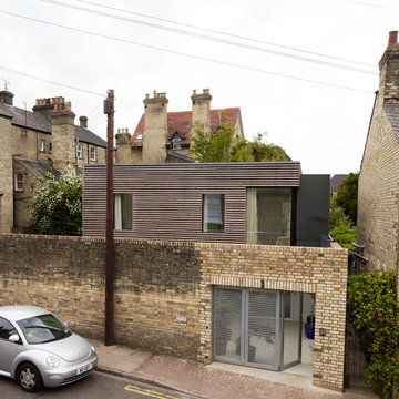
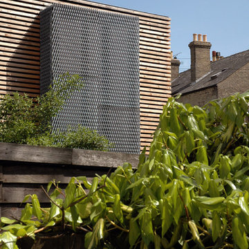
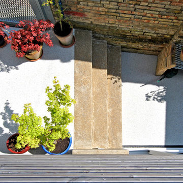
A three bedroom family house on a tight urban site in the centre of Cambridge. The site measures only 7.5metres wide by 10.5metres deep, it is flanked on all sides by 3metre high walls and room had to be found for an off street parking space. Unobscured glazing was only permitted on the front elevation, and 1 square metre of fixed obscured glass was all that was permitted on the other three. Most of the daylight comes from above and white resin floors, a white metal staircase, a double height sitting area, mirrors, and perforate meshes maximize the sense of space inside.
Photos: Mel Yates
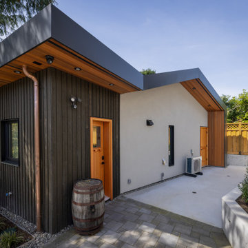
The concrete-colored smooth stucco, black metal fascia, and warm colored clear cedar soffit create a west coast modern feel, giving this laneway home a unique look.
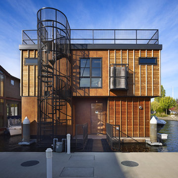
Entry side boarding ramp with spiral stair to the roof top putting green. Photography by Ben Benschneider.
シアトルにあるラグジュアリーな小さなインダストリアルスタイルのおしゃれな家の外観 (混合材サイディング、緑化屋根) の写真
シアトルにあるラグジュアリーな小さなインダストリアルスタイルのおしゃれな家の外観 (混合材サイディング、緑化屋根) の写真
Carriage house, laneway house, in-law suite, investment property, seasonal rental, long-term rental.
バンクーバーにある小さなトランジショナルスタイルのおしゃれな家の外観 (混合材サイディング、緑化屋根) の写真
バンクーバーにある小さなトランジショナルスタイルのおしゃれな家の外観 (混合材サイディング、緑化屋根) の写真
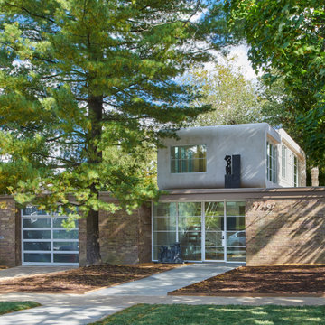
Designed in 1970 for an art collector, the existing referenced 70’s architectural principles. With its cadence of ‘70’s brick masses punctuated by a garage and a 4-foot-deep entrance recess. This recess, however, didn’t convey to the interior, which was occupied by disjointed service spaces. To solve, service spaces are moved and reorganized in open void in the garage. (See plan) This also organized the home: Service & utility on the left, reception central, and communal living spaces on the right.
To maintain clarity of the simple one-story 70’s composition, the second story add is recessive. A flex-studio/extra bedroom and office are designed ensuite creating a slender form and orienting them front to back and setting it back allows the add recede. Curves create a definite departure from the 70s home and by detailing it to "hover like a thought" above the first-floor roof and mentally removable sympathetic add.Existing unrelenting interior walls and a windowless entry, although ideal for fine art was unconducive for the young family of three. Added glass at the front recess welcomes light view and the removal of interior walls not only liberate rooms to communicate with each other but also reinform the cleared central entry space as a hub.
Even though the renovation reinforms its relationship with art, the joy and appreciation of art was not dismissed. A metal sculpture lost in the corner of the south side yard bumps the sculpture at the front entrance to the kitchen terrace over an added pedestal. (See plans) Since the roof couldn’t be railed without compromising the one-story '70s composition, the sculpture garden remains physically inaccessible however mirrors flanking the chimney allow the sculptures to be appreciated in three dimensions. The mirrors also afford privacy from the adjacent Tudor's large master bedroom addition 16-feet away.
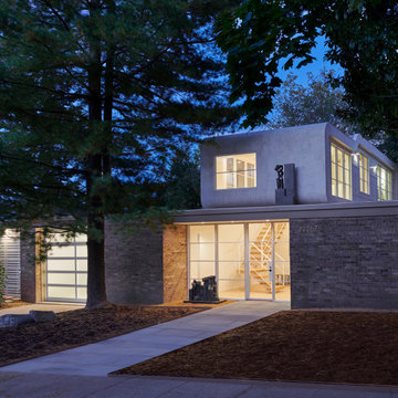
Mel Yates
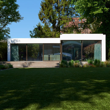
ケンブリッジシャーにあるお手頃価格の小さなコンテンポラリースタイルのおしゃれな家の外観 (混合材サイディング、マルチカラーの外壁、緑化屋根) の写真
ケンブリッジシャーにあるお手頃価格の小さなコンテンポラリースタイルのおしゃれな家の外観 (混合材サイディング、マルチカラーの外壁、緑化屋根) の写真
Mel Yates
ケンブリッジシャーにあるお手頃価格の小さなコンテンポラリースタイルのおしゃれな家の外観 (混合材サイディング、マルチカラーの外壁、緑化屋根) の写真
ケンブリッジシャーにあるお手頃価格の小さなコンテンポラリースタイルのおしゃれな家の外観 (混合材サイディング、マルチカラーの外壁、緑化屋根) の写真
Modern roof lines that transcend down the exterior walls, creating a clean form of flow.
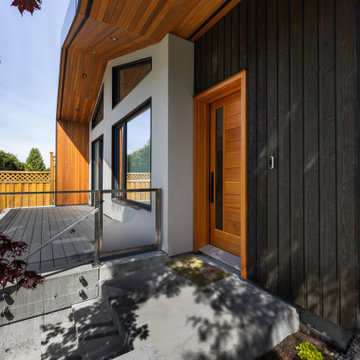
バンクーバーにある高級な小さなコンテンポラリースタイルのおしゃれな家の外観 (混合材サイディング、緑化屋根、縦張り) の写真
バンクーバーにある高級な小さなコンテンポラリースタイルのおしゃれな家の外観 (混合材サイディング、緑化屋根、縦張り) の写真
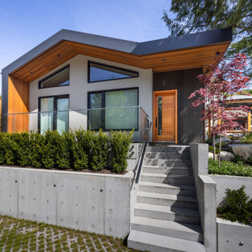
Modern roof lines that transcend down the exterior walls, creating a clean form of flow. The pitch of the roof, Douglas fir exterior doors and the stain grade cedar Board & Batten siding compliment the exterior aesthetic of the existing house.
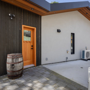
The pitch of the roof, Douglas fir exterior doors and the stain grade cedar Board & Batten siding compliment the exterior aesthetic of the existing house.
小さな家の外観 (緑化屋根、混合材サイディング) の写真
1