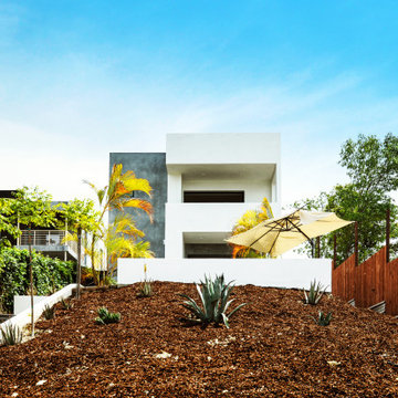
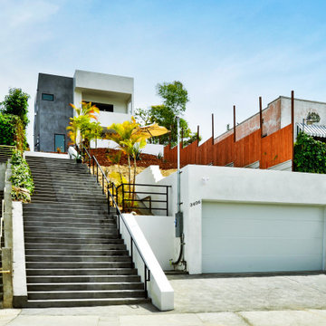
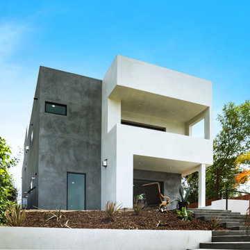
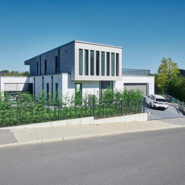
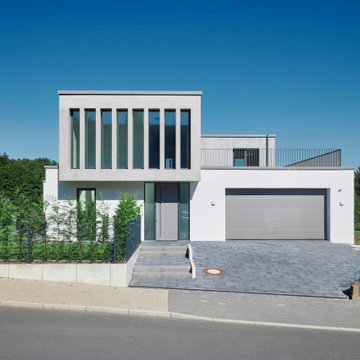
家の外観 (緑化屋根、混合材サイディング) の写真
絞り込み:
資材コスト
並び替え:今日の人気順
写真 1〜16 枚目(全 16 枚)
1/5
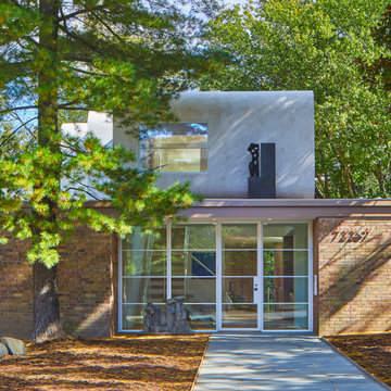
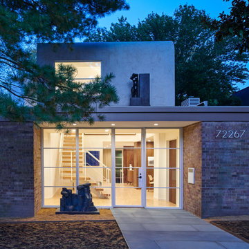
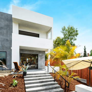
Designed in 1970 for an art collector, the existing referenced 70’s architectural principles. With its cadence of ‘70’s brick masses punctuated by a garage and a 4-foot-deep entrance recess. This recess, however, didn’t convey to the interior, which was occupied by disjointed service spaces. To solve, service spaces are moved and reorganized in open void in the garage. (See plan) This also organized the home: Service & utility on the left, reception central, and communal living spaces on the right.
To maintain clarity of the simple one-story 70’s composition, the second story add is recessive. A flex-studio/extra bedroom and office are designed ensuite creating a slender form and orienting them front to back and setting it back allows the add recede. Curves create a definite departure from the 70s home and by detailing it to "hover like a thought" above the first-floor roof and mentally removable sympathetic add.Existing unrelenting interior walls and a windowless entry, although ideal for fine art was unconducive for the young family of three. Added glass at the front recess welcomes light view and the removal of interior walls not only liberate rooms to communicate with each other but also reinform the cleared central entry space as a hub.
Even though the renovation reinforms its relationship with art, the joy and appreciation of art was not dismissed. A metal sculpture lost in the corner of the south side yard bumps the sculpture at the front entrance to the kitchen terrace over an added pedestal. (See plans) Since the roof couldn’t be railed without compromising the one-story '70s composition, the sculpture garden remains physically inaccessible however mirrors flanking the chimney allow the sculptures to be appreciated in three dimensions. The mirrors also afford privacy from the adjacent Tudor's large master bedroom addition 16-feet away.
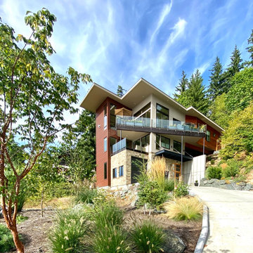
History:
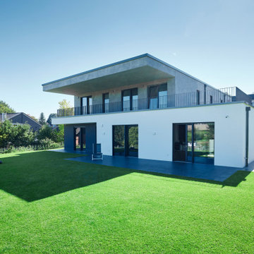
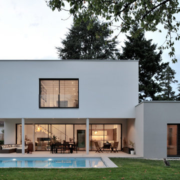
Client was given a property, that was extremely difficult to build on, with a very steep, 25-30' drop. They tried to sell the property for many years, with no luck. They finally decided that they should build something on it, for themselves, to prove it could be done. No access was allowed at the top of the steep incline. Client assumed it would be an expensive foundation built parallel to the hillside, somehow.
Program:
The program involved a level for one floor living, (LR/DR/KIT/MBR/UTILITY) as an age-in-place for this recently retired couple. Any other levels should have additional bedrooms that could also feel like a separate AirBnB space, or allow for a future caretaker. There was also a desire for a garage with a recreational vehicle and regular car. The main floor should take advantage of the primary views to the southwest, even though the lot faces due west. Also a desire for easy access to an upper level trail and low maintenance materials with easy maintenance access to roof. The preferred style was a fresher, contemporary feel.
Solution:
A concept design was presented, initially desired by the client, parallel to the hillside, as they had originally envisioned.
An alternate idea was also presented, that was perpendicular to the steep hillside. This avoided having difficult foundations on the steep hillside, by spanning... over it. It also allowed the top, main floor to be farther out on the west end of the site to avoid neighboring view blockage & to better see the primary southwest view. Savings in foundation costs allowed the installation of a residential elevator to get from the garage to the top, main living level. Stairs were also available for regular exercise. An exterior deck was angled towards the primary SW view to the San Juan Islands. The roof was originally desired to be a hip style on all sides, but a better solution allowed for a simple slope back to the 10' high east side for easier maintenance & access, since the west side was almost 50' high!
The clients undertook this home as a speculative, temporary project, intending for it to add value, to sell. However, the unexpected solution, and experience in living here, has them wanting to stay forever.
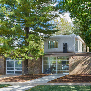
Designed in 1970 for an art collector, the existing referenced 70’s architectural principles. With its cadence of ‘70’s brick masses punctuated by a garage and a 4-foot-deep entrance recess. This recess, however, didn’t convey to the interior, which was occupied by disjointed service spaces. To solve, service spaces are moved and reorganized in open void in the garage. (See plan) This also organized the home: Service & utility on the left, reception central, and communal living spaces on the right.
To maintain clarity of the simple one-story 70’s composition, the second story add is recessive. A flex-studio/extra bedroom and office are designed ensuite creating a slender form and orienting them front to back and setting it back allows the add recede. Curves create a definite departure from the 70s home and by detailing it to "hover like a thought" above the first-floor roof and mentally removable sympathetic add.Existing unrelenting interior walls and a windowless entry, although ideal for fine art was unconducive for the young family of three. Added glass at the front recess welcomes light view and the removal of interior walls not only liberate rooms to communicate with each other but also reinform the cleared central entry space as a hub.
Even though the renovation reinforms its relationship with art, the joy and appreciation of art was not dismissed. A metal sculpture lost in the corner of the south side yard bumps the sculpture at the front entrance to the kitchen terrace over an added pedestal. (See plans) Since the roof couldn’t be railed without compromising the one-story '70s composition, the sculpture garden remains physically inaccessible however mirrors flanking the chimney allow the sculptures to be appreciated in three dimensions. The mirrors also afford privacy from the adjacent Tudor's large master bedroom addition 16-feet away.
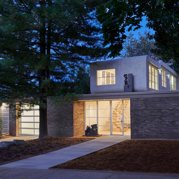
家の外観 (緑化屋根、混合材サイディング) の写真
1