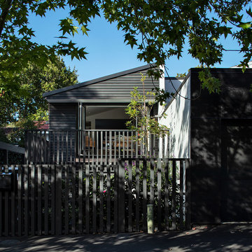
小さな黒い外観の家 (混合材屋根) の写真
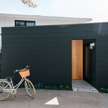
a plywood panel marks the new side entry vestibule, accessed from the driveway and framed by bold wide horizontal black siding at the new addition
オレンジカウンティにある高級な小さなモダンスタイルのおしゃれな家の外観 (コンクリート繊維板サイディング、混合材屋根) の写真
オレンジカウンティにある高級な小さなモダンスタイルのおしゃれな家の外観 (コンクリート繊維板サイディング、混合材屋根) の写真
Photography by Richard Chivers https://www.rchivers.co.uk/
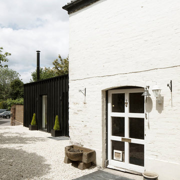
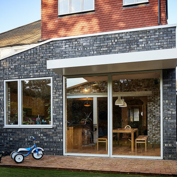
Marshall House is an extension to a Grade II listed dwelling in the village of Twyford, near Winchester, Hampshire. The original house dates from the 17th Century, although it had been remodelled and extended during the late 18th Century.
The clients contacted us to explore the potential to extend their home in order to suit their growing family and active lifestyle. Due to the constraints of living in a listed building, they were unsure as to what development possibilities were available. The brief was to replace an existing lean-to and 20th century conservatory with a new extension in a modern, contemporary approach. The design was developed in close consultation with the local authority as well as their historic environment department, in order to respect the existing property and work to achieve a positive planning outcome.
Like many older buildings, the dwelling had been adjusted here and there, and updated at numerous points over time. The interior of the existing property has a charm and a character - in part down to the age of the property, various bits of work over time and the wear and tear of the collective history of its past occupants. These spaces are dark, dimly lit and cosy. They have low ceilings, small windows, little cubby holes and odd corners. Walls are not parallel or perpendicular, there are steps up and down and places where you must watch not to bang your head.
The extension is accessed via a small link portion that provides a clear distinction between the old and new structures. The initial concept is centred on the idea of contrasts. The link aims to have the effect of walking through a portal into a seemingly different dwelling, that is modern, bright, light and airy with clean lines and white walls. However, complementary aspects are also incorporated, such as the strategic placement of windows and roof lights in order to cast light over walls and corners to create little nooks and private views. The overall form of the extension is informed by the awkward shape and uses of the site, resulting in the walls not being parallel in plan and splaying out at different irregular angles.
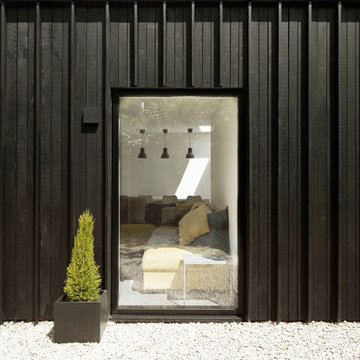
Externally, timber larch cladding is used as the primary material. This is painted black with a heavy duty barn paint, that is both long lasting and cost effective. The black finish of the extension contrasts with the white painted brickwork at the rear and side of the original house. The external colour palette of both structures is in opposition to the reality of the interior spaces. Although timber cladding is a fairly standard, commonplace material, visual depth and distinction has been created through the articulation of the boards. The inclusion of timber fins changes the way shadows are cast across the external surface during the day. Whilst at night, these are illuminated by external lighting.
A secondary entrance to the house is provided through a concealed door that is finished to match the profile of the cladding. This opens to a boot/utility room, from which a new shower room can be accessed, before proceeding to the new open plan living space and dining area.
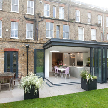
Simply two way bi-folding doors were added to this modest extension to allow it to flow seamlessly into the garden.
ロンドンにあるお手頃価格の小さなコンテンポラリースタイルのおしゃれな家の外観 (メタルサイディング、アパート・マンション、混合材屋根) の写真
ロンドンにあるお手頃価格の小さなコンテンポラリースタイルのおしゃれな家の外観 (メタルサイディング、アパート・マンション、混合材屋根) の写真
The project features a pair of modern residential duplexes with a landscaped courtyard in between. Each building contains a ground floor studio/workspace and a two-bedroom dwelling unit above, totaling four dwelling units in about 3,000 square feet of living space. The Prospect provides superior quality in rental housing via thoughtfully planned layouts, elegant interiors crafted from simple materials, and living-level access to outdoor amenity space.
Primary exterior materials are charcoal color brick, fiber cement siding, and aluminum clad windows.
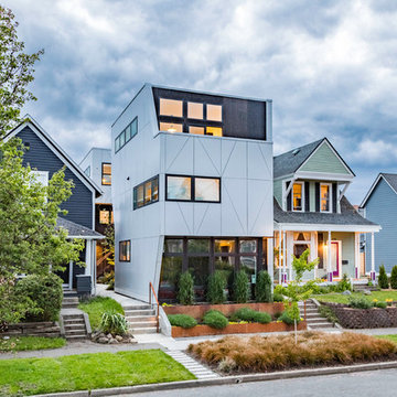
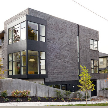
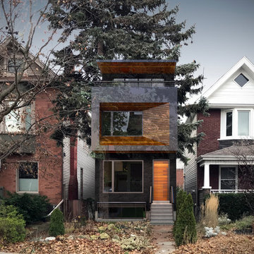
シアトルにある高級な小さなモダンスタイルのおしゃれな家の外観 (レンガサイディング、混合材屋根) の写真
シアトルにある高級な小さなモダンスタイルのおしゃれな家の外観 (レンガサイディング、混合材屋根) の写真
Photograph: Simon Devitt.
The house connects to the street by opening onto a street-side sunny deck, and lots of planting. The extension was designed to echo the strong roof forms of the original townhouse.
Renovation of an existing house included small adjustments to the rooflines to make a much more modern expression inspired by Scandinavian architecture. Minimal trim around windows and corners also helps the pure geometric forms emerge. While still respecting the scale and the origins of the local style, it is unmistakably distinct.
Its complementary black box master suite with roof deck creates a contrast with the more traditional, iconic house shapes in white. The result is a house that is familiar and comfortable while at the same time challenging our ideas about what a house should be.
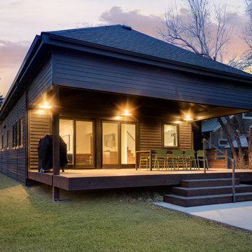
Long Island Modern Architect Firm Designs a Sustainable Surf House in Long Beach NY
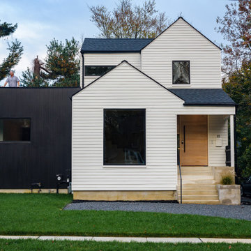
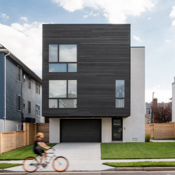
ニューヨークにあるお手頃価格の小さなモダンスタイルのおしゃれな家の外観 (混合材屋根) の写真
ニューヨークにあるお手頃価格の小さなモダンスタイルのおしゃれな家の外観 (混合材屋根) の写真
Photography by Richard Chivers https://www.rchivers.co.uk/
Marshall House is an extension to a Grade II listed dwelling in the village of Twyford, near Winchester, Hampshire. The original house dates from the 17th Century, although it had been remodelled and extended during the late 18th Century.
The clients contacted us to explore the potential to extend their home in order to suit their growing family and active lifestyle. Due to the constraints of living in a listed building, they were unsure as to what development possibilities were available. The brief was to replace an existing lean-to and 20th century conservatory with a new extension in a modern, contemporary approach. The design was developed in close consultation with the local authority as well as their historic environment department, in order to respect the existing property and work to achieve a positive planning outcome.
Like many older buildings, the dwelling had been adjusted here and there, and updated at numerous points over time. The interior of the existing property has a charm and a character - in part down to the age of the property, various bits of work over time and the wear and tear of the collective history of its past occupants. These spaces are dark, dimly lit and cosy. They have low ceilings, small windows, little cubby holes and odd corners. Walls are not parallel or perpendicular, there are steps up and down and places where you must watch not to bang your head.
The extension is accessed via a small link portion that provides a clear distinction between the old and new structures. The initial concept is centred on the idea of contrasts. The link aims to have the effect of walking through a portal into a seemingly different dwelling, that is modern, bright, light and airy with clean lines and white walls. However, complementary aspects are also incorporated, such as the strategic placement of windows and roof lights in order to cast light over walls and corners to create little nooks and private views. The overall form of the extension is informed by the awkward shape and uses of the site, resulting in the walls not being parallel in plan and splaying out at different irregular angles.
Externally, timber larch cladding is used as the primary material. This is painted black with a heavy duty barn paint, that is both long lasting and cost effective. The black finish of the extension contrasts with the white painted brickwork at the rear and side of the original house. The external colour palette of both structures is in opposition to the reality of the interior spaces. Although timber cladding is a fairly standard, commonplace material, visual depth and distinction has been created through the articulation of the boards. The inclusion of timber fins changes the way shadows are cast across the external surface during the day. Whilst at night, these are illuminated by external lighting.
A secondary entrance to the house is provided through a concealed door that is finished to match the profile of the cladding. This opens to a boot/utility room, from which a new shower room can be accessed, before proceeding to the new open plan living space and dining area.
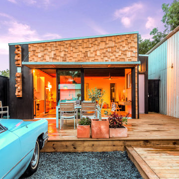
2020 New Construction - Designed + Built + Curated by Steven Allen Designs, LLC - 3 of 5 of the Nouveau Bungalow Series. Inspired by New Mexico Artist Georgia O' Keefe. Featuring Sunset Colors + Vintage Decor + Houston Art + Concrete Countertops + Custom White Oak and White Cabinets + Handcrafted Tile + Frameless Glass + Polished Concrete Floors + Floating Concrete Shelves + 48" Concrete Pivot Door + Recessed White Oak Base Boards + Concrete Plater Walls + Recessed Joist Ceilings + Drop Oak Dining Ceiling + Designer Fixtures and Decor.
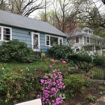
A "Before" image of the existing Cape home before renovation.
ニューヨークにある高級な小さな北欧スタイルのおしゃれな家の外観 (コンクリート繊維板サイディング、混合材屋根) の写真
ニューヨークにある高級な小さな北欧スタイルのおしゃれな家の外観 (コンクリート繊維板サイディング、混合材屋根) の写真
The house's geometry was very sharp and fun to play with. The new form echoes the old steeply-pitched roofed form, which then talks to its neighbour. Overall the effect is striking and modern.
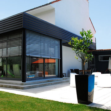
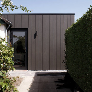
Pour cette maison d’habitation, le Maître d’Ouvrage souhaitait créer une piscine et ouvrir la maison sur l’extérieur en créant une extension architecturale résolument contemporaine. Une rupture entre l’existant et l’extension accentuée par une verrière, liaison entre deux époques, renforce cette intégration dans le jardin existant.
小さな黒い外観の家 (混合材屋根) の写真
1