小さなコの字型の家 (円形の家) の写真
絞り込み:
資材コスト
並び替え:今日の人気順
写真 1〜20 枚目(全 38 枚)
1/4
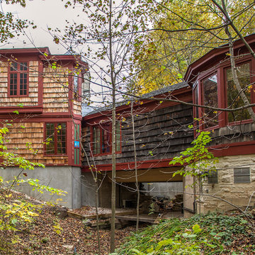
Exterior view of new addition and house spanning the creek.
Bill Meyer Photography
シカゴにあるラグジュアリーな小さなラスティックスタイルのおしゃれな家の外観 (円形の家) の写真
シカゴにあるラグジュアリーな小さなラスティックスタイルのおしゃれな家の外観 (円形の家) の写真
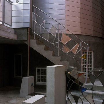
Designed in 1970 for an art collector, the existing referenced 70’s architectural principles. With its cadence of ‘70’s brick masses punctuated by a garage and a 4-foot-deep entrance recess. This recess, however, didn’t convey to the interior, which was occupied by disjointed service spaces. To solve, service spaces are moved and reorganized in open void in the garage. (See plan) This also organized the home: Service & utility on the left, reception central, and communal living spaces on the right.
To maintain clarity of the simple one-story 70’s composition, the second story add is recessive. A flex-studio/extra bedroom and office are designed ensuite creating a slender form and orienting them front to back and setting it back allows the add recede. Curves create a definite departure from the 70s home and by detailing it to "hover like a thought" above the first-floor roof and mentally removable sympathetic add.Existing unrelenting interior walls and a windowless entry, although ideal for fine art was unconducive for the young family of three. Added glass at the front recess welcomes light view and the removal of interior walls not only liberate rooms to communicate with each other but also reinform the cleared central entry space as a hub.
Even though the renovation reinforms its relationship with art, the joy and appreciation of art was not dismissed. A metal sculpture lost in the corner of the south side yard bumps the sculpture at the front entrance to the kitchen terrace over an added pedestal. (See plans) Since the roof couldn’t be railed without compromising the one-story '70s composition, the sculpture garden remains physically inaccessible however mirrors flanking the chimney allow the sculptures to be appreciated in three dimensions. The mirrors also afford privacy from the adjacent Tudor's large master bedroom addition 16-feet away.
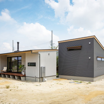
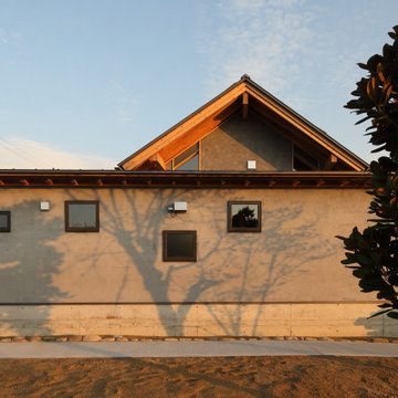
建物により中庭を囲むデザインの平屋。スタッコフレックスによる塗り壁外壁の部分は居住エリア。グレーのガルバリウムが張られた部分はビルトインガレージとなります。居住エリアは、中庭の他、南側にも大きく開いています。南側の庭は、家庭菜園と愛犬のためのドッグランとして利用します。
他の地域にある高級な小さな北欧スタイルのおしゃれな家の外観 (混合材サイディング、縦張り) の写真
他の地域にある高級な小さな北欧スタイルのおしゃれな家の外観 (混合材サイディング、縦張り) の写真
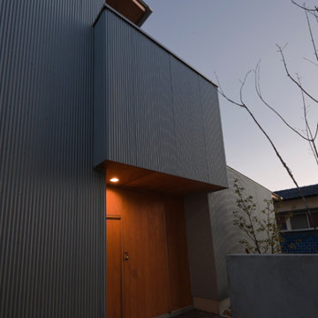
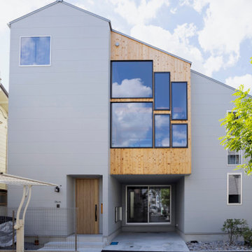
夫婦+幼稚園児3人の世帯だったことを意識して、門扉と外階段手すりは、“楽しさ”と“安全性”を両立させることを考えて設計した。外装は、RC基壇がモルタル洗い出し、円筒部分はガルバリウム鋼板平葺
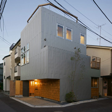
東京23区にある小さなコンテンポラリースタイルのおしゃれな家の外観 (混合材サイディング、円形の家) の写真
東京23区にある小さなコンテンポラリースタイルのおしゃれな家の外観 (混合材サイディング、円形の家) の写真
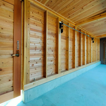
中庭から見た書庫と渡り廊下。渡り廊下土間の縁石も、以前建っていたお蔵の縁石を再利用。
飛び石も再利用しています。
他の地域にある小さな和モダンなおしゃれな家の外観 (混合材屋根、ウッドシングル張り) の写真
他の地域にある小さな和モダンなおしゃれな家の外観 (混合材屋根、ウッドシングル張り) の写真

薪ストーブの前には大きなウッドデッキを設置。
軒を大きくせり出しているので、ウッドデッキの耐久性を高めるとともに
軒下に設置した物干しスペースが雨に濡れる心配もありません。
ウッドデッキはハードウッドのアマゾンジャラを使用しています。
壁に取り付けたマリンランプがおしゃれです。
他の地域にある高級な小さな北欧スタイルのおしゃれな家の外観 (混合材サイディング、縦張り) の写真
他の地域にある高級な小さな北欧スタイルのおしゃれな家の外観 (混合材サイディング、縦張り) の写真
外観の夕景です。
外壁はガルバリウム鋼板の一文字葺です。パラペットの(上端)は特殊な納まりとなっており、一文字葺の縦のラインが美しく見えます。
玄関前など部分的に木製の外壁を貼っています。これは建替え前の既存建物の木材を古材として利用し、手割りで製材した「柿(こけら)板」を葺いています。この柿葺きは建主さんのセルフビルドで作られました。建替え前の既存建物は建主さんの祖父母の代に建てられた家で、建替える新築の家にも何らかのかたちで引き継ぐことができればとの思いからのアイデアです。
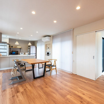
2方向に道路のある角地で1階にダイニングキッチンのある間取りとなっていますことからプライバシーへの配慮が必要でした。道路からはプライバシーが確保できており、実家である隣家側計画した中庭に対して開放的な平面計画となっているため落ち着いた居心地の良い1階のダイニングキッチンとなっています。
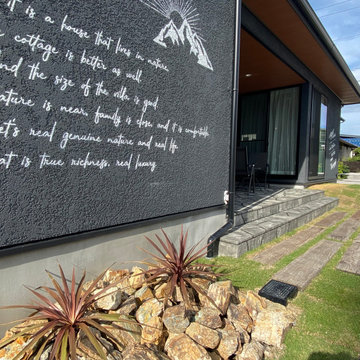
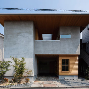
都市部でつくる中間領域のある家
今回の計画は、兵庫県西宮市の閑静な住宅街の一画にある敷地。
本敷地は、L字の道路の突き当りにあり、この道路部分が唯一外部へと抜けのある場所であった。また、クライアントは、アウトドアや自然のある場所を好まれるご家族であり、どこかに外部で遊べる場所を求められていた。しかしながら、本敷地は、100㎡の狭小地で外部に庭を設けることが困難であった。そこで、抜けのある道路を内部へと繋げた中間領域をつくることをコンセプトとした。
道路の直線状にダイニングスペースを設け、ここを外部を感じることのできるオープンな
スペースとした。外部にみたてたウッドデッキの材料を使用した床材や木製サッシで囲むなどのしつらえを行い内部でありながら外部空間のような開放感のあるスペースとした。
ガラスで囲むことにより、ここからリビングスペースやキッチンスペースへと光を取り入れるゾーニングとした。
都市部の狭小地で採光や外部の庭スペースを設けにくい敷地であったが、外部を感じることのできる内部空間を設けることにより、光をとりこみ、家族が豊かに生活をたのしむことのできる中間領域のある家となった。
Designed in 1970 for an art collector, the existing referenced 70’s architectural principles. With its cadence of ‘70’s brick masses punctuated by a garage and a 4-foot-deep entrance recess. This recess, however, didn’t convey to the interior, which was occupied by disjointed service spaces. To solve, service spaces are moved and reorganized in open void in the garage. (See plan) This also organized the home: Service & utility on the left, reception central, and communal living spaces on the right.
To maintain clarity of the simple one-story 70’s composition, the second story add is recessive. A flex-studio/extra bedroom and office are designed ensuite creating a slender form and orienting them front to back and setting it back allows the add recede. Curves create a definite departure from the 70s home and by detailing it to "hover like a thought" above the first-floor roof and mentally removable sympathetic add.Existing unrelenting interior walls and a windowless entry, although ideal for fine art was unconducive for the young family of three. Added glass at the front recess welcomes light view and the removal of interior walls not only liberate rooms to communicate with each other but also reinform the cleared central entry space as a hub.
Even though the renovation reinforms its relationship with art, the joy and appreciation of art was not dismissed. A metal sculpture lost in the corner of the south side yard bumps the sculpture at the front entrance to the kitchen terrace over an added pedestal. (See plans) Since the roof couldn’t be railed without compromising the one-story '70s composition, the sculpture garden remains physically inaccessible however mirrors flanking the chimney allow the sculptures to be appreciated in three dimensions. The mirrors also afford privacy from the adjacent Tudor's large master bedroom addition 16-feet away.
小さなコの字型の家 (円形の家) の写真
1