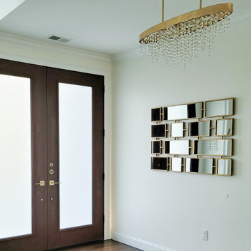
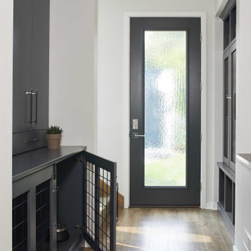
玄関 (茶色い床、赤い床、白い壁) の写真
絞り込み:
資材コスト
並び替え:今日の人気順
写真 1〜20 枚目(全 8,654 枚)
1/4
Download our free ebook, Creating the Ideal Kitchen. DOWNLOAD NOW
For many, extra time at home during COVID left them wanting more from their homes. Whether you realized the shortcomings of your space or simply wanted to combat boredom, a well-designed and functional home was no longer a want, it became a need. Tina found herself wanting more from her Old Irving Park home and reached out to The Kitchen Studio about adding function to her kitchen to make the most of the available real estate.
At the end of the day, there is nothing better than returning home to a bright and happy space you love. And this kitchen wasn’t that for Tina. Dark and dated, with a palette from the past and features that didn’t make the most of the available square footage, this remodel required vision and a fresh approach to the space. Lead designer, Stephanie Cole’s main design goal was better flow, while adding greater functionality with organized storage, accessible open shelving, and an overall sense of cohesion with the adjoining family room.
The original kitchen featured a large pizza oven, which was rarely used, yet its footprint limited storage space. The nearby pantry had become a catch-all, lacking the organization needed in the home. The initial plan was to keep the pizza oven, but eventually Tina realized she preferred the design possibilities that came from removing this cumbersome feature, with the goal of adding function throughout the upgraded and elevated space. Eliminating the pantry added square footage and length to the kitchen for greater function and more storage. This redesigned space reflects how she lives and uses her home, as well as her love for entertaining.
The kitchen features a classic, clean, and timeless palette. White cabinetry, with brass and bronze finishes, contrasts with rich wood flooring, and lets the large, deep blue island in Woodland’s custom color Harbor – a neutral, yet statement color – draw your eye.
The kitchen was the main priority. In addition to updating and elevating this space, Tina wanted to maximize what her home had to offer. From moving the location of the patio door and eliminating a window to removing an existing closet in the mudroom and the cluttered pantry, the kitchen footprint grew. Once the floorplan was set, it was time to bring cohesion to her home, creating connection between the kitchen and surrounding spaces.
The color palette carries into the mudroom, where we added beautiful new cabinetry, practical bench seating, and accessible hooks, perfect for guests and everyday living. The nearby bar continues the aesthetic, with stunning Carrara marble subway tile, hints of brass and bronze, and a design that further captures the vibe of the kitchen.
Every home has its unique design challenges. But with a fresh perspective and a bit of creativity, there is always a way to give the client exactly what they want [and need]. In this particular kitchen, the existing soffits and high slanted ceilings added a layer of complexity to the lighting layout and upper perimeter cabinets.
While a space needs to look good, it also needs to function well. This meant making the most of the height of the room and accounting for the varied ceiling features, while also giving Tina everything she wanted and more. Pendants and task lighting paired with an abundance of natural light amplify the bright aesthetic. The cabinetry layout and design compliments the soffits with subtle profile details that bring everything together. The tile selections add visual interest, drawing the eye to the focal area above the range. Glass-doored cabinets further customize the space and give the illusion of even more height within the room.
While her family may be grown and out of the house, Tina was focused on adding function without sacrificing a stunning aesthetic and dreamy finishes that make the kitchen the gathering place of any home. It was time to love her kitchen again, and if you’re wondering what she loves most, it’s the niche with glass door cabinetry and open shelving for display paired with the marble mosaic backsplash over the range and complimenting hood. Each of these features is a stunning point of interest within the kitchen – both brag-worthy additions to a perimeter layout that previously felt limited and lacking.
Whether your remodel is the result of special needs in your home or simply the excitement of focusing your energy on creating a fun new aesthetic, we are here for it. We love a good challenge because there is always a way to make a space better – adding function and beauty simultaneously.
• CUSTOM DESIGNED AND BUILT CURVED FLOATING STAIRCASE AND CUSTOM BLACK
IRON RAILING BY UDI (PAINTED IN SHERWIN WILLIAMS GRIFFIN)
• NAPOLEON SEE THROUGH FIREPLACE SUPPLIED BY GODFREY AND BLACK WITH
MARBLE SURROUND SUPPLIED BY PAC SHORES AND INSTALLED BY CORDERS WITH LED
COLOR CHANGING BACK LIGHTING
• CUSTOM WALL PANELING INSTALLED BY LBH CARPENTRY AND PAINTED BY M AND L
PAINTING IN SHERWIN WILLIAMS MARSHMALLOW
コロンバスにある高級な広いトラディショナルスタイルのおしゃれな玄関ロビー (白い壁、無垢フローリング、白いドア、茶色い床、折り上げ天井、パネル壁) の写真
The elegant main entry has eight-foot tall double wood-looking fiberglass doors with frosted glass. The hardwood floors are a warm and welcoming feature that leads straight into the living room and adjacent formal dining room.
Stunning traditional home in the Devonshire neighborhood of Dallas.
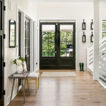
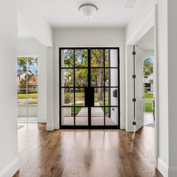
ダラスにある高級な広いトランジショナルスタイルのおしゃれな玄関ロビー (白い壁、無垢フローリング、黒いドア、茶色い床) の写真
ダラスにある高級な広いトランジショナルスタイルのおしゃれな玄関ロビー (白い壁、無垢フローリング、黒いドア、茶色い床) の写真
Warm and inviting this new construction home, by New Orleans Architect Al Jones, and interior design by Bradshaw Designs, lives as if it's been there for decades. Charming details provide a rich patina. The old Chicago brick walls, the white slurried brick walls, old ceiling beams, and deep green paint colors, all add up to a house filled with comfort and charm for this dear family.
Lead Designer: Crystal Romero; Designer: Morgan McCabe; Photographer: Stephen Karlisch; Photo Stylist: Melanie McKinley.
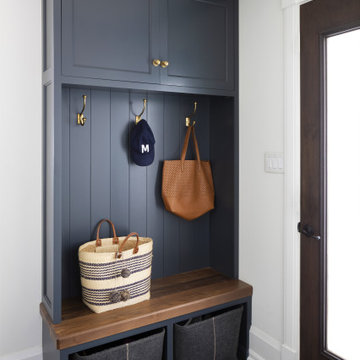
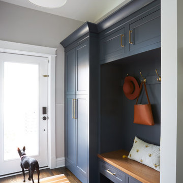
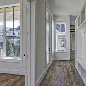
In the remodel of this early 1900s home, space was reallocated from the original dark, boxy kitchen and dining room to create a new mudroom, larger kitchen, and brighter dining space. Seating, storage, and coat hooks, all near the home's rear entry, make this home much more family-friendly!
Martha O'Hara Interiors, Interior Design & Photo Styling | Troy Thies, Photography | Swan Architecture, Architect | Great Neighborhood Homes, Builder
Please Note: All “related,” “similar,” and “sponsored” products tagged or listed by Houzz are not actual products pictured. They have not been approved by Martha O’Hara Interiors nor any of the professionals credited. For info about our work: design@oharainteriors.com
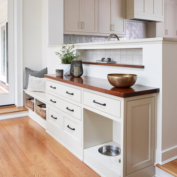
Rear Entry Drop-Zone
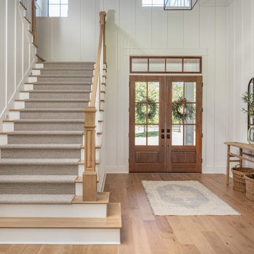
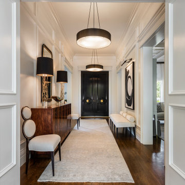
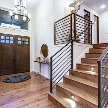
リッチモンドにある高級な中くらいなトランジショナルスタイルのおしゃれな玄関ホール (白い壁、無垢フローリング、茶色い床) の写真
リッチモンドにある高級な中くらいなトランジショナルスタイルのおしゃれな玄関ホール (白い壁、無垢フローリング、茶色い床) の写真
As a conceptual urban infill project, the Wexley is designed for a narrow lot in the center of a city block. The 26’x48’ floor plan is divided into thirds from front to back and from left to right. In plan, the left third is reserved for circulation spaces and is reflected in elevation by a monolithic block wall in three shades of gray. Punching through this block wall, in three distinct parts, are the main levels windows for the stair tower, bathroom, and patio. The right two-thirds of the main level are reserved for the living room, kitchen, and dining room. At 16’ long, front to back, these three rooms align perfectly with the three-part block wall façade. It’s this interplay between plan and elevation that creates cohesion between each façade, no matter where it’s viewed. Given that this project would have neighbors on either side, great care was taken in crafting desirable vistas for the living, dining, and master bedroom. Upstairs, with a view to the street, the master bedroom has a pair of closets and a skillfully planned bathroom complete with soaker tub and separate tiled shower. Main level cabinetry and built-ins serve as dividing elements between rooms and framing elements for views outside.
Architect: Visbeen Architects
Builder: J. Peterson Homes
Photographer: Ashley Avila Photography
photography by Jennifer Hughes
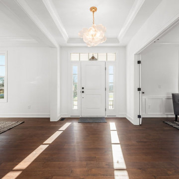
ワシントンD.C.にある広いカントリー風のおしゃれな玄関ホール (白い壁、濃色無垢フローリング、赤いドア、茶色い床) の写真
ワシントンD.C.にある広いカントリー風のおしゃれな玄関ホール (白い壁、濃色無垢フローリング、赤いドア、茶色い床) の写真
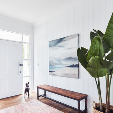
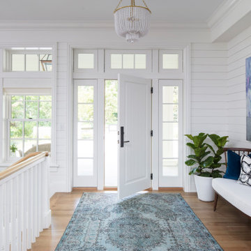
Beautiful minimalist foyer featuring a beautiful wooden bench, a painting that fits in perfectly with the white wall background and a plant.
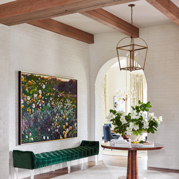
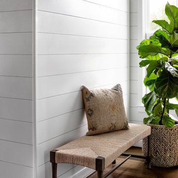
シドニーにあるビーチスタイルのおしゃれな玄関ロビー (白い壁、濃色無垢フローリング、白いドア、茶色い床) の写真
シドニーにあるビーチスタイルのおしゃれな玄関ロビー (白い壁、濃色無垢フローリング、白いドア、茶色い床) の写真
玄関 (茶色い床、赤い床、白い壁) の写真
1