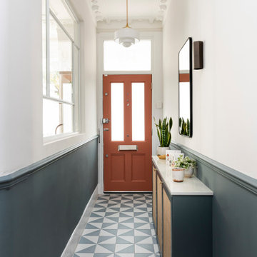
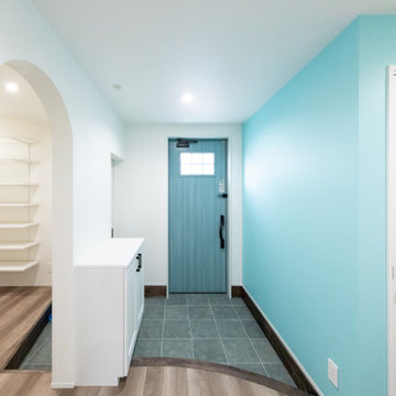
玄関 (全タイプの天井の仕上げ、青い床、紫の床) の写真
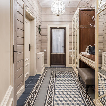
Прихожая в загородном доме в стиле кантри. Шкаф с зеркалами, Mister Doors, пуфик, Restoration Hardware. Кафель, Vives. Светильники шары. Входная дверь.
Pour ce projet nous avons réduit l'entrée existante de moitié afin d'agrandir la nouvelle cuisine. Le challenge était de garder une vraie entrée avec beaucoup de caractère sur un tout petit espace.
Download our free ebook, Creating the Ideal Kitchen. DOWNLOAD NOW
As with most projects, it all started with the kitchen layout. The home owners came to us wanting to upgrade their kitchen and overall aesthetic in their suburban home, with a combination of fresh paint, updated finishes, and improved flow for more ease when doing everyday activities.
A monochromatic, earth-toned palette left the kitchen feeling uninspired. It lacked the brightness they wanted from their space. An eat-in table underutilized the available square footage. The butler’s pantry was out of the way and hard to access, and the dining room felt detached from the kitchen.
Lead Designer, Stephanie Cole, saw an improved layout for the spaces that were no longer working for this family. By eliminating an existing wall between the kitchen and dining room, and relocating the bar area to the dining room, we opened up the kitchen, providing all the space we needed to create a dreamy and functional layout. A new perimeter configuration promoted circulation while also making space for a large and functional island loaded with seating – a must for any family. Because an island that isn’t big enough for everyone (and a few more) is a recipe for disaster. The light white cabinetry is fresh and contrasts with the deeper tones in the wood flooring, creating a modern aesthetic that is elevated, yet approachable for everyday living.
With better flow as the overarching goal, we made some structural changes too. To remove a bottleneck in the entryway, we angled one of the dining room walls to create more natural separation between rooms and facilitate ease of movement throughout the large space.
At The Kitchen Studio, we believe a well-designed kitchen uses every square inch to the fullest. By starting from scratch, it was possible to rethink the entire kitchen layout and design the space according to how it is used, because the kitchen shouldn’t make it harder to feed the family. A new location for the existing range, flanked by a new column refrigerator and freezer on each side, worked to anchor the space. The very large and very spacious island (a dream island if we do say so ourselves) now houses the primary sink and provides ample space for food prep and family gathering.
The new kitchen table and coordinating banquette seating provide a cozy nook for quick breakfasts before school or work, and evening homework sessions. Elegant gold details catch the natural light, elevating the aesthetic.
The dining room was transformed into one of this client’s favorite spaces and we couldn’t agree more. We saw an opportunity to give the dining room a more distinguished identity by closing off the entrance from the foyer. The relocated wet bar enhances the sophisticated vibe of this gathering space, complete with beautiful antique mirror tiles and open shelving encased by moody built-in cabinets.
Updated furnishings add warmth. A rich walnut table is paired with custom chairs in a muted coral fabric. The large, transitional chandelier grounds the room, pairing beautifully with the gold finishes prevalent in the faucet and cabinet hardware. Linen-inspired wallpaper and cream-toned window treatments add to the glamorous feel of this entertainment space.
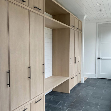
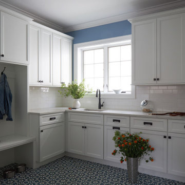
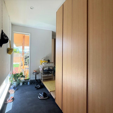
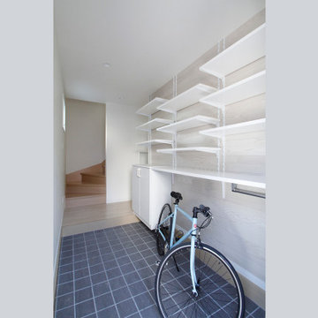
There is no way around it. The laundry room was cramped. The large washer and dryer blocked access to the sink and left little room for the space to serve its other essential function – as a mudroom. Because we reworked the kitchen layout to create more space overall, we could rethink the mudroom too – an essential for any busy family. The first step was moving the washer and dryer to an existing area on the second floor, where most of the family’s laundry lives (no one wants to carry laundry up and down the stairs if they don’t have to anyway). This is a more functional solution and opened up the space for all the mudroom necessities – including the existing kitchen refrigerator, loads of built-in cubbies, and a bench.
It’s hard to not fall in love with every detail of a new space, especially when it serves your day-to-day life. But that doesn’t mean the clients didn’t have their favorite features they use on the daily. This remodel was focused largely on function with a new kitchen layout. And it’s the functional features that have the biggest impact. The large island provides much needed workspace in the kitchen and is a spot where everyone gathers together – it grounds the space and the family. And the custom counter stools are the icing on the cake. The nearby mudroom has everything their previous space was lacking – ample storage, space for everyone’s essentials, and the beloved cement floor tiles that are both durable and artistic.
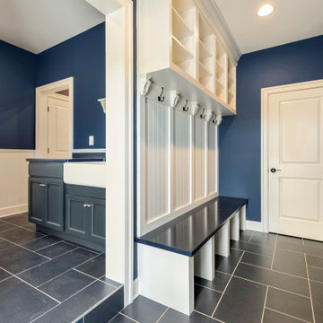
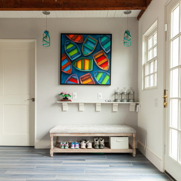
New Mudroom in this Rockport, MA Coastal Cottage Conversion.
ボストンにあるビーチスタイルのおしゃれなマッドルーム (白い壁、セラミックタイルの床、青い床、塗装板張りの天井) の写真
ボストンにあるビーチスタイルのおしゃれなマッドルーム (白い壁、セラミックタイルの床、青い床、塗装板張りの天井) の写真
Dal punto di vista progettuale abbiamo deciso di intervenire nella zona che fa da filtro tra le due funzioni dell’immobile, ovvero nella sala d’attesa, dove abbiamo previsto l’inserimento di un nuovo bagno ad uso dello studio di psicoterapia creando così un disimpegno con la cucina che si presta sia all’uso occasionale per i pazienti dello studio che all’uso degli ospiti delle camere B&B quando, durante l’estate, in concomitanza con la chiusura estiva dello studio di psicoterapia la sala d’attesa diventa la terza camera da letto “jolly” della struttura
Diseño y construcción de oficinas corporativas en el centro de Barcelona.
Techo con instalaciones descubiertas y paneles acústicos para absorver la reberverancia.
Suelo de pvc imitación madera en los pasillos, y moqueta en las zonas de trabajo.
Cabinas telefónicas acústicas individuales
Diseño de vinilos para mamparas de vidrio
Diseño y suministro de mobiliario a medida con taquillas y jardineras.
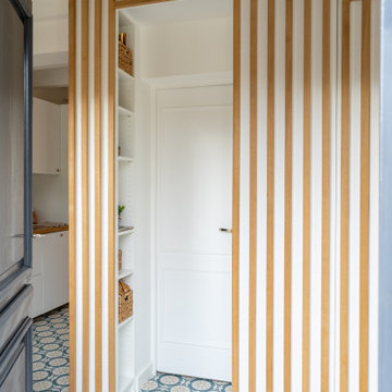
Dès l’entrée, notre regard est directement porté sur le sublime claustra en chêne réalisé sur mesure qui fait le lien entre l’entrée et la cuisine tout en apportant du cachet.
Bitte nicht stören
!
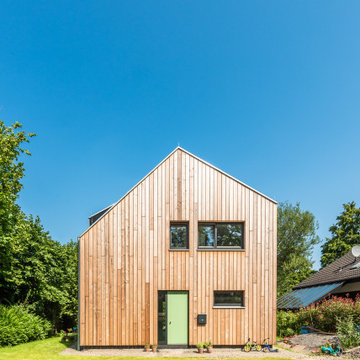
Pferdekoppel, Streuobstwiese und die Ruhe des Waldes. Das kleine Einfamilienhaus gliedert sich wie selbstverständlich und ganz unaufdringlich in die bestehende Struktur aus Wäldchen, Feldern und Einfamilienhäusern ein.
Das freie Baulückengrundstück wurde lange Zeit von Gehölzen und Sträuchern vereinnahmt und lag unscheinbar am Wegesrand der kleinen Sackgassenstraße, worüber gerade mal acht Häuser zu erreichen sind. Das neunte Haus sollte dieses Idyll nicht stören, sondern vervollständigen. Baufluchten und Volumen orientieren sich an den Nachbarn.
Die Bauherren, eine junge vierköpfiger Familie, mit Wurzeln in Mülheim und Oberhausen, wollten das Berliner Großstadtflair gegen die Qualitäten der Metropolregion Ruhrgebiet eintauschen. Die Vorzüge aus eng verbundenen und gut miteinander verknüpften Städten und dazu der schnelle Kurzschluss ins Grüne und die Natur direkt vor der Haustür ließen die Entscheidung nicht schwer fallen. Die Nähe zur Familie, Heimat und Freunden aus Kindertagen war da fast nur noch das „i Tüpfelchen“.
Aber nicht nur lokal sollte sich das Gebäude einer gewissen Naturverbundenheit unterstellen, auch die Bauweise, die gewählten Materialien und die Haustechnik sollten möglichst ökologisch und sinnvoll eingesetzt werden. So entstand auf kleinem Grundriss ein Energieeffizientes Gebäude im KfW70 Standard.
Als Primärbauweise entschieden sich die Bauherren für eine Holzrahmenbauweise mit Zellulosedämmung, dreifach verglaste Holz-Aluminium Fenster, sowie einer Holzfassade aus breiten Lärchendielen. Unterstützt wird die Effizienz der Gebäudehülle durch eine kontrollierte Lüftungsanlage, welches das ganz Jahr über ein angenehmes und behagliches Wohnklima schafft.
Grundrissausrichtung und -orientierung der Fenster wurde bewusst auf den Tagesablauf der Bewohner abgestimmt. So findet der Licht und Sonneneinfall dort statt, wo er tageszeitlich gewünscht ist. Das Erdgeschoss bietet viel Raum für das gemeinsame Familienleben. Küche, Esszimmer und Wohnzimmer bilden das offen Herzstück des Erdgeschosses. Die Vielzahl an möglichen Blickbeziehungen zwischen den Bereichen, mit direkter Verknüpfung zum Garten, bieten nicht nur in der Nutzung viele Möglichkeiten. Auch das Spielen im und um das Haus herum spiegeln das Einbinden in die Umgebung besonders gut wieder.
Der Baustoff Holz ist überall im Haus spür- und erlebbar. Über die Holz-Aluminium Fenstern mit innenseitig klar lasiertem Fichtenholz, der skulpturalen Innentreppe aus Bau-Schichtholz Platten, hin zur unbehandelten Massivholzdecke. Die Böden hingegen wurden mit einem homogenen Linoleum in dunkel Lila belegt, wodurch Kontrast und Farbabstimmung den Räumen noch mehr Tiefe verleihen. Die Ruhe und Stärke des Erscheinungsbildes werden subtil aber zielgerichtet durch das passgenaue Zusammenspiel von Proportionen, Fassadenbrett & Fuge, sowie den bewusst gesetzten Fensterformaten erzeugt und ist das Resultat einer konsequenten und bis ins Detail ausgearbeiteten Planung.
玄関 (全タイプの天井の仕上げ、青い床、紫の床) の写真
1