PR記事

5 Inspiring & Oh-So-Soothing Bedroom Colour Combos
Breathe new energy into your sleep space with a transformative colour scheme
PR記事
Looking to refresh your bedroom with a decorative scheme that’s out of the ordinary? Then take a cue from these unique colour combinations and give your sleep space a whole new narrative.
The first step is to identify which end of the colour spectrum you sit – light and neutral or rich and intense? Then, journey through these dreamy colour pairings and discover the tones that will complement your room’s style, flooring and any existing furniture. Want to test your colour choice first? Click on the paint names below to order one of Dulux’s revolutionary new roller testers.
Looking for more colour ideas and trend alerts? Visit our brand new Colour Inspiration Centre!
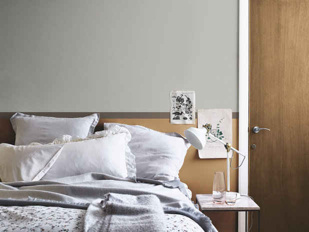
Soothing Grey & Honey Tones
You can’t go wrong with two neutrals that are warm, versatile and utterly calming. This comforting pairing of calming grey and warm honey will instantly evoke a cosy retreat, perfect for snuggling into, yet these breezy hues are full of freshness at the same time.
Use them in equal measure around the room for a sense of harmony and balance, and if you’re feeling a little playful, pop a stripe of warm chocolate amongst the mix.
Continue the fresh vibe with layered linens. Dress your bed with cool, crisp linens in wispy grey shades to echo the purity that this look conjures.
Try Concrete Grey and Spiced Honey, both Dulux
Everything You Need to Know About Painting With Grey
Pale Pinks & Rich Berry
Take inspiration from a punnet of wild berries – think deep blackberry and blueberry shades – and combine a pale pink for a cosy and atmospheric space that’s utterly relaxing.
The beauty of this look is its versatility. On one hand, it can work in a feminine setting with pretty blush pinks sprinkled about. Or this colour combo can be teamed with pale blueberry bed linen for a more masculine approach. Either way, the result will be laid-back and relaxed.
Create a modern focal point. If your bedroom is without a natural focal point, such as a fireplace, create one by simply adding interesting shelving and display your favourite knick-knacks at eye level.
Try Blossom Tree and Mulberry Burst, both Dulux
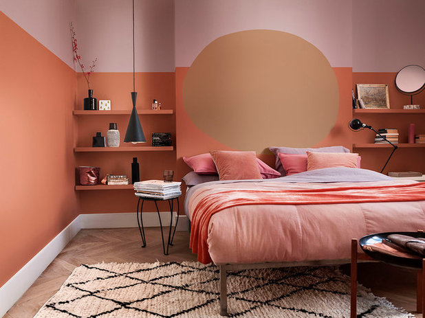
Terracotta & Chocolate
A popular shade often used in boho and global, nomad-style schemes, rich terracotta is a wonderfully warming tone that replicates the sun-baked walls of exotic Moroccan riads or Tuscan fincas.
Balance the intensity with a paler shade, such as milk chocolate or a rich caramel shade, and you’ll create a haven in which to shelter and reset.
Layers of comfort are key. Any bedroom will benefit from an added layer of comfort on the floor, whatever the surface underneath, and if you’re keen to channel the boho look, go for a textured Berber rug.
Try Cinnamon Sprinkle and Spiced Honey, both Dulux
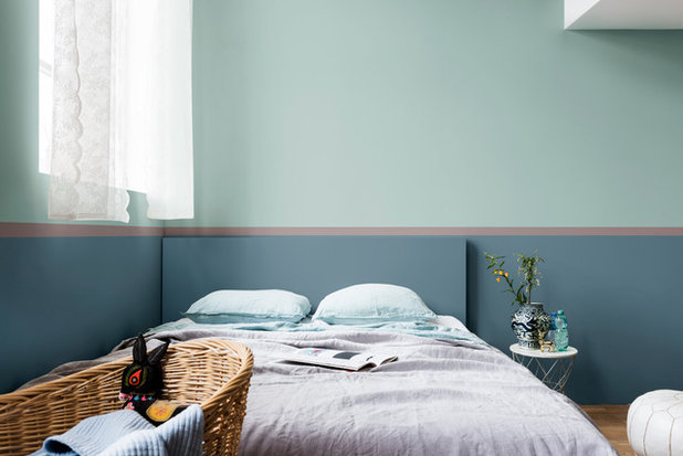
Blue & Blue
There’s something delightfully tranquil about blue, thanks to its connection with breezy blue skies and calm, rolling waves, making it ideal for a restful sleep space. However, the blues have to be just right so as not to lower the temperature.
Look out for blues with a warm, greeny tone and don’t be afraid to combine two variations of this colour in the same space. Just think of the sea and its multitude of shades.
Less is more. To ensure the pace stays slow and restful, keep the room simply styled and clutter-free, but add nuggets of interest with a side table vignette of pretty accessories.
Try Fresh Foliage and Faded Indigo, both Dulux
Meet Dulux’s Soothing New Colour of the Year 2020
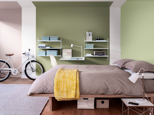
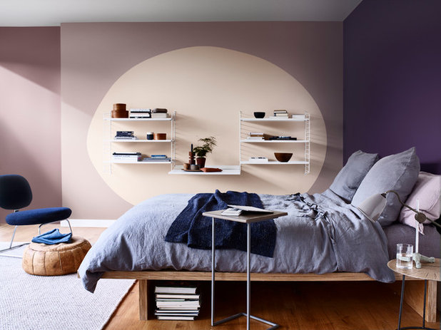
Leafy Green & Heather
This combination of nature-inspired hues offers the ultimate hub in which to recharge. Revitalising shades of leafy green add a positive note, while playful heather ensures the look stays hip and up to date.
As this look is fresh and modern, it can handle a trendy paint effect, such as chunky white stripes that help zone the room.
Be creative with storage. Turn bedroom clutter into a feature with smart open shelving, while easy-to-grab storage will make the most of unused space under the bed.
Try Fresh Artichoke and Heart Wood, both Dulux
More: Visit our brand new Colour Inspiration Centre for tons of creative ideas, tips and advice. Plus, find more information on Dulux’s colour range here.
Your turn: Which colour combination has grabbed your eye?
This story was written by the Houzz Sponsored Content team.
Dulux is the UK’s leading paint brand, with a wealth... 続きを読む


Dulux is the UK’s leading paint brand, with a wealth... 続きを読む

I think Dulux is a brilliant paint - great coverage. I just had every room in my new build sprayed with Dulux Trade Matt Emulsion (pure brilliant white) - paying significantly more for Dulux trade paint vs other trade paints.
But, completely agree with the lovesail comment.
Dulux, you are letting yourself down. Seriously, look at the competition (little greene paint co, farrow & ball, etc.) and at other Houzz photos - hopefully, you too will see that yours simply are not up to snuff in terms of the colour combinations, room design, advice ("turn bedroom clutter into a feature..."??, etc. You really can do so much better.
sorry but those are horrible colour combinations.
I agree with btuk, your colour combinations never look right. To me they just don't please the eye, haven't for a long time. When I need inspiration for room colours it's never Dulux that I look to it's the premium paint companies. When I saw this article I thought "Ok let's see if Dulux has improved...and...no" Disappointed again. Your paint as a product is good, but your colour ideas not so much, sorry.