Console Tables - Stay or Go?
I have a design dilemma.
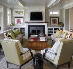
Do the console tables flanking the fireplace
stay or go?
If they stay, how do I accessorize them?
If they go, what goes in its place? A chair
with small drink table?
Thanks for your input!

コメント (48)

Yvonne Martin
昨年More photos of the room would help. For example, could you use more seating in the room, which might be provided by chairs under the paintings?
A G
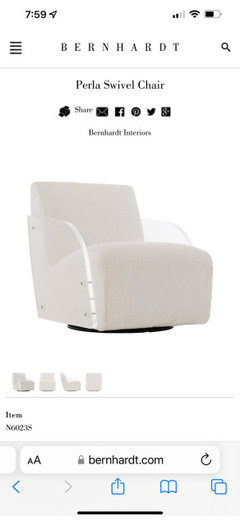
質問の投稿者昨年Furniture is on order that’s why there’s no photos. I have a navy sofa, navy and white acrylic swivel chairs and two other upholstered chairs ordered. I’m wanting a minimalistic look. Navy and white rug, mixed metal accents…. Maybe I post question once all furniture has arrived? But, no, I won’t need seating but could move two chairs in place of consoles. I like consoles, husband does not. We are at a loss as to how to accessorize.
A G
質問の投稿者昨年This is coffee table (not accessories or surrounding furniture) and two of the four chairs

shirlpp
昨年Something is not right. The consoles, artwork and TV are flanking the fireplace making it look really small.
lizziesma
昨年I find your fireplace stunning but would have placed the tv elsewhere. My pesbrain says its over-symetry-ized. Guess cor me the tables would go.
Shasta
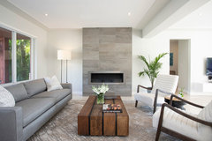
昨年I think the color of the consoles is wrong for your room. I also would do something different on each side, employing different shapes. Like this:

- PRO
Patricia Colwell Consulting
昨年At least get to different paintings this looks like a store display and honestly I would wait until all the furniture is in place then decide on what goes on the consoles I sure like them better than a bunch of shelves filled with stuff that should not be displayed .

Kay p
昨年I like the console tables a lot. Nice baskets underneath for storage. Some pottery and plants on top.
Remove paintings
decoenthusiaste
昨年Minimalist doesn't have to mean rectangular, as in windows, TV, firebox, consoles, rug, art and FP itself. It all looks too blocky to me and the art is way too large, and repetitious. I would soften with at least one plant, perhaps a chair and lamp or drink table opposite.
 Miami Shores Makeover · 詳細
Maureen
昨年最終更新:昨年The first thing I noticed was that the sides feel unbalanced due to tables bejng off kilter from windows/art. Suggest shorter length tables (same size as the art), or even skip tables and then lower art just a touch. Love your choices, by the way.
 PRO
PRORL Relocation LLC
昨年The paintings have to go. the consoles can stay, just need styled.
I might paint those walls, or wallpaper.
add floating shelves

K R
昨年I think the tables are too clunky for that space - they’re beautiful tables but they look jammed in. I also think the matching artwork is too busy. I would definitely do a more minimalist vibe here. Deco enthusiasts has the right idea for that space.

tfitz1006
昨年I agree with most of what people have said above, esp. Deco. I love those tables and I like the artwork, but maybe not where they are placed? I would get all your furniture in - looks like you've made some great picks. Then see about the artwork, perhaps somewhere else in your house. I can't believe I'm saying this b/c I don't love huge TVs, but I think yours is too small. Could you spring for one of those TVs that look like art? My daughters have them and they are really nice.
 PRO
PROMay Construction, Inc.
昨年I like the modern open concept shelves. However modern is about simplicity so i would keep what items you put into those shelves to a minimum.
M Riz
昨年最終更新:昨年Swap the tables so the metal is on the outside and find art that co-ordinate or complements each other, two of the same exact pieces scream mass produced and cheap, and kind of the lazy way (sorry). Im also not against mounting a tv over a FP, but your FP is too small to support (figuratively) the TV, especially without a mantel.

lucky998877
昨年Could you relocate the paintings to an entry wall etc? Please post a picture without the paintings...they are the real problem here.
A G
質問の投稿者昨年If I turned art horizontally would that help? Or turn one upside down? The art helps tie in the dark FP with the rest of the light colored home. I’ll try to send pics without art.
I appreciate all of the feedback. Definitely some things to trydecoenthusiaste
昨年The art is too large for the wall space you have, it is too close to the windows, and the subject matter is identical with just a slight color variation, which makes it quite boring, IMO. If you want art there, go for a pair that are designed to be seen together but not identical. If those two windows do not face the street side of the house, consider taller, skinnier art that actually covers them and is about as wide as they are. Or simply remove the windows and do built-ins up the entire wall on either side.
 Modern Living Room for ADULTS! · 詳細
 Client House · 詳細
Kathy G
昨年最終更新:昨年I love the tables but they feel too large. Same with the art - really large for that space, I like the idea of art there but less matchy and thinner than the windows. I would consider matching benches flanking the fireplace. I would get a larger TV. and try adding a plant on one side of the fireplace (against the brick) and something different on the other side for balance (basket, etc.) bc the fireplace also looks small within the brick.
good luck!
I added a (bad photoshop) sample of what I mean...
everdebz
昨年最終更新:昨年You have a ceiling light fixture, yes? But you could try items on just one side. [They wanted lamps]

everdebz
昨年If you're adding a few furniture pieces, 2 consoles might be 'too much'...
this room has the family's life on display with tripod/telescope thing, and not a traditional look.
everdebz
昨年最終更新:昨年I can picture one side with: 2 pieces of art or wall sculpture below window, the same basic rectangles as the window. On other side, console with minimal.

Olychick
昨年If the tables are flipped so the panel strip is on the outside, I think they look great and are a nice relief from the usual bookcases.
I really like the idea of floating shelves above them; maybe try one of the paintings on the fireplace and place the tv, on an adjustable arm, over one of the console tables with floating shelves on the opposite side. Maybe a floating shelf on the tv side, too, if there is room. Don't junk them up with a bunch of stuff, but a few well placed items and a few books.
If that doesn't work for you, I totally agree about replacing the art. Too large, too similar to each other and everything is too symmetrical and angular.

RedRyder
昨年I’m not a pro, but I would take away everything for now. You said “minimal” is your goal. Once your furniture arrives, rethink that wall. Maybe just complementary artwork on either side that are a better size. But for now, just take everything away. It will be more visually restful and you can rethink the space.

hu818472722
昨年It looks to me that the scale/size of your console tables are too large for the size of the windows directly above them. The art pieces look oversized as well because you do not have an equal amount of wall space on either side of them.
A G
質問の投稿者昨年I think the picture is misleading. The art is perfectly centered to the wall. Appreciate your input
Tara
昨年最終更新:昨年Do you NEED those tables to hold anything? If you don't have a function for them already in mind, don't use them. Isn't that what minimalist is all about? Don't accessorize just because they're there. Maybe use one of the paintings and take away the console, and use the other painting somewhere else in the house. Use a similar styled taller shelving unit in the other niche and make it into a bar area. I see you already have wine glasses on one - go all out with that.
A G
質問の投稿者昨年I know I said minimalist style. I really don’t know what to call it. Other than I don’t like a lot of clutter. I like clean lines. Maybe contemporary traditional is my style. 🤷🏼♀️
everdebz
昨年最終更新:昨年Kathy's yesterday - take a look in case you missed it anyone - lower items [benches which seem ok to have?] fit the scale better, of small fireplace box. Her art is smaller too.
ratherbeatthebeach
昨年I love the console tables, just swap them as others suggested. I think you need some curves, shine, and wood for contrast. I would do a really large curved vase on one side. And a large mirror with an irregularly shaped frame on the other.
- PRO
RL Relocation LLC
昨年im inclined to agree to wait for the furniture so we can all see the whole room. maybe post the whole room now we have no idea what the whole space feels like.
felizlady
昨年The tables are fine. The fit the space. I find the almost-twin paintings jarring. They don’t appear to be centered in their respective spaces, either. The open storage below would tend to get messy or cluttered without matching container boxes to unify the look. The rug appears to be the wrong color for the space.


chispa