Splashback colour decision
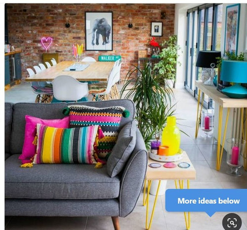
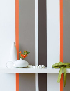
We're having a new kitchen diner created, and although the fixtures and paint are going to be very nuetral, all of the pictures, rugs, cushions etc are going to be multicoloured. Pictures are not my house, but from my mood board to give you an idea of the decor.
Kitchen cabinets are going to be white gloss, some kind of grey flooring, worktops and upstands a mid grey quartz and no tiles on the walls because I hate tiles, (or specifially I hate grout). So I need to pick a splashback for behind the hob and my husband and I CANNOT agree. Every colour I suggest he objects to (red will "look like a brothel", yellow is "too crazy", pink "too girly" etc etc) and when I showed him the colour chart he picked.....grey. I feel like with such a neutral kitchen we need SOME splash of colour. We're not even having a kettle but a boiling water tap instead. The barstools we've picked are one yellow, one turquoise and one fuschia. So he's not averse to colour, but only in the removeable parts of the scheme, nothing thats built in, in case we want to change things up in the future and redecorate.
What might you suggest we go for? Perhaps some kind of turquoise?

コメント (14)

Sonia
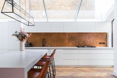
4年前最終更新:4年前Love your intended use of colour, and I think you are really doing it the right way by adding colour with accessories. As you don’t want tiles, lots of companies now do glass splashbacks, so how about glass with a tile pattern, if you get what I mean? I know Ted Baker and Laura Ashley do patterned glass splashbacks, or what about something wood like? Of course this may be your idea of hell! Copper splashbacks are lovely, but the aged ones aren’t cheap so depends on your budget. Here’s what I mean:


Daisy England
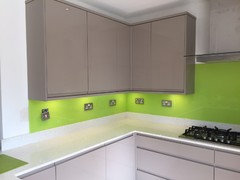
4年前Nothing wrong with a splash of colour. In my holiday home I have white gloss handleless doors and lime green upstands and then the splashback behind the hob in lime green too. Sometimes you have to dare to be different.
With grey orange or lime green would suit.
peggysue67
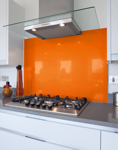
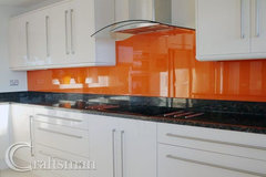
4年前We’ve got off white glass kitchen, black tiles and worktop, wood table and orange glass splashback which links with blind, curtains, towels, tea towels and Brabantia bin! We love it. Warm and cheery in a north facing kitchen. If you don’t fancy orange I think turquoise would also work but be cooler. If you choose boring but safe and your heart isn’t in it you will always feel a bit sad!

rachelmidlands
4年前I think I’d personally stick with something neutral then use the bright colours elsewhere. You could always paint the wall above the upstand in whichever colour you wish then protect with decorators varnish so it’s easy to wipe clean. For the cooker splashback you could use the same quartz as the worktop and upstands for a seamless look. Or... I think a sheet metal would look fab and fit in with the industrial aesthetic, something like a brushed or galvanized steel or an aged zinc. No idea on prices but this site does sheet metal: https://www.metalsheets.co.uk/kitchen-backsplashes/

 PRO
PROCroydon Window Company Ltd
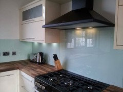
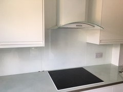
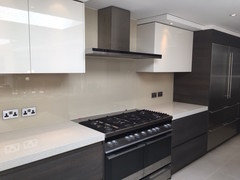
4年前Hi, I think a neutral or subtle colour to complement the pops of brighter colours. Here are some of our installations...


Anthony (Beano)
4年前I’d echo most of the above, I’m not a fan of a strong coloured splash back as I think you’ll tire of it very quickly, accessories can be hard to match with it too!
I’ve still my walls painted white! Dulux easycare and still like new, dark and light grey doors with quartz concrete grey worktops and white walls! Very easy to change the accent colours of the accessories, only statement piece I have are 4 orange dining chairs my mum gave me that I love!
 PRO
PROOnePlan
4年前Wow - some brave people with a love for colour !! I do love colour - but as I tend to fall in and out of love with particular colour easily - I’d echo the advice for anything expensive or needing to be installed - go for neutral - then add your bright or intense colour fix in less expensive or easily moved to other rooms type pieces .
cornwallsharonさんはOnePlanさんにお礼を言いました
Patrina
4年前I vote neutral as well. I think if you are going to pay a significant amount for your splashback. I have cream kitchen cupboards and chose as very pale grey glass splashback. It goes very well with my decor and you can introduce colours with acceasories.

Juliet Docherty
4年前Neutral colours make saturated colours stand out which is why they work well for walls. A saturated splashback will draw the eye, which is good if that's what you want, but not so good if you want to inject colour through accessories.
Drew Minty
4年前We painted the wall behind the hob yellow then got a clear glass splashback. So if we eventually get bored of the colour we can just paint it and reattach the splashback. Just remember the material behind the hob needs to be safe e.g. some materials can’t go behind a gas hob.
 PRO
PROCaroline Couzens Design Ltd
4年前Well, I'm going to add something completely different. I designed this splashback for my client. Two years on, the workhorse behind a fabulous Lacanche range...
 Interior Refurbishment, Southgate · 詳細
...is standing the test of time and looking vibrant and adding an artistic flourish to the kitchen.


Walk Interior Architecture & Design