Cambria counter mix and match suggestions
I’ve tentatively chosen my two kitchen counter colours but I’m currently conflicted about where to put each one.
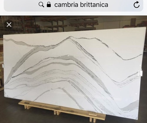
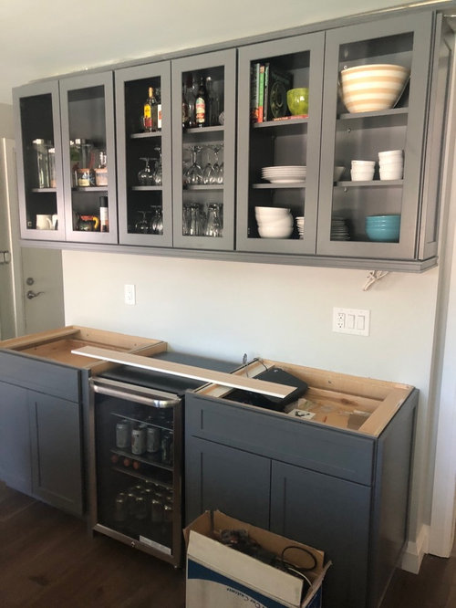
I was thinking Queen Anne on window and stove side as well as island - and Brittanica on both the beverage station and backsplash .
Thoughts ?


コメント (25)
 PRO
PROSina Sadeddin Architectural Design
5年前A simple design is usually the better design. You already have two cabinet colors, so if you want the beverage center to feel like a part of the kitchen, use the same countertops throughout. I definitely wouldn't use a grey quartz on top of a grey cabinet. And if you're thinking of doing quartz for the backsplash (keep in mind not all stones work well behind a stove) then it needs to be the same one as the countertop.
IMO use the Britannica everywhere. The grey veins add interest, and it ties the grey beverage station cabinets in with the rest of the kitchen, plus the grey veins compliment it.
Remember though that when using a stone with strong veining you need to be very careful when templating to avoid unsightly seams which can ruin the look.

Michelle Turan
質問の投稿者5年前Thank you Sina! I was definitely not going to use the Queen Anne (grey) on the beverage station, but was maybe thinking Queen Anne on the island and Britannica on the other two, with ONLY the beverage station having the backsplash.

User
5年前Much too much going on. And too much gray and white already. You need some warmth. Like wood.

Dawn Reid
5年前There's wood on the floors. I think it's a nice combination as long as you add some colour somewhere
 PRO
PROFlo Mangan
5年前I would put the most "movement" on the island and do the peripherals in a plain medium gray. Then consider some killer pendants for over the island and a coordinating one over the sink. What Joseph is referring to is with quartz with heavy veining, don't do it on island that is larger than the jumbo sized slabs of quartz. You will have to have a seam and it is almost impossible to do a good seam with that type veining. Your island doesn't look too big, so put the white with gray veining on the island, plain color on the peripheral cabinets. Then do white backsplash with light gray grout.
- PRO
Flo Mangan
5年前Don't put the veining on peripheral cabinets either due to difficulty with seams. Remember, things look different when viewed on the horizontal plane rather than the vertical as well, so you peripheral stone will show mainly the sides and the island will be the star because it will have more horizontal surface to view. Check and make sure the one you select for the island will be large enough to do your island without a seam. Common problem. Also, make sure you get with the fabricator and do the exact template of the veined piece so you get the look you want focused on the island.
Michelle Turan
質問の投稿者5年前Thank you everyone ! I really appreciate all the considerations !! Lots to decide !friedajune
5年前最終更新:5年前Just do one counter, or if it must be two, then one needs to be solid. Your kitchen does not suit two dramatically vein-y counters. And on the backsplash too! Nope. One counter would be my rec, and plain tile backsplash. Look at the style, size, ceiling height, and tone of your kitchen. It will not support all you want to do. People have an addiction to making everything have wow factor, when only one item should be the star. You gotta know when to stop with the wow factor.
Michelle Turan
質問の投稿者5年前Yes that’s what I’m leaning towards - perhaps Brittanica everywhere
I was only doing backsplash on beverage station which is to your back when entering the room - but I could just do a mirrored backsplash there -
Do you think Britannica everywhere is too much and I should make the window counter plain ?leelee
5年前Keep it all the same. That can't be a mistake but adding another one could.
Too much at stake.
User
5年前最終更新:5年前You’re not getting matching seams in the corners in Britannica. It ain’t bookmatched granite. Avoid using any of the ones with a lot of movement anywhere but on an island with no seam. Or accept that the seams will not flow like it will with natural stone.
Two colors of cabinets and two colors of stone and different backsplashes is about 3 things too many. Pick one Counter. Pick one splash.
And either choice it’s still way too much white and gray. Find some color.

champcamp
5年前最終更新:5年前If you search Brittanica in Design Dilemma you will see some of the threads people are referencing where the strong veins don’t line up at seams and some people end up with expensive counters that look a bit amateur with the veining not lined up. Whichever you go with you should make sure the fabricator shows you a digital layout with where the seams go to make sure you are ok with it.
- PRO
Flo Mangan
5年前Do not do Britannica on peripheral (back countertops) your seams will ruin the look. Just do island in Britannica. Plain material on back cabinets in color solid color of your choice. White would be bright with gray cabinets. Just make sure to take cabinet door from lowers cabs to get good color for back countertops. One focal point. The island. Please.  PRO
PROBayberry Cottage
5年前We agree with what Flo said about doing the Britannica on the island and a plain countertop on the back cabinets. That will really look quite nice.
 Azalea Cottage - Kitchen · 詳細
Michelle Turan
質問の投稿者5年前Counters come Friday ! I will post when I have a pic and you can see what we decided -J Kay
5年前Do the island or beverage station in a butcher block top. I’d go with light light quartz on all the other surfaces.Michelle Turan
質問の投稿者5年前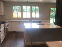
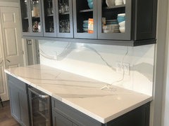
 It's a Brittanica kitchen. Beautiful. We love it! Thanks everyone for your input!!
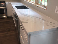


Joseph Corlett, LLC