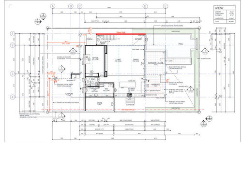
West Side Wall Issue
Just finalising our plans but not sure about the west wall that is currently solid. (no windows). The back of the house (north) is all windows/doors with a large window 5x2m adjoining pool. Should there be any windows on this west wall? (wall is 2 storeys high). The house on this side is less than a metre from the fence and has a neighboring house 2 metres away. Thanks for any thoughts or advice. Any other comments in general welcome too!
コメント (16)

Jason Treanor
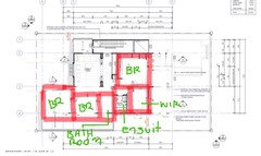
5年前I don’t think it needs windows. We could make a better assessment if you included the second floor plan so we can see where the stairs land.GravityCさんはJason Treanorさんにお礼を言いましたJason Treanor
5年前Great looking plan by the way. All those northern windows will bring so much light. The contrast of a solid wall will make the space more dramatic and add a sense of strength, comfort and protection to the open space.GravityCさんはJason Treanorさんにお礼を言いました PRO
PROLewisham Interiors
5年前I agree, a peek at the first floor plan would be great to see with this West wall extending all the way up from the ground to the top of the first level.
With a complete solid wall there is great potential to enhance the staircase as a feature, introduce a textured wallpaper or even artwork series in a stepped design to relate with the staircase angle.
Should you find you would like the additional natural light to filter down this wall but would rather not introduce windows, then a long ceiling high-light window set all the way along this West side would allow the natural light to flood down the entire wall and add to the appeal of the space while lighting up what could potentially be a dimly lit area (depending on what is in plan for the first floor design).
You have certainly made the most out of your north facing window potential which is great!
GravityCさんはLewisham Interiorsさんにお礼を言いました PRO
PROGravityC
質問の投稿者5年前


Thank you so much for taking the time to give us your thoughts, yes I should have included some pics I realised after uploading the post. If you have time to have a quick look, please see updated images. Thanks again, we're really loving the feedback!
- PRO
MB Design & Drafting
5年前Make the wall a feature internally and externally. Sandstone externally against white weatherboard for example.
No windows as theres probably no breeze to pickup.
GravityCさんはMB Design & Draftingさんにお礼を言いました  PRO
PROPaul Di Stefano Design
5年前Yeah, probably doesn't need it, BUT, looking at this it feels like something's missing - perhaps you consider a slight wrapping of the big window around to the west and making it a corner window to really maximise on that feature - it sort of feels like it needs something, or the opportunity is not being maximised to it's full potential....trust your instinct ;) PD
GravityCさんはPaul Di Stefano Designさんにお礼を言いましたJason Treanor
5年前I agree with ddaroch. I was concerned when I saw so much overhang. There is a lot of space above the carport (where you want shade and protection), this space could be utilised by building on top of the car port and removing the overhang above the living area windows. Louvered Pergola can be used to provide light and shade as needed. The floor space looks about the same.GravityCさんはJason Treanorさんにお礼を言いました
siriuskey
5年前For me I would like to see a tall window in the entrance at the foot of the stairs otherwise the walls will make that space feel closed in.
The covered alfresco needs to be Vergola so as to control summer and winter conditions.
It looks like a really beautiful house, I wish it was built one house from us as the one that's nearly finished and cost heaps is very ugly and ordinary. cheers
GravityCさんはsiriuskeyさんにお礼を言いました- PRO
Paul Di Stefano Design
5年前最終更新:5年前yes siriuskey.....isn't it extraordinary how many examples there are of (as you put it) "ugly and ordinary" houses, that considering how much has been spent on them, fall way short of the mark.......which is why (investment in) design is so important & critical, and it's astounding how it's regularly bypassed by people with the (skewed) school of thought that it will "save money because designed homes are expensive".......nope, non-designed homes are arguably more expensive as they (generally) achieve lesser value outcomes........
I digress, back onto this one... too, I'd be looking also at that north elevation resolution and how the alfresco/overhangs are resolved/articulated. It's like there's some "cut off" action happening which is causing some compositional imbalance....can't help feel that there could be some tweaks that would make this feel less "uppy" (is that even a word?!) in proportion, when it's like it's trying to channel a bit of traditional hamptonsy vibe, that realistically requires more attention to/exploitation of the width proportion and getting the various overhangs and cantilevered elements to be integrated and flowing, rather than "cut off" and sitting almost separated directly next to each other....kind of hard to explain in words, but hopefully you get my drift ;)
GravityCさんはPaul Di Stefano Designさんにお礼を言いました siriuskey
5年前最終更新:5年前The worst part for us Paul is that we have to look at it everyday, they demolished an Architect designed 80's two story cavity brick house and replaced it with a two story clad building of no description and painted it "Gray", we should be happy for them but what a waste cheers
GravityCさんはsiriuskeyさんにお礼を言いましたddarroch
5年前最終更新:5年前Good plan Jason, though I think you're missing one minor bedroom.
I'd also be thinking about moving the upstairs family room to the northern side of the home, grouping the minor bedrooms on the southern side. The family room would then be brighter & more pleasant, & the rearrangement may go some way to resolving the issues with the cantilevers.
Talking cantilevers, along with one above the carport, I'd prefer to have a cantilevered room above a southern section of the pool, rather than above the living areas. This overhang could offer a small section of shade in the pool in summer, but wouldn't shade it in winter.
GravityCさんはddarrochさんにお礼を言いましたddarroch
5年前:)
OP, how big is your family? If one bedroom is a guest bedroom, you could consider moving out downstairs. You'd then have a bedroom which wouldn't require using stairs, in case you have a kid with a broken leg, or a disabled person visiting. This could also resolve the issues created by the size difference between the upper level & the lower level (interior) rooms. ie. reduce the cantilevers somewhat, though you obviously still want some as a feature.GravityCさんはddarrochさんにお礼を言いました- PRO
Lewisham Interiors
5年前Thank you for posting the first floor plan and pics Gravity C.
I would still suggest no windows be introduced onto the West wall and suggest a long high-light window set in the ceiling would work well. See idea below;
The structure and roof trusses will determine the design of how this will work and look, but my thought is to extend the tall feature window directly opposite the staircase overlooking the pool up and over along the ceiling line of this wall to allow the natural light to flood all the way along this West side and all the way down to the ground floor level.
It will be important for this to be designed and executed in a way that will relate with the architecture of the home, but will result in the entrance into your home being quite an experience while also feeling more visually open on both the ground and first floor levels on this side of the home.
Wishing you all the very best!
GravityCさんはLewisham Interiorsさんにお礼を言いました


ddarroch