which color tile for kitchen backsplash

コメント (25)
 PRO
PROBeth H. :
6年前you have a lot of green in this stone. you could do a very pale green/gray and it would beautiful w/the white cabs. or your white one is fine too. the one in the pic is a 2x8 in herringbone and the green tone one is from Encore tile in Cashmere.

sbscoast
質問の投稿者6年前My kitchen doesn't have much natural light. Only a window over the sink. I like the white and the gray. I think I'll use sterling grout. White might reflect more light. Once stone was installed I started having doubts about the cream /tan. There is more white in my stone than in the sample I had been taking to the tile stores. I just picked up the white tonight. It is my preference. In the store, others felt the white made the sample look dingy but with my actual stone I think it's fine. Might look different in daylight?- PRO
Beth H. :
6年前I think would be fine. bring home a few samples and see how they look next to the white cabinets. sometimes whites can be off and look different next to each other. not all white subway tiles are a true, pure white
herbflavor
6年前Color is one thing but the herringbone seems too busy. It's a really pretty counter..looking closer it seems a glass tile in subway would play up that swirl/aquatic look it has.
 PRO
PROJana Kadlicová - JK DECO
6年前As for my feeling, I ´d definitely use the left one. It would unify whole "working space" and let white cabinetry to shine.
White tiles would not only divide the working space into two different covers. but would be somewhat "stucked" to white cabenits, what has for me no sense.
 PRO
PROPearl Remodeling
6年前The Taj Mahal quartzite you installed is gorgeous. Although any tile in that color palette may work, I suggest picking a tan/cream color instead of the white, so you can appreciate the colors more, otherwise the contrast factor may steal the attention. Also, consider the color of your furniture and other design elements so that the items complement each other without competing for the eye's attention.
 PRO
PROCourtney Thomas Design
6年前The one on the right seems to go with the Taj Mahal quartzite much better than the one on the left. Perhaps a grey or green would work as well though?

fernpetrie
6年前What kind of flooring do you have and what is your paint colour? I think that with white cabinets and a light countertop that you may want something to warm up the space. PRO
PROClare Sells Homes, Inc.
6年前I love the one on the right for a clean, fresh, timeless look! :) Post updated pics when you're finished!

beth09
6年前I agree with herb that herringbone might be too busy. And for sure it will distract from your gorgeous counter. I personally would let it be the star, not the BS. :)
marcjennyd
6年前That quartzite is gorgeous! The one on the right hands down! (especially with one window) Your kitchen is going to be beautiful.
sbscoast
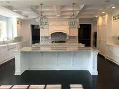
質問の投稿者6年前My floor is warm oak. I was planning to use sterling (light gray) grout which would pick up gray in stone. Staring to second guess herringbone pattern due to some comments that it would be too busy. This is the last time I'm doing this. For that reason I don't want anything trendy. I do like a light and bright in the kitchen. New picture shows white next to installed stone.

- PRO
Beth H. :
6年前最終更新:6年前herringbone,subway layout,,,it's all the same. it's not going to be any busier regardless of the way they're laid. It's a neutral tile. either way is fine. I prefer the herringbone. it's a classy, and classic look. that pattern goes back centuries.
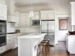
here is Sea Pearl quartzite w/the herringbone. doesn't look busy, or trendy, or whatever else. it just looks beautiful.
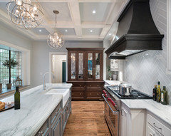
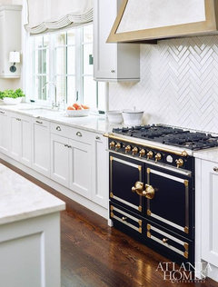
here are two kitchens with one herringbone and one subway. does the herringbone really look busier? to me they look the same. it's just one has a slightly different tile design .

Sammie J
6年前On my monitor, the counter looks like it has a greenish undertone, while the tile on the left appears to have a pinkish undertone. If that is accurate, I would choose the whiter tile - the one on the right.
beth09
6年前The white goes well with it imo, and I LOVE your floor!
As for the BS design, you've gotten opinions, and they are just that. Go with what your gut says, and what you can live with the rest of your life. :)
sbscoast
質問の投稿者6年前Finished, maybe... thinking of painting upper cabinets very light grey like grout color because cabinet color is a warmer white than tile. And adding light moulding at bottom of cabinets. Thoughts?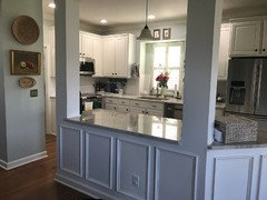
- PRO
Beth H. :
6年前最終更新:6年前so glad you went w/the herringbone. looks beautiful
what tile did you end up using? Great choice.
and your trim work on the island is very nice.

Jamie Ludwig
6年前最終更新:6年前The herringbone backsplash if lovely!!!
I think if you want to paint any of your cabinets grey I would recommend the BOTTOM cabinets going the darker color not the tops.
sbscoast
質問の投稿者6年前The tile was handmade in Europe. I saw the name on the box but unfortunately don’t remember the name. Tile store had ordered for someone who changed their mind. It is bright white. My thought to paint upper cabinets light grey was because they were right next to it.- PRO
Beth H. :
6年前either leave them, or paint all of them a very warm, pale gray. not a blue gray, but warm gray to go w/the stone.


Beth H. :