Please help me pick my backsplash...again
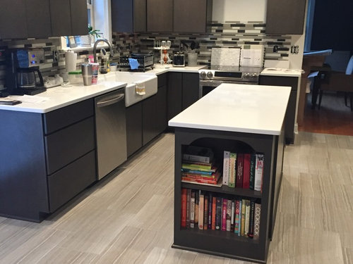
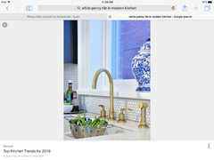
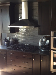
We are in round 2 of putting up a back splash in our kitchen that we have been renovating for over a year and a half. A couple of months ago my husband was putting up the first back splash we had chosen and the more that went up, the more I disliked it. (First pic shown below.) I found it too busy and overwhelming. I convinced my husband to pause and ultimately redo. Here we are two months later and we have narrowed things down (again) to two glass tile choices. This time I am going monochromatic but there are two color options in this style: white and bone. The tiles themselves have texture and I feel adds interest. I initially wanted white but now I am considering the bone choice more as I feel it will add warmth and pull in color from the floor. I am also contemplating grout color for either option. Please help me make the RIGHT choice the second (and final) time around. See other pics for a pic of my kitchen and the samples displayed on the wall, on the left side close to the coffee maker. Thanks in advance for your insight and feedback!

コメント (45)

User
7年前Can you take a bigger picture of the samples you have? I like your kitchen and I agree the titles are busy. I am dreaming of my new kitchen and love the look of glass subway tiles.

Kristin VanStory
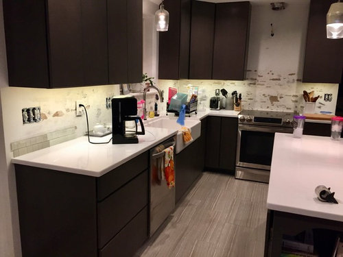
質問の投稿者7年前Yes! I attached a few more pics @plaft. These are technically not subway since the shapes are different, but I like them being a little different than the usual subway shape. Would love to hear your thoughts on the new options? The busy look is now no more!
Kristin VanStory
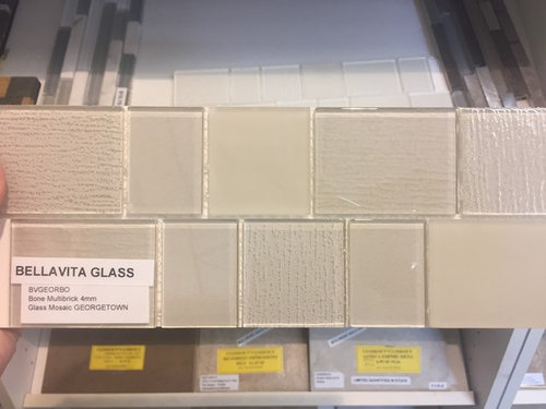
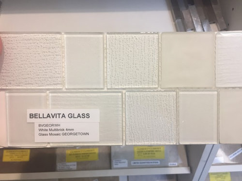
質問の投稿者7年前Yes @Joann! One of the options of the new tiles is white. The other is "bone" colored. Let me know which one you think would be the best!
User
7年前Truthfully I think both will work, you might have to toss a coin. I will say I agree the bone color goes great with the floor!!! Good luck!
_amp_
7年前I think you can go either way, but prefer the bone color. It adds more contrast to the countertop and brings in the floor color.Kristin VanStory
質問の投稿者7年前最終更新:7年前Thanks on the comments! The floor is actually tile, and it was another decision we contemplated forever before choosing. Our house has all original older hardwood everywhere else so when we renovated we wanted to do something very different looking and not try to to match or do another hardwood choice. It's certainly the first thing people comment on when they see the renovations thus far. That and my big sink! :)
User
7年前I love that, I am thinking about using wood look tile myself! So good to see in your picture. Sorry you have problems with your back splash and have to redo, I totally understand that! Sometimes you don't know the result, even when looking at others photos. Good luck to you!
Kristin VanStory
質問の投稿者7年前Thanks @plaft! You will love the wood look tile too I am sure. And we will get the back splash right this time. My husband has told me this is IT no matter what! :)
Kristin VanStory
質問の投稿者7年前Grout definitely gets dingy, but maybe not as much on tile that you aren't walking on and dirtying up as quickly. I have considered this but also worry that using another color might make it too busy again!
User
7年前I think the bone is best with a matching grout? Steer clear of the white grout? I am not sure. But that would be something to consider.

Emily Jowers
7年前I like the white. I think it goes better and with the dark cabinets, I would use light finishes. It's still a warm white. Your kitchen is beautiful. I love the book nook.

D J
7年前FYI
Glass tile always ends up being a different color once installed. White (being the worst) ends up having blue under tones.
So I would recommend getting a drywall board to install 1 square feet with grout to see how you like it.
So because of that I would say the cream one.
Really great kitchen!Kristin VanStory
質問の投稿者7年前最終更新:7年前Thanks @Emily and @bere-all good things to consider. I wondered about the white looking different once installed. Our under cabinet lights are LED but warm not white, so I thought that might impact things also. Good call on the drywall board to see how it turns out. And I love my book nook too-a custom piece that my husband grumbled about but I coveted! Thanks for the kind remarks!
calidesign
7年前The white glass tiles look gray against your white countertops. I would find a white porcelain tile that exactly matches your countertop, and use a light taupe grout to match your floors. That would be perfect. You can't choose a tile by looking at a piece of it up close. Put a large sample by your cabinets and stand back to get a true picture of what it will look like.
 PRO
PROHome Interiors with Ease
7年前I would do white penny tile with white grout...simple and classic..will give a more textured look..would be beautiful with your white counters.


Kathi Steele
7年前Because your countertops are plain, you can get away with a patterned backsplash. Just not as patterned as the previous one!!
Glass tiles are trendy, but if you love it, then go for it. Just know that glass will either turn blue or green, depending on the base.
If you cannot decide, just paint it. Live with it for a while and then start over. Rome was not built in a day.
 PRO
PROSkippack Tile & Stone
7年前Glass is a great choice for the kitchen. The bone color looks good in the setting; pick a grout color that blends or is slightly lighter.
 PRO
PRODavid Charles Klein Design
7年前Hi there! First of all I completely agree with your decision to remove the original tile option. It was way too busy and rather commonplace. I do and see a lot of kitchen remodels and everyone now is doing something very similar which means it's out of style.
I digress. So in terms of the white or bone there are a couple of things to consider. First if you want a more modern, sleek look I would go with the white. If it is a more contemporary yet warm look do the bone. You already have a lot of white with your counter tops so the bone would be a nice contrast. Second you are using glass tile which is always harder to install. It does not cut as easily as ceramic or porcelain and has a greater tendency to break. That said it just takes a bit more time and precision when installing. The other factor with glass has to do with the condition of the wall you are attaching the tile to. It is glass and sometimes the wall color can seep through and affect the color of the tile once installed, or the texture of the wall can been seen through the glass, so make sure you are applying to a solid, clean surface. Also, clear glass always reads bottle green and white glass often reads blue or grey, depending on the light, time of day and other colors you have in the design.
Without knowing you it's hard to pick one but from what you've written it sounds like you are leaning towards the bone and I think that would be a beautiful choice.
Post the final result for all of us to see!
I hope this was helpful.
Best,
DCK
Kristin VanStory
質問の投稿者7年前More great feedback--thank you! I do love the penny tile look @Home Interiors with Ease. Great suggestion. And @DCK, super good tips on the white. My husband is a contractor but sometimes these design aspects can surprise him too. He said the white has a backing on it, so the wall behind won't matter, but I agree about it giving off a different hue, particularly under our warmer LED under cabinet lights. I am definitely leaning towards the bone knowing all this. Although now I am thinking about that darn penny tile look. Did I mention I am hosting Thanksgiving so under just a bit of a time crunch? Ack!
Will definitely post pics of the after, which I hope will happen soon. Thanks again everyone!ilesliemy
7年前I would prefer any porcelain tile that is not see thru. These both look dingy to me. White or bone but not glass (unless it is a color). Any imperfections behind these tiles will show thru as shadows. You might find that annoying!
acm
7年前I like the darker of your two samples, for contrast with counter and to help tie in the floor. Nice looking kitchen!
User
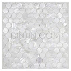
7年前I have looked at glass tiles and always see a backing on them so I don't think your wall color will come through. Penny tiles remind me of the little mozaic trays we use to make in childhood and truthfully I think with the amount of grouting involved with those little tiles it may end up looking busy again. I still like the bone or larger tiles of some sort. But if you like the penny tile idea I found this nice one with mother of pearl in it.

barncatz
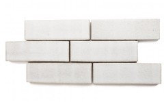
7年前Although your counter is quiet, your floor is not. I personally am not a fan of the striped look, (tan, dk brown, white, tan, dark brown) so I would also choose a white backsplash to match, not contrast with, the counters, in order to achieve a larger block of color.
I also think the glass tile you're considering might still look pretty busy with your floor, given its random shapes and smaller size. Have you tried a large scaled ceramic subway? There's also something I like about Fireclay Tile's thin brick with your floor. This is Cotton, there are may colors and sizes.
 PRO
PROCancork Floor Inc.
7年前White tile = lighter space. You have very dark, non-reflective cabs and a mid-tone beige floor. The only thing offering a "lift" in the space is the counter tops. I think a white back splash will help add a bit more lift and a LOT LESS beige.
The travertine-look tiles are the star of the show. Let them shine. Let them be the ONLY beige material in the whole space. A white tile back splash will maintain the white surface started by the counters. They will be non-intrusive. Which means the floors will maintain their star status.
Very handsome space. You are one step away from perfection.
Kristin VanStory
質問の投稿者7年前Love that penny tile @plaft. So pretty! @barncatz, my husband is anti subway tile-don't ask, it doesn't makes sense to me. And @Cancork, I agree the floor is the star, but I want a pretty backdrop behind me, not just under me. :) Do you still think the white is the best option if the white does not come across as pure/bright as the quartz counter-tops? That is part of my big concern!
P.S. My husband would say that I would prefer to be the star in the kitchen. Thanks for the great feedback!
User
7年前最終更新:7年前Then I would say go with penny tiles but maybe get one like I mentioned with the mother of pearl in it to make it a bit different and pretty. I think white would work because of the variation in the tiles, it would not just be a flat glossy white. Tell your husband he is and will be the shining star when he gets the tiles in before Thanksgiving! :)
User
7年前I think whatever you try be sure to bring samples home to be sure it works with your lighting.
- PRO
Home Interiors with Ease
7年前The only thing with the mother of pearl it will give off a gray tone...not a good idea with your other elements..stick with flat white penny tiles with white grout it will look so sophisticated!
here is the mother of pearl very pretty but to cool/gray for your kitchen.
 PRO
PRODevon Grace Interiors
7年前My vote is for white tile with a white backsplash! The bone is beautiful but I feel it is too similar to the floors (which are gorgeous!) so the white would be a nice way to brighten the space up and add some contrast Good luck!! Can't wait to see some after photos! :)
Kathi Steele
7年前If you are on a time crunch for Thanksgiving, I say, paint it. Live with it. Do NOT make this big decision hurriedly.
If your husband is a contractor, after the first of the year when things settle down, then make a relaxed decision.
I do like the penny tiles though!!! I would not go all the way up the wall. Think function. Backsplash is to protect and it looks kinda funny when going all the way up where you do not expect it.
Kristin VanStory
質問の投稿者7年前I so appreciate all the helpful feedback and thoughts! We are making a decision before the weekend because the work needs to get done and without a deadline, I could contemplate and second guess this decision forever. I promise to post the end result pics for your further review and hopefully, approval! Thanks again!
Joanne
6年前最終更新:6年前Oops! I just realized that your post is old and I'm sure you've already completed the project. Here is my belated comment: Since your kitchen cabinets and countertops are quite streamlined and contemporary, I can see a back splash with that same look, something with a clean and modern look. I think the tiles in your photo are too small and look choppy compared to what you already have going on in your cabinets and countertops. Of course this is just my opinion, and I certainly have no training in design whatsoever.


Kris Mays