Help with paint color


コメント (23)

User
9年前 Pretty Powder · 詳細
 casual luxury · 詳細
 Woodland Addition & Renovation · 詳細
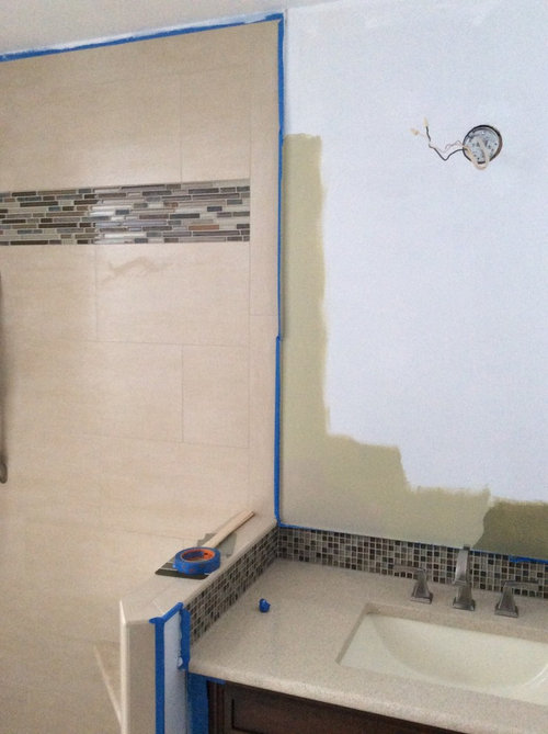
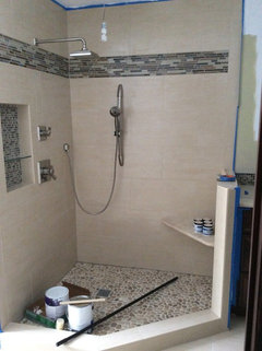
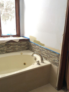
I think I would try to either find a color to match the wall tiles, so that the mosaics will stand out or find a nice blue or light green. Gray could be really pretty as well. Not liking the sample you put up on the wall-it fights with the beige tiles-too gold. Do you have a sample tile you can bring to the paint store?
nomimama
9年前Yes a grayed down blue for sure. Not seeing it in any of the pics though. Be careful of Easter eggish pastels.
sunnydrew
9年前These are the colors from my palette. This is actually the tray ceiling and green walls in bedroom. Bathroom is the Crystaline blue of the ceiling. I will try to find numbers. I had the bathroom painted the brown color, Elkhorn, I think was the name, before, but we just repainted during reno.
The blue is like a very pale robin's egg.
sunnydrew
9年前The color in my bathroom now is BM Affinity AF-485. It is called Crystalline. It is actually green, not blue, but changes based on sunlight or artificial light. I am sure it will go in your bathroom.
Your tiles are such that you have a lot of leeway in the paint color. It may just come down to the color that you just like best. Try paining large swatches on poster board so you can move them around to see in different types of light.
I have the swatch form my dark green and will find it for you. I apologize but they all got separated. Thank goodness BM keeps a record of paint that you buy, so I was able to go back and ask. We painted the bedroom sometime ago. PRO
PROChristina's Interior Finishes, LLC
9年前My suggestion for a pretty, classic gray blue would be BM AC-22 Nantucket Fog. It is cool and relaxing, spa-like.
leelee
9年前最終更新:9年前Take one of your large shower tiles to the paint store and have the paint mixed to match it. You want your room to look "open" and it'll be blocked off if you go with a darker paint. The paint should match the large beige tiles. Try that and you'll see how your room will be open and not color-blocked and divided into separate spaces. Match the large tiles--not the small ones.
Kendrah
9年前Leelee's suggestion is outstanding and I never would have thought of it. Smart. I completely agree that the room will look divided into color blocked spaces if you go with something other than a match to the large tiles.

Kristi Traynor
9年前Don't like that mossy green next to your tile. I am partial to the blue grays and my favorite is Celtic gray by Behr.
Barbara Almandarz
9年前I love the basic khaki color. You can add your green with towels;rugs; and deco and artwork. This khaki color let's the mosaic take center stage, as it should!
User
9年前jbvelzy-the sample you painted up on the wall looks great with your mosaic glass, but how does it look with your beige tiles?
User
9年前It's hard to see how the paint color looks against the beige tile because the mosaics are in the middle. Can you place a sample right next to your beige tiles? This way you can make sure you like the color against both the mosaics and the beige tiles.
sunnydrew
9年前Hi again, the color green that I wanted to suggest is BM Affinity, AF-410. It is called Lapland. I think it would work well with your tiles. Of course you have to see it in person, but I will attach a photo anyway.
Good luck with your search.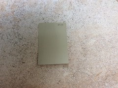

sunnydrew
9年前Same sample card. Different lighting and background. That is why it is so difficult using photos.leelee
9年前Looks like you nailed it with Basic Khaki but you're the one in the room and not trying to see it on the computer screen. If it looks like a match from where you are then go with it.


sunnydrew